How to edit photos on a phone is mostly about order of operations: open the photo, fix the light, correct the color, crop, sharpen, then save a copy. Run the steps out of sequence and you end up with a washed-out or over-sharpened shot. The whole job takes about two minutes, and every tool you need is already on your device.
What follows covers the current Apple Photos app and Google Photos, plus the Samsung Gallery editor, on their current versions. Labels shift a little between releases, so look for the concept rather than the exact wording. Every edit happens non-destructively on a copy, which means you can always go back.
Table of Contents
- What You Need
- Step-by-Step: How to Edit Photos on a Phone
- 1. Open the Photo in Your Phone’s Editor
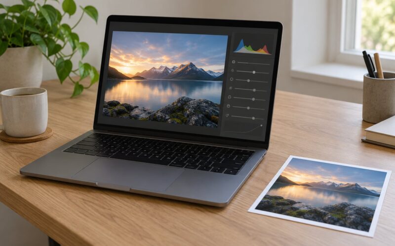
- 2. Correct Exposure, Highlights, and Shadows
- 3. Set White Balance and Natural Color
- 4. Crop, Straighten, and Correct Perspective
- 5. Add Selective Adjustments
- 6. Apply Sharpening, Clarity, and Filters Carefully
- 7. Save, Export, and Check the Result
- The Five Edits to Make First, in Order
- Common Mistakes
- Frequently Asked Questions
- What is the best free app for editing photos on a phone?
- Does editing a photo on a phone reduce its quality?
- How do I make edited photos look natural rather than overprocessed?
- Where are edited photos saved on iPhone and Android?
- Should beginners use filters when editing photos on a phone?
- Start With Exposure and White Balance
What You Need
Almost nothing. You need the phone in your hand, the photo already in your library, and the editor that ships with the system.
Open the image first, before you install anything. The built-in editors handle crop, straighten, rotation, brightness, contrast, color, filters, and sometimes a selective brush and an object remover. That covers the majority of fixes people want to make.
You might also want a completely free dedicated app such as Snapseed for masking, curves, and perspective correction, or Adobe Lightroom Mobile when you shoot in RAW. Both run offline and neither needs an account.
A few habits make the rest easier. Work on a duplicate, not the original. Use the gesture toggle on iPhone to compare against the untouched version while you edit. And turn off any setting that re-saves automatically after every tap.
Step-by-Step: How to Edit Photos on a Phone
1. Open the Photo in Your Phone’s Editor
On iPhone, open the photo in Photos, tap Edit at the top right, and the adjustment panel slides up from the bottom. On Google Photos, open the image, tap the pencil icon, then choose Edit with more tools to reach adjustments beyond crop and filters. In Samsung Gallery, open the photo, tap the pencil icon in the toolbar, then tap Adjust to see the full slider set.
If you do not see an edit option, you may be in a screenshot preview or a messaging attachment view. Go back to the full-screen photo and look again.
Make your first tap a duplicate where the app offers one. On iPhone that is the Duplicate button inside the edit view; in Google Photos it is under the three-dot menu. If you skip it, use Revert rather than Undo to get back, because Undo only steps back one action.
2. Correct Exposure, Highlights, and Shadows
Start with exposure, because every color decision you make afterward depends on it. Raise brightness slightly if the whole frame is dim. Pull highlights down if the sky or a window has turned into flat white with no detail in it. Lift shadows only where you need to recover a dark foreground.
Lifting shadows and raising exposure are not the same thing. Exposure moves the entire tonal range up or down and can wash out the sky. Shadows only affect the darker half of the image, so it is the safer tool when you have a bright sky and a dark subject.
Small numbers go a long way. Move a brightness slider by about ten to fifteen units rather than fifty, then look away for a second and back again. If the image feels oddly flat or glowing, you went too far.
How do you know it worked? Open the image at full size and zoom into the brightest and darkest areas. You should still see texture in what used to be a blown patch, and the darks should have detail without looking grey and hazy.
3. Set White Balance and Natural Color
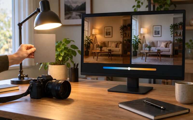
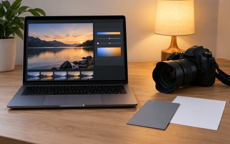
A yellow or blue cast usually means the wrong white balance, not a bad photo. Move the temperature slider toward blue if everything looks too warm and yellow, and toward yellow if the image looks cold and blue. If the picture is greenish or magenta, use the tint slider instead.
Here is a real example. Photograph a bed of flowers outdoors under a tree on a bright day. The petals come out yellow because the camera balanced for the shade. Drop temperature by ten or so until the whites on the surrounding path read as neutral, and the flowers turn true without looking grey.
After white balance, check skin tones in any portrait and check true whites in something you know should be white, like a shirt or a kitchen appliance. If those look right, everything else usually follows.
Use vibrance before saturation. Vibrance lifts dull colours and protects skin tones and skies that are already vivid, while saturation pushes every pixel, which is how flat-looking oversaturated skies happen.
4. Crop, Straighten, and Correct Perspective
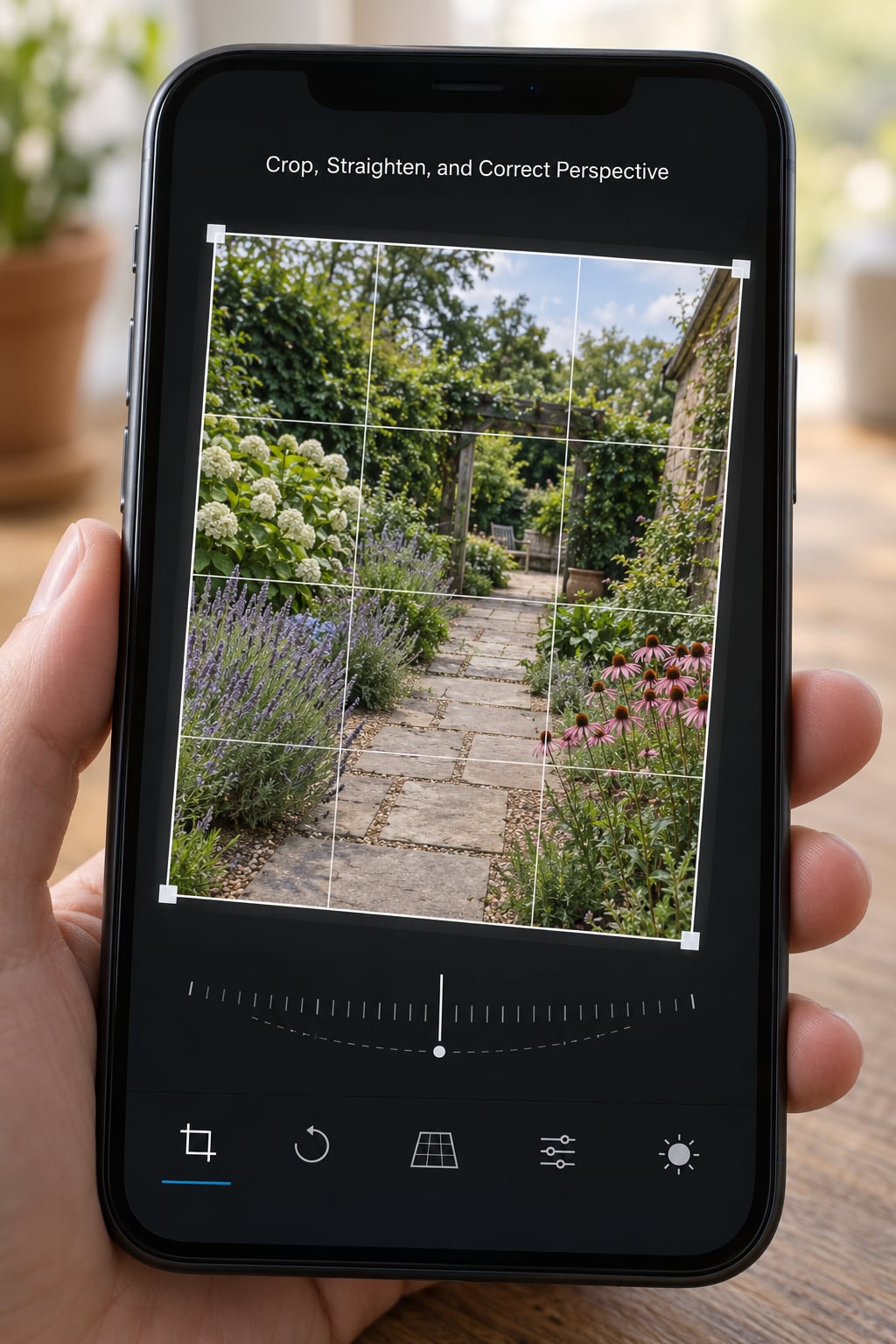
Crop last, or at least crop twice. The mistake people make is cropping tight before they have finished adjusting light, then finding that the subject needs to sit differently.
Pick your aspect ratio first. Square works for feeds, 4:5 or 9:16 for portrait posts, and 16:9 for video thumbnails or banners. Once you commit, the app locks the shape and you can only zoom and reposition.
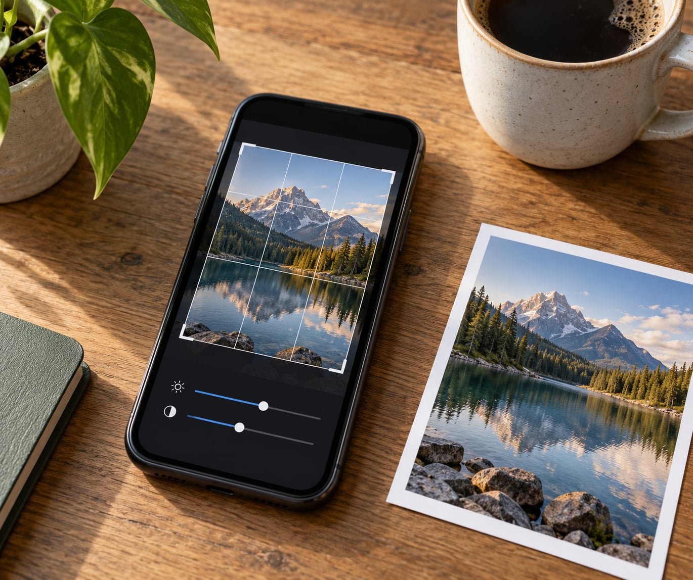
Then straighten. On iPhone, open the crop tool and tap the Auto button to level it. In Snapseed, use the rotate tool and drag the horizon until the lines match the grid. A building wall, a door frame, or a row of fence posts will tell you quickly whether it is straight.
Perspective correction is for photos shot from above or below, where vertical lines lean inward or outward. Look for the vertical and horizontal tools inside the crop menu on iPhone, or the Perspective option in Snapseed’s crop tool. Pull the corners back toward the grid until the lines run true.
Leave a little breathing room around your subject so you are not cutting off at a hairline. And if straightening takes the corners of the frame into nothing, zoom in a touch before you commit.
5. Add Selective Adjustments
Selective controls change one area and leave the rest alone. Instead of lifting the whole photo, you brush or tap onto a single subject. It is the difference between a flat brightening and a subject that separates from its background.
The garden flower example again: the bloom is in shade and the sky above is already bright. A global brightness bump makes the sky worse. Brush onto the flower only and lift it by ten units, and the sky stays where it was.
Use the same idea for saturation, sharpening, and clarity. Tap a sky to make it bluer, brush a face to soften texture, or mask the shadow side of a wall so it brightens without touching the lit side.
Selective work beats a global change when the photo has both a bright area and a dark area, or when one colour dominates the frame. If the whole frame has the same problem, the global sliders from steps 2 and 3 will be faster and cleaner.
6. Apply Sharpening, Clarity, and Filters Carefully
Sharpening boosts local contrast, so a sharpening pass also raises noise in shadows and can create a crunchy look on foliage. Start around twenty and increase slowly.
Clarity adds midtone contrast and texture, giving a punchier look. It is easy to overdo because the effect is obvious while you are moving the slider and much less obvious two weeks later. If a photo looks harsh in a way you cannot explain, clarity is the first slider to pull back.
Filters change colour and contrast in one tap, which is exactly why they are tempting and exactly why they hide bad exposure. Fix the light first, then use a filter at reduced strength if you want one. In Google Photos, drag the filter intensity down after you pick a look.
Compare the edited version against the original at full size, not at thumbnail size. Toggle between them with a tap or a press, and check the corners, where sharpening and vignetting problems show up first.
7. Save, Export, and Check the Result
Choose Save as Copy wherever it appears. You keep the untouched original and get a new file beside it. Saving over the original is fine for a throwaway snapshot and a real loss for anything you care about.
Apple devices usually store photos as HEIC, which is smaller and holds more detail than JPEG. Many apps and social platforms convert on export, so a JPEG at maximum quality is a reasonable choice when you are sending a photo out, and the difference is not something you will notice on a phone screen.
Look for the quality or size setting before you export. Some apps default to a reduced resolution to save space, and that is the usual reason an edited photo looks worse than the original.
Then check the result where it will actually be used. Open it at thumbnail size in your grid first to judge composition, then full-screen to judge detail, then once in whatever app you are posting to.
The Five Edits to Make First, in Order
If you want a workflow you can repeat on every photo, learn these five and nothing else at the start:
- Crop and straighten, so the frame is settled.
- Exposure and brightness, so the overall light is right.
- Highlights down, shadows up, to recover detail at both ends.
- White balance, then vibrance, to fix colour.
- Sharpen, gently, and save a copy.
Filters come after all of that, if you use them at all.
Common Mistakes
Over-editing the first pass. Every slider at maximum is the most common beginner outcome. Fix: make each change small, then look at the full image rather than at the area under your finger.
Cropping too tight before adjusting. You end up with a frame that cannot be re-cropped later. Fix: crop as the last of the basic steps, or crop twice.
Boosting blacks to make a photo pop. Lifting the dark end adds a grey haze that looks flat and slightly foggy. Fix: leave the darkest parts alone and use contrast instead.
Applying a heavy filter to fix exposure. A filter cannot recover a blown sky or a dark subject. Fix: correct the tone first, then apply the filter at low strength.
Losing highlights permanently. Once a sky has clipped to pure white in the file, no editor can bring back the missing data. Fix: lower exposure before you brighten the rest of the frame, and work from a copy.
Saving repeatedly over the original. Each save re-encodes the file and shrinks it a little. Fix: duplicate once, edit the copy, and keep the original untouched.
A few habits keep results consistent. Match your edits by copying the exact slider values from one photo to the next rather than eyeballing each one. Photograph in the same light when you can, because an edit cannot invent detail that was never recorded. And settle on one editing app plus a preset workflow so every photo in a set looks like it belongs together.
Frequently Asked Questions
What is the best free app for editing photos on a phone?
Snapseed is the strongest genuinely free option: every tool is unlocked, there are no ads, no account, and it works offline. It includes a healing tool, selective brush, perspective correction, curves and RAW support. Google Photos is the easiest choice if you never leave the system app. Adobe Lightroom Mobile is free for its core sliders, with presets and cloud sync behind a subscription.
Does editing a photo on a phone reduce its quality?
Only if you let it. Editing itself does not degrade the file, because changes are stored as instructions until you save. The quality loss comes from exporting: if you export at reduced size, or re-save the same file over and over, each encode strips a little detail. Save as a copy, check the export quality setting, and you will not notice a difference.
How do I make edited photos look natural rather than overprocessed?
Work in order: exposure, then highlights and shadows, then white balance, then colour, then sharpening and filters last. Keep every slider change small, and compare against the original at full size before saving. The giveaway of over-processing is heavy clarity, clipped whites and heavily saturated skies. Pull those back and the photo will look like a good photograph instead of a filter.
Where are edited photos saved on iPhone and Android?
On iPhone, Save as Copy creates a new item in your Photos library marked as edited, right beside the original. Google Photos saves edits into the same album or view as the original, with an edited label in the details. Samsung Gallery offers Save as new copy and Save to both versions. Check the app’s Files or Gallery section if you are looking for the export itself.
Should beginners use filters when editing photos on a phone?
Not at first. Filters apply colour and contrast in one tap, which makes it easy to hide a badly exposed photo rather than fix it. Spend your first few weeks on brightness, highlights, shadows and white balance. Once those are quick and automatic, try a filter at reduced intensity as a final step, and keep the same one for a consistent look across a set.
Start With Exposure and White Balance
Duplicate the photo before you touch anything, correct exposure and highlights before you brighten the rest of the frame, and fix white balance before you touch saturation. Then crop, sharpen gently, and save a separate version rather than over the original.
Do those five things on your next photo and it will look better than most of what comes out of a phone without any editing at all.