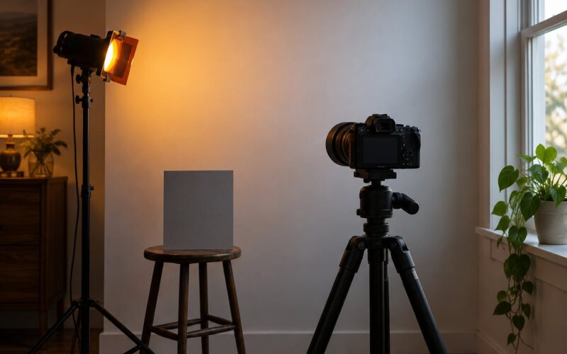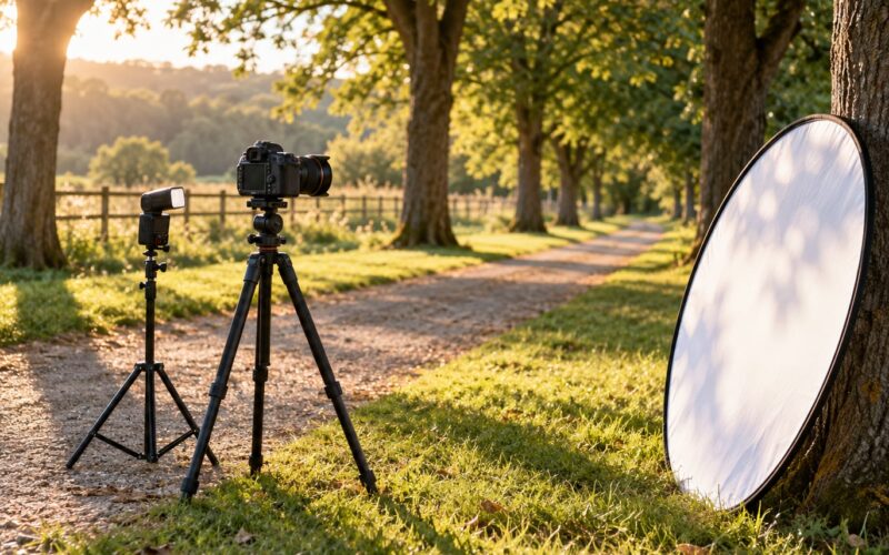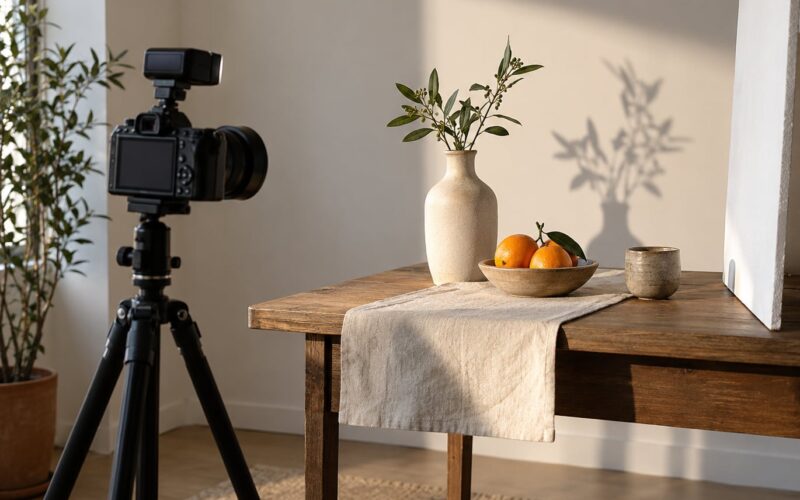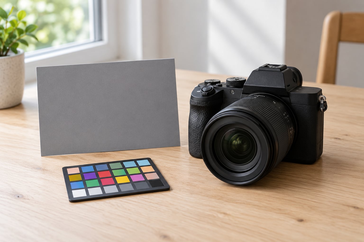
White balance is the setting that tells your camera what neutral white looks like in the light you are shooting in, so a white wall records as white instead of orange under a household bulb. You set it in three ways: leave it on auto, pick a preset like Daylight or Shade, or dial in a specific Kelvin value, usually with a gray card. If you want the short version, start on RAW, set a custom white balance from a gray card before you begin, and fine-tune the temperature and tint sliders later in editing.
I spent years leaving white balance on auto and then wondering why indoor shots of my family looked like they were shot through a jar of honey. The fix took about ten minutes, once I understood that the setting is not a creative filter. It is a correction.
Table of Contents
- What Is White Balance and Why Does It Matter?
- How White Balance Affects Color in Your Photos
- How to Set White Balance Step by Step
- White Balance Settings for Common Lighting Conditions
- Auto, Daylight, or Manual White Balance: Which Should You Use?
- How to Correct White Balance in Photo Editing
- How to Check Whether Your White Balance Is Correct
- Frequently Asked Questions
- Should I use auto white balance or manual white balance?
- What Kelvin value should I use for indoor or outdoor photography?
- Can white balance be corrected after taking a photo?
- Why do my photos look blue or yellow?
- Is custom white balance accurate in mixed lighting?
- Should I shoot RAW or JPEG for better white balance control?
- Where to Start With Your Own Photos
What Is White Balance and Why Does It Matter?
Every light source has its own color, and that color is measured on the Kelvin scale. A candle is warm and orange. Direct midday sun is neutral. A cloudy sky is noticeably blue. Your eye quietly adapts to all of it, which is why a white shirt looks white to you under any of those lights even though the light falling on it is a different color each time.
A camera does not adapt. It records whatever light hits the sensor, so without correction a tungsten-lit room comes out heavy orange and a shaded outdoor scene comes out cold blue. White balance is the instruction that tells the camera how much of the opposite color to add back so neutral objects land on neutral.
Getting it wrong does three things. It puts a color cast over the entire frame, which is the most visible problem. It wrecks skin tones, and skin that looks orange or pink in a portrait is harder to fix than a slightly off white wall. And in a JPEG, the error is baked into the file at the moment of capture, so no amount of editing fully rescues it.
Work photographers notice the same pattern over and over: auto white balance is dependable in plain daylight and in a simple studio with one light source. It falls apart when the scene mixes a window with a ceiling bulb, or when a green wall bounces colored light onto a face. That last one is not a white balance problem at all, and no slider will solve it.
| Light source | Typical Kelvin | How it looks uncorrected |
|---|---|---|
| Candle, fireplace | 1000–2000K | Deep orange |
| Household incandescent bulb | 2500–3500K | Warm, distinctly yellow |
| Sunrise and sunset | 3000–4000K | Warm golden tone |
| Overhead fluorescent | 4000–4500K | Slightly green |
| Direct sunlight, flash | 5200–6000K | Close to neutral |
| Open shade | 6500–8000K | Cool, bluish |
| Heavy overcast | 8000–10000K | Strongly blue |
How White Balance Affects Color in Your Photos
The Kelvin scale runs backwards from what most people expect. Higher Kelvin means cooler and bluer, lower Kelvin means warmer and more orange, even though higher numbers sound like more heat. A candle at roughly 1800K is the warmest thing on the scale and heavy overcast at 9000K is the coldest.
Your camera corrects by adding the opposite color. Under a 2800K bulb it adds blue, which neutralizes the orange. Under an 8000K blue sky it adds warmth, which pulls the image back toward neutral. That single principle explains every color shift you see in a photo.
There is a second axis most beginners never touch: tint. Temperature handles the blue-to-yellow direction, and tint handles green-to-magenta. Fluorescent tubes and cheap LED bulbs often carry a green spike that temperature alone will not remove, which is why a picture lit by them can look slightly sick even when the Kelvin number looks right.
One more thing trips people up: different software reports different Kelvin values for the same physical light. Daylight can read around 5000K in Capture One, around 5500K in Lightroom, and around 5200K in Canon’s own raw converter. The white is still white in all three. Kelvin numbers are not a universal currency, so do not chase a specific number across programs.
How to Set White Balance Step by Step
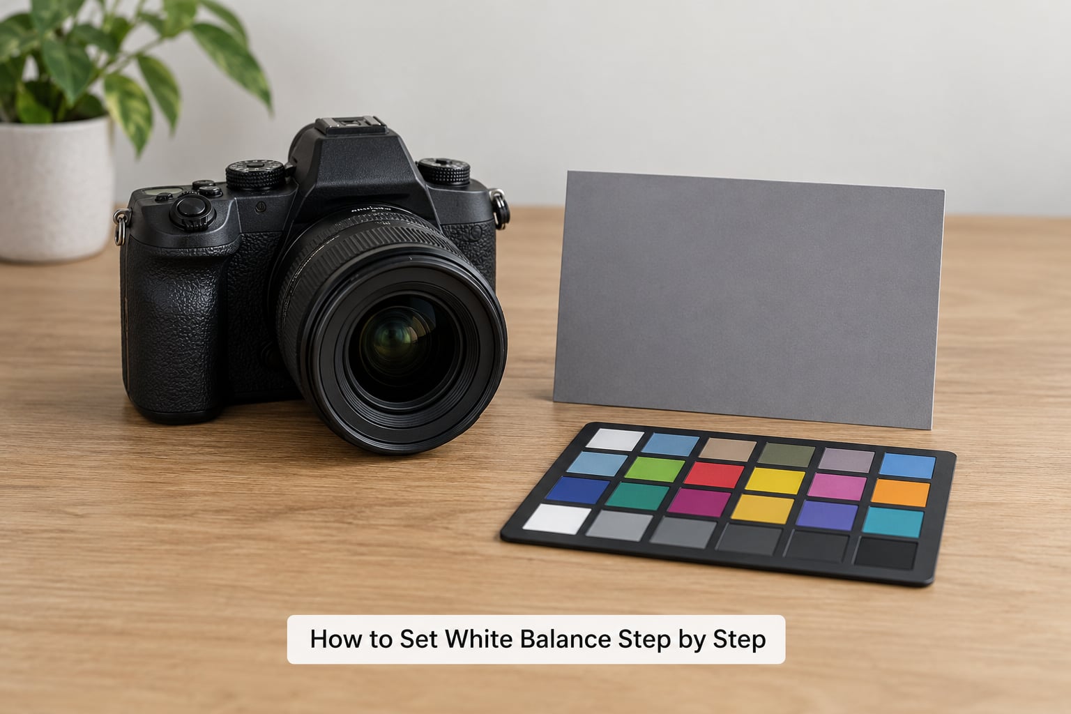
Here is the workflow I give beginners. It takes a few minutes on location and saves an afternoon of editing later.
- Decide your file format first. If you shoot RAW, precision matters less at capture because you can correct anything later. If you shoot JPEG, white balance has to be right in the camera.
- Look for a neutral reference in the scene. A gray card, a white sheet of paper, or even a plain white T-shirt held near your subject works. Something known to be white before your camera touches it.
- Switch out of auto. On most cameras this is a dedicated button or a line in the shooting menu. Find it once, before the shoot starts, not during.
- Fill the frame with the reference under the actual light hitting your subject. Not the light in the background, and not through a window.
- Set a custom white balance from that reference. The camera measures the light and stores a Kelvin value you can reuse for the whole session.
- Take a test frame and check it on the camera screen. Look at skin, not the histogram. Skin is the fastest tell.
- Recheck when the light changes. Clouds move, a door opens, the sun goes behind a building. Settings that were right ten minutes ago may not be now.
If you are shooting movement, distance, or a subject who will not hold still for a card, step 5 gets replaced by a manual Kelvin entry. Look up the light source in the table above and type the number in.
White Balance Settings for Common Lighting Conditions
Match the scene description in the first column to the row that fits your situation, then use either the Kelvin value or the camera preset. Both routes work; presets are faster and Kelvin is more precise.
| If you are shooting | Start at this Kelvin | Camera preset |
|---|---|---|
| Portrait beside a window, no indoor lights on | 6000–7000K | Daylight or Cloudy |
| Open sun at midday | 5200–5500K | Daylight |
| Golden hour, sun low on the horizon | 6000–7000K | Daylight |
| Subject in shade on a sunny day | 7000–8000K | Shade |
| Overcast beach or snow | 7000–9000K | Cloudy |
| Indoor room lit by old bulbs | 2800–3500K | Tungsten |
| Indoor room lit by ceiling tubes | 4000–4500K | Fluorescent |
| Product on a white sweep | 5000–5500K | Daylight |
A few notes on the rows that surprise people. Golden hour is listed above 5500K because the sun is low and the light is orange, which means you need extra warmth in the correction, not less. Overcast is listed high because a full cloud deck is a giant blue sky. And for the product-on-white row, shade is genuinely useful: shaded daylight is dimmer but neutral, and dimmer means less glare bouncing off a white sweep.
Mixed lighting has no single right number. When a window and a bulb hit the same face, pick the source that covers the largest part of your subject and accept that the other will be wrong. Turning off the conflicting light is almost always faster than correcting it.
Auto, Daylight, or Manual White Balance: Which Should You Use?
Auto white balance is not bad. It is fast and it works in daylight and in even, single-source interiors, which covers a lot of everyday shooting. Its weakness is consistency: the camera re-measures the frame on every shot, so the same subject against a different background can record 3600K one frame and 5600K the next, and a sequence of portraits will drift from frame to frame.
Daylight and the other presets are a fixed Kelvin value. One setting, the same result every frame, no drift, and no cost. The weakness is that the preset is a general guess, so a lamp that is older or dimmer than the reference tungsten will still leave a slight orange cast.
Manual Kelvin, usually set from a gray card, is the accurate answer. It is also the one that needs a moment of setup and a reference in the scene. For product work, real estate interiors, and any shoot where the file goes to a client or a lab, this is the method I default to.
RAW versus JPEG changes how much any of this matters. In a RAW file the white balance data is recorded but not baked in, so a wrong setting costs you nothing and you can set the correction in editing with full quality. In JPEG the decision is final at the moment you press the shutter, and heavy correction later will chew up detail in the brightest and darkest channels before you are done.
One more distinction worth making, because it trips people up regularly: a picture style called Natural, Neutral, or Flat is not a white balance setting. It changes how your camera renders color and contrast. Adjusting those expecting a color cast to disappear will waste your afternoon.
How to Correct White Balance in Photo Editing
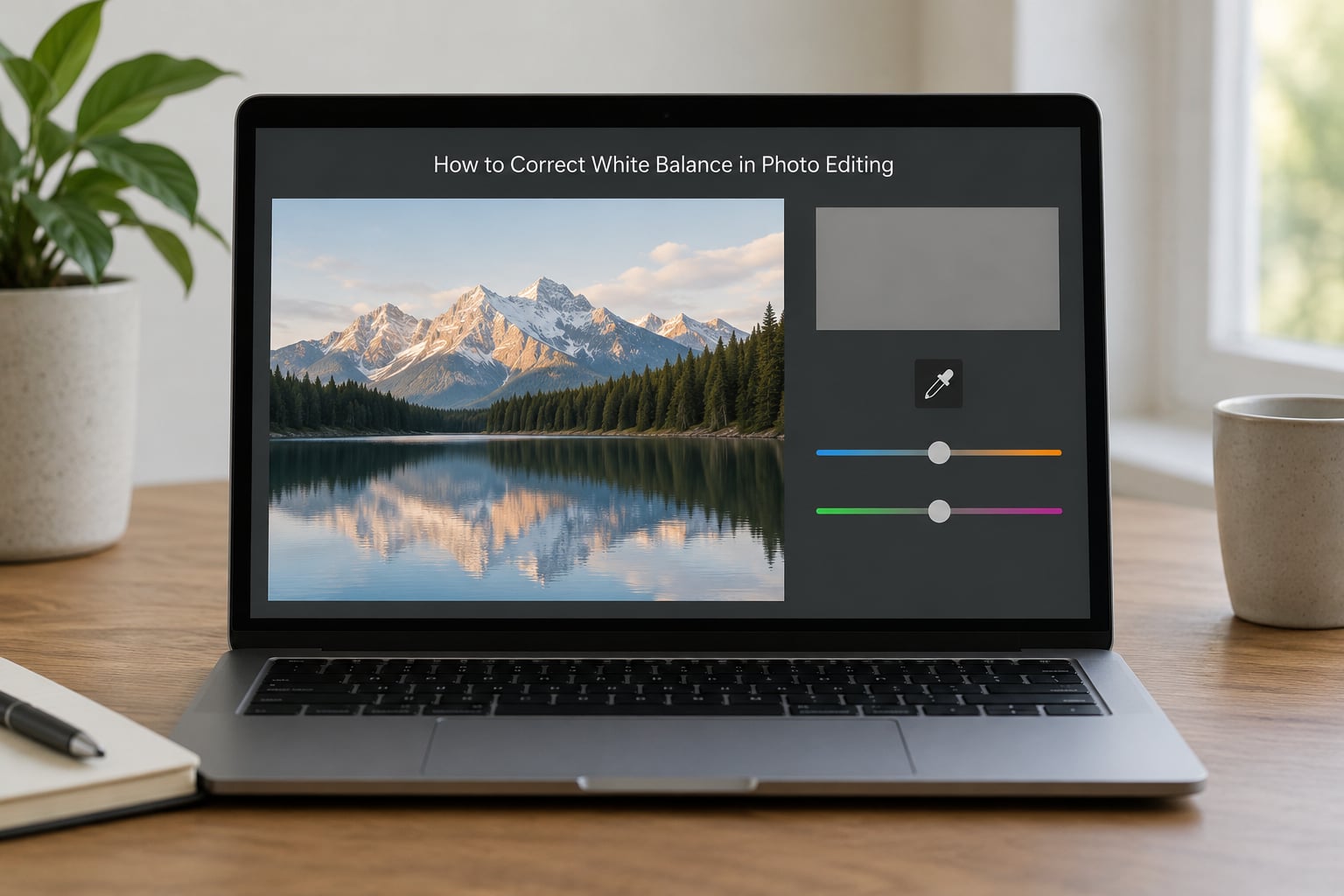
Post correction is the easiest version of this job, and it is where you should start if you already own the frames. In Lightroom, Adobe Camera Raw, Capture One, and DxO PhotoLab, the tools are in the same place under the white balance panel.
- Open the raw file and switch to the profile that leaves headroom. Most of them have an Adobe Color or Neutral default profile. Avoid the ones labeled Standard, which clip.
- Find a neutral pixel. Ideally a gray card in the frame, or a shadowed patch of something you know is truly white.
- Click the white balance eyedropper and sample that pixel. One click sets temperature and tint together.
- Nudge temperature and tint by hand. A few hundred Kelvin either way, then look at skin rather than the numbers.
- Sync the settings across the whole shoot. Select the folder, right click, and copy settings from a corrected frame.
Two warnings. The eyedropper goes haywire on mixed-light frames, returning absurd values like 15,000K or more, because it is averaging light from several sources at once. Set it manually there. And a huge correction costs quality, because you are pushing the red and blue channels in opposite directions until the brightest highlights start to lose detail.
Matching a frame to a reference across a whole set is what the AI-assisted tools are good at. Lightroom’s Match Color, and similar features elsewhere, take one corrected image and push that look across a batch, which saves real time on a big shoot.
How to Check Whether Your White Balance Is Correct
Run these checks in order. They take about fifteen seconds and catch almost everything.
- Neutral objects. Look at a gray card, a white wall in shadow, or white paper. They should read as neutral gray or clean white, not blue, green, or cream.
- Skin tones. Skin is the fastest and most sensitive indicator. It should look like skin, not orange, yellow, or pink.
- Side by side. Put your frame next to one you know is right. On a bright screen, human vision is remarkably good at spotting the odd one out.
- Reversed check. If the image looks cold, add warmth. If it looks warm, add cool. Beginners almost always under-correct and it is nearly always the wrong direction.
| Symptom | Likely cause | Fix |
|---|---|---|
| Everything looks blue or cold | White balance set too high, or a preset meant for shade | Lower the Kelvin value or switch to Daylight |
| Everything looks orange | Daylight preset used under tungsten bulbs | Drop to 2800–3500K or use the Tungsten preset |
| A slight green cast | Fluorescent or green-biased LED lighting | Move the tint slider toward magenta |
| Skin looks orange while walls look fine | Reflected warm light, not a white balance error | Change the subject’s position or the room color |
| One frame differs from the rest of the set | Auto white balance re-measured mid-sequence | Set a fixed value and lock it |
| Correct outdoors, wrong under a window | Sky light is far bluer than direct sun | Raise the Kelvin setting to around 6500–7000K |
Notice the fourth row. White balance corrects the color of the light source, and it cannot correct colored light that bounced off something nearby. A green wall, a red door, even a white ceiling catching orange from a wooden floor will put a cast on your subject that no temperature or tint value will remove.
When light changes mid-shoot, reshoot one frame with the reference. It takes twenty seconds and confirms the new value before you commit to a hundred more photographs.
Frequently Asked Questions
Should I use auto white balance or manual white balance?
Auto is fine for daylight and simple single-source indoor scenes, and it saves time. It drifts frame to frame when the background changes, which matters for sequences and portraits. Manual, set from a gray card, gives you one consistent value across the shoot. If you shoot RAW, auto plus a correction in editing is the fastest workflow most working photographers use.
What Kelvin value should I use for indoor or outdoor photography?
Direct sunlight sits around 5200 to 5500K. Open shade and window light run cooler, roughly 6000 to 7500K, and heavy overcast reaches 8000 to 10000K. Old household bulbs are warm, around 2800 to 3500K, and ceiling tubes land near 4000 to 4500K. Start from these numbers and adjust by eye.
Can white balance be corrected after taking a photo?
In a RAW file, almost always. The color temperature data is recorded but not applied, so you can set the correction in editing at full quality with no loss. In a JPEG the choice was made at capture, and fixing it later means pushing the color channels apart, which softens fine detail in highlights and shadows. Large corrections on JPEG are never free.
Why do my photos look blue or yellow?
Blue usually means your white balance is set too high for the light, or you are using a shade or cloudy preset in daylight. Yellow or orange means it is set too low, most often a daylight setting used under household bulbs. Check the Kelvin value against the light source table before changing anything else, since a wrong preset is the cause far more often than a faulty sensor.
Is custom white balance accurate in mixed lighting?
It is accurate for the light you measured, and useless for the light you did not. If a window and a ceiling bulb both hit your subject, a gray card can only report the mix between them. Choose the source that covers most of your subject and correct for that, or turn off the conflicting light, which is almost always faster. Splitting the difference leaves both sources wrong.
Should I shoot RAW or JPEG for better white balance control?
RAW gives you full control after capture, so white balance mistakes cost nothing and a single correction can be synced across an entire shoot. JPEG locks the decision in at the shutter, which keeps files small and shareable but removes your margin for error. If you are learning, shoot RAW. If you need small files or you are not editing at all, get the white balance right in camera instead.
Where to Start With Your Own Photos
Open the last batch you shot and look at one frame with something neutral in it. Find the white balance setting your camera used, note the Kelvin value, and compare it against the light you were standing in. Most people find a mismatch of a thousand Kelvin or more, which is a five-second fix that will make the next session noticeably better before you have touched the editing software at all.