Learning how to avoid oversaturated photos comes down to two things: stop the colours being pushed too far in the first place, and when you fix a file afterwards, work on the one colour that looks wrong instead of dragging a global slider. Most oversaturated frames are a 15-minute fix once you know where to look.
The word “oversaturated” gets used loosely, so it is worth being precise about what we are fixing. Saturation is the intensity of a colour in an image. Push it past what the scene actually looked like and reds turn to fire-engine, greens go radioactive, and skin turns orange. Colour that looks wrong on screen, clips in a print, or clashes with the red paint on your kitchen wall is oversaturation, whatever your phone’s settings did to get there.
This guide covers both halves of the problem. Prevention happens on the camera or phone, where it costs nothing later. Correction happens in an editor, and it works best when you understand why the colour went wrong before you touch anything.
Table of Contents
- What You Need
- How to Avoid Oversaturated Photos: Step-by-Step
- 1. Check the Original Before Editing
- 2. Set a Balanced Camera Baseline
- 3. Reduce Saturation So You Avoid Oversaturated Photos Without Flattening the Image
- 4. Correct Problem Areas With Masks or Color Tools
- 5. Restore Texture and Contrast Without Ending Up Oversaturated
- 6. Compare, Export, and Check on Different Screens
- Common Mistakes
- Over-lowering saturation
- Correcting colours that are naturally intense
- Raising vibrance and saturation together
- Skipping the histogram
- Judging the edit on one screen only
- Editing JPEGs and fighting the file
- Frequently Asked Questions
- What is the best way to fix an already oversaturated photo?
- Can I make an oversaturated photo look natural in editing?
- Should I lower saturation or vibrance first?
- Why do my flower and nature photos look too vivid?
- How much should I reduce saturation in Photoshop or a free editor?
- Can changing the white balance fix oversaturated colours?
- Start With the Smallest Correction
What You Need
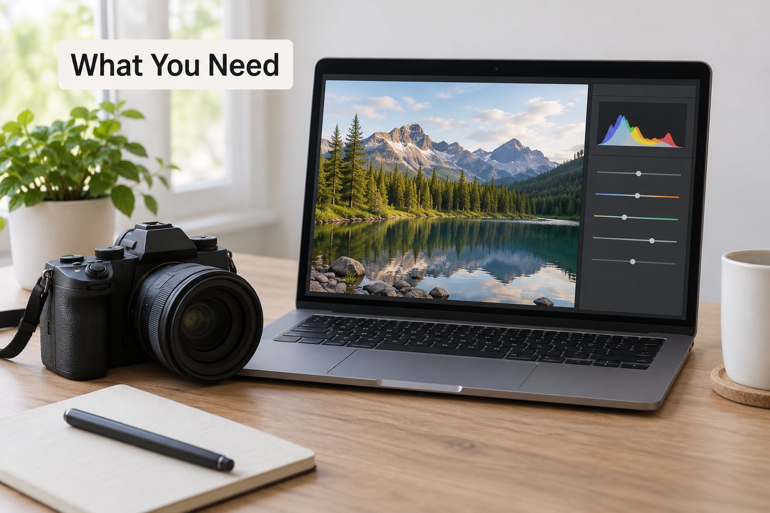
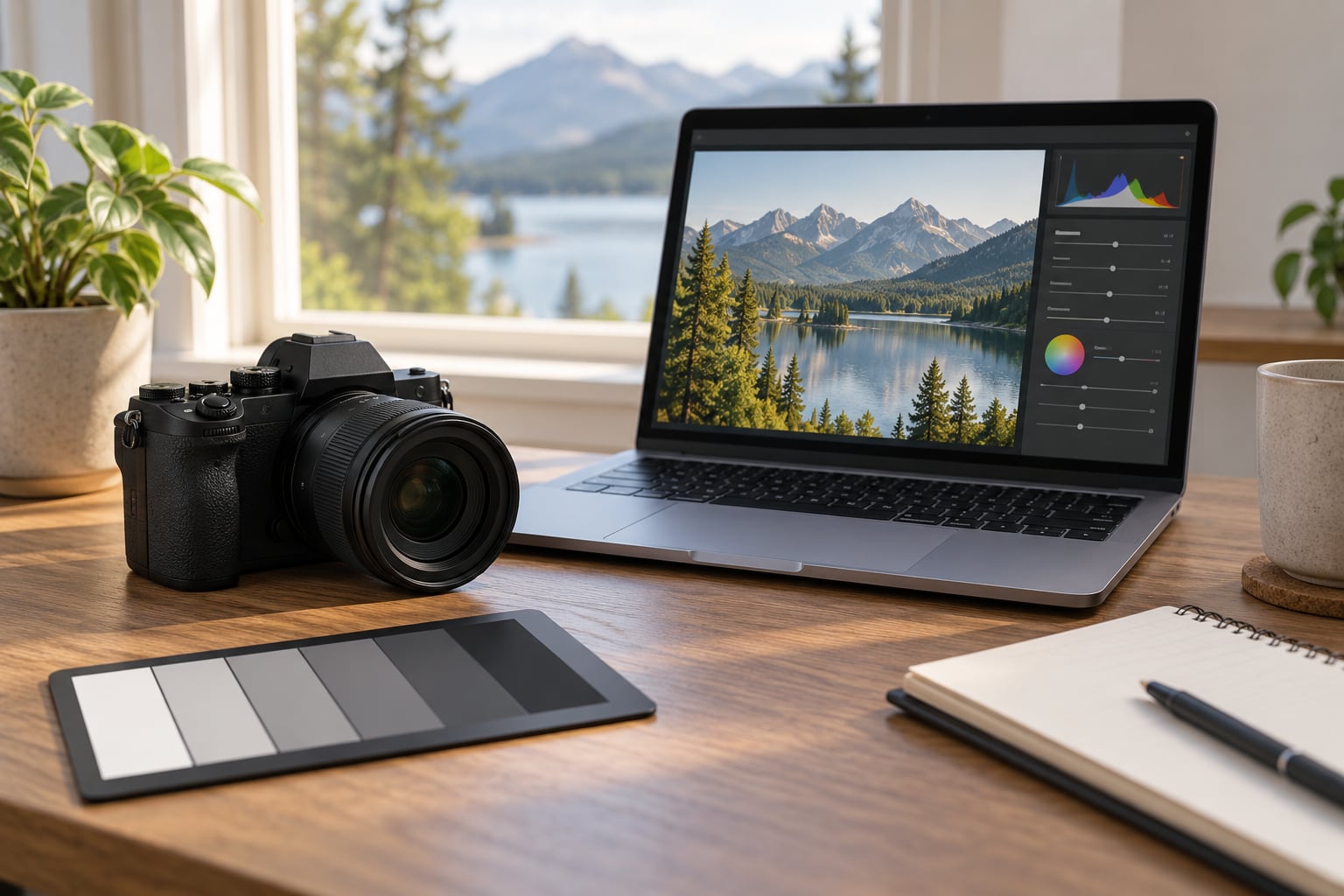
None of the tools below are expensive, and you can get through the whole workflow with whatever you already own.
- Any camera or phone that shoots raw. Raw files keep far more colour information than JPEGs, which is what makes a bad white balance or a clipped red recoverable. On iPhone, that means ProRAW or ProRAW Max; on Samsung and Google phones, look for Pro or RAW in the camera settings; on a DSLR or mirrorless body, set the file type to RAW plus JPEG so you still have a fallback.
- An editor with a saturation slider and a vibrance slider. Lightroom Classic, Lightroom CC, Adobe Camera Raw and Capture One all have both. GIMP, Affinity Photo, Krita and Snapseed cover the same ground, and mobile apps are genuinely fine for a first correction.
- A histogram, not just the image. Every serious editor shows one. It is the fastest way to spot clipped colour channels before you start dialling sliders.
- A reference you trust. A grey card or colour checker shot in the same light, or simply the wooden table in your kitchen whose colour you already know. This is what separates “looks punchy” from “is wrong”.
- A second screen or your phone. Checking on a different display catches the wide-gamut problem described in step 6.
How to Avoid Oversaturated Photos: Step-by-Step
1. Check the Original Before Editing
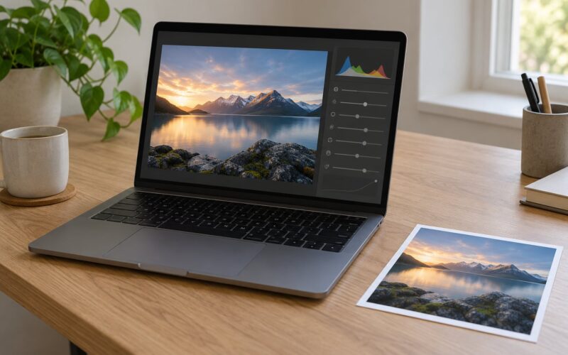
Open the file and do not touch a slider yet. Turn on the histogram and the clipping warnings, then look at where the colour is stacking up against the right-hand edge of the graph.
What you are looking for is separation between the red, green and blue channels. When colours sit at zero intensity they are black. When every channel sits at full intensity they are white, and everything in between comes out of the file as some mixture of those three. Raise the saturation of a colour that is already near the top of a channel and there is nowhere left to go, so the pixel clips and you get a flat patch with no texture. That flat patch is the tell-tale sign of oversaturation, and it is the part you can never fully recover.
Check three things before you edit: does the histogram show clipping in one or more channels, is the problem all over the frame or in one area, and does the raw file look better than the JPEG preview on the back of the camera? That last comparison tells you whether the problem happened in the scene or in the camera’s processing.
2. Set a Balanced Camera Baseline
Prevention is where the biggest gains are, because a file that never clipped never needs rescuing. Four settings do most of the work: picture style, white balance, exposure and contrast.
Picture style. Every camera ships with a neutral profile and several punchy ones. Vivid, Standard, Landscape or the vivid filters on a phone deliberately push colour so thumbnails look good on a screen. Pick the neutral or standard profile if your goal is colour you can trust, and turn any “enhance” or “vivid” mode off. On Samsung phones, Scene Optimizer is the usual culprit: it detects a flower or a tree and boosts the greens before you press the shutter. Turn it off, switch the display mode from Vivid or Adaptive to Natural, and shoot in Pro mode.
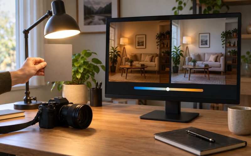
White balance. Getting this wrong is the most common cause of oversaturated-looking frames. Auto white balance sees a scene dominated by one colour and compensates by adding the opposite colour, which pushes everything else further from neutral. Set it manually using the Kelvin setting, or use a preset that matches your light. Daylight and Shade presets sit around the 5000 to 7500 K range, overcast light is nearer 6000 to 7000 K, and indoor tungsten light drops below 3500 K. If you leave it on auto, keep an eye on the tint slider too, since green and magenta casts are easily mistaken for a saturation problem.
Exposure. Overexposed pixels lose colour as well as highlight detail. Watch the histogram and keep highlights off the right-hand wall. Pulling exposure down by a third of a stop is often enough. On a phone, tap the subject to focus then drag the sun icon down slightly; forum regulars on phone photography boards suggest dropping exposure by about a quarter stop as a default habit.
Contrast. Extra contrast deepens shadows and brightens highlights, which squeezes the midtones where most colour lives. If your camera offers a contrast setting above neutral, leave it there.
3. Reduce Saturation So You Avoid Oversaturated Photos Without Flattening the Image
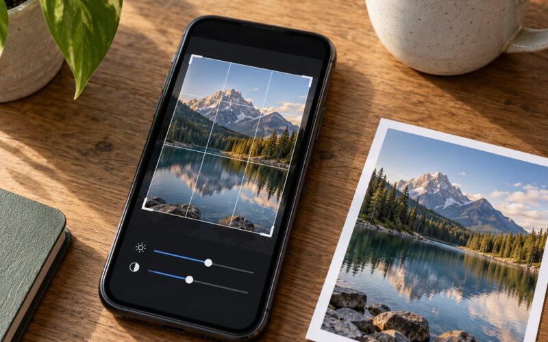
Here is the method that has travelled furthest in editing communities: zero out, then build back up. Drag the saturation slider to minus 100 and look at the image in black and white. Now you can see the real tonal structure without colour distracting you.
Look for three things while the colour is gone. Do any areas look flat and lifeless, which means the original colour was carrying information? Do any areas look harsh and posterised, which means colour was clipping there? And does the brightest part of the frame look right, or is it glowing?
Now bring saturation back from zero in small steps. Add 5 at a time and stop watching the number, start watching the image. In most landscape and nature work you end up somewhere between plus 10 and plus 20 over a correct raw file, though a frame that was already vivid usually needs less than nothing.
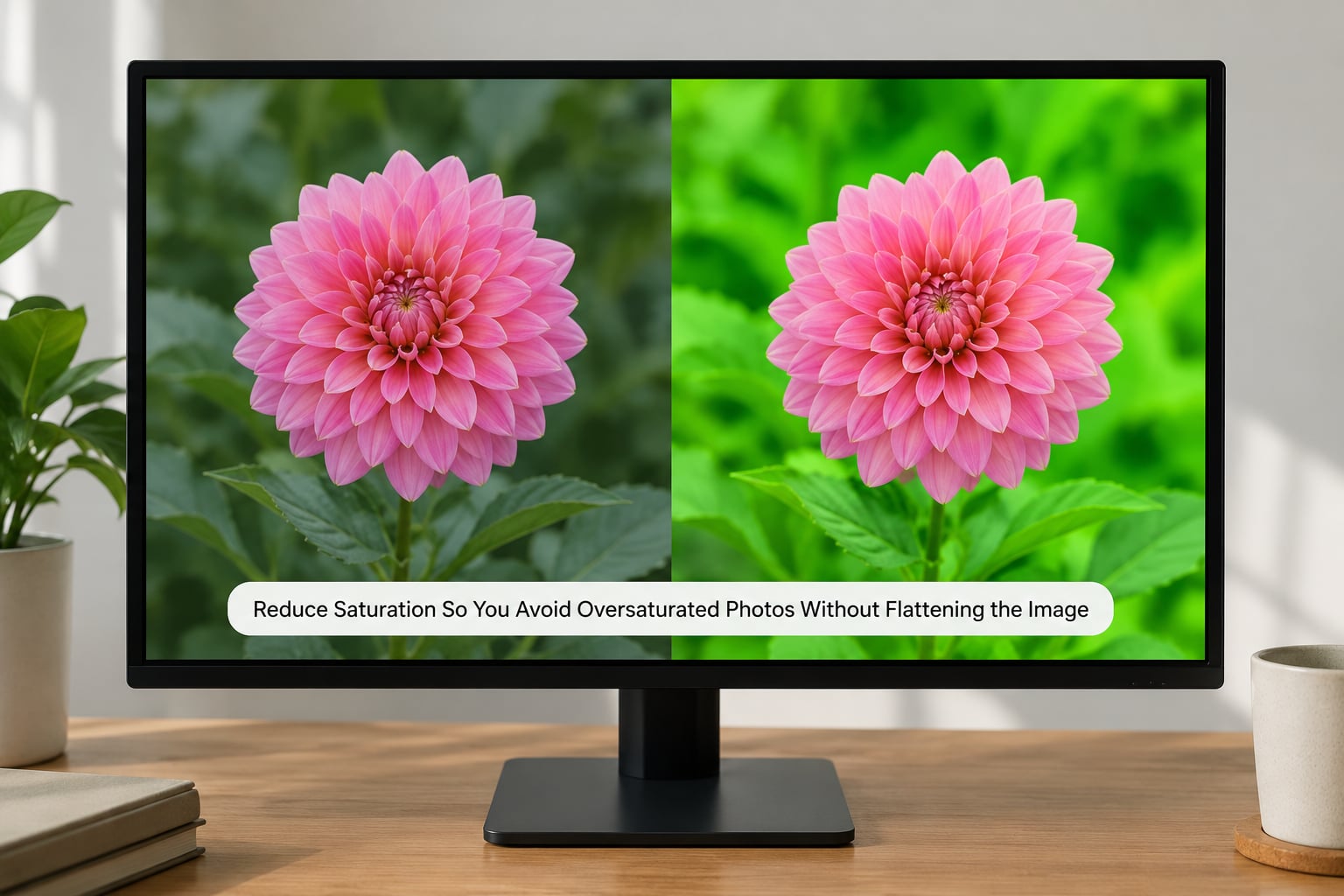
Use vibrance first when you want protection. The vibrance slider works on the colours that are currently muted, so it lifts the dull blues and greens in a shadow while leaving already-strong skin tones and bright reds alone. Negative vibrance does the reverse and is the gentlest way to pull a frame back. Saturation is the blunt instrument: it scales every colour equally, which is exactly why it turns skin orange when you drag it to minus 40.
For a portrait, most photographers use vibrance alone, and that is usually the right call. For a nature or scenery frame where you want greens and blues to sing but red flowers to stay believable, vibrance plus a small amount of saturation in the 5 to 10 range works well. Test on a copy rather than the file itself, and check the result at 100% zoom as well as fit to screen.
4. Correct Problem Areas With Masks or Color Tools
Global sliders treat a whole frame the same way, and real scenes are never that uniform. The HSL panel, called the Color Mixer in recent versions of Lightroom, breaks the image into hue, saturation and luminance sliders for eight colour ranges: red, orange, yellow, green, aqua, blue, purple and magenta.
Start by finding the offending colour. Sample it with the white balance eyedropper, note where it sits on the hue slider, then make a small change. If the sky is too electric, drop the blue and aqua saturation by 10 or 15 and lift their luminance slightly. If foliage is radioactive, pull green saturation down and add a touch of yellow, since real leaves carry yellow and red alongside the green. Yellow flowers going neon usually means orange and yellow saturation need lowering, not green.
For skin, the orange range is the one to watch. Dropping orange saturation by 10 to 20 and reducing its luminance is a reliable way to bring an orange cast back without touching the rest of the frame.
Point Color, the newer precision tool, lets you click one exact colour in the image and adjust only pixels of that hue, which is useful for a single lipstick shade or one distant roof. For anything that needs more control, use a mask instead: a brush over the subject, a gradient across the sky, or a colour range selection around the greens. A local adjustment that reduces green saturation by 20 with the texture slider up is often cleaner than a global move, because it leaves the contrast in the foliage intact.
5. Restore Texture and Contrast Without Ending Up Oversaturated
Cutting saturation often leaves an image looking thin, because colour was doing some of the work that depth now has to do. The fix is texture, not more colour.
Raise the texture slider, which adds micro-contrast to edges, rather than the clarity slider, which adds contrast to the midtones and tends to push colours apart again. A modest amount, somewhere around 10 to 20, restores the bite that saturation was providing.
Then set the black and white points properly. Drag the black point up until the deepest shadows reach zero without crushing detail, and set the white point so the brightest areas approach the top of the range without clipping. Once the tonal range is anchored, check the black and white view again: if the image still looks flat, your texture is too low; if it looks crunchy, back the texture off.
Throughout, keep at least one reference in mind. Skin should sit slightly warmer and less saturated than the surrounding scene. Foliage should show variation between individual leaves rather than one uniform green. Water should have depth, with darker and lighter zones instead of a single flat blue. If any of those relationships break, you have gone too far.
6. Compare, Export, and Check on Different Screens
Before exporting, hold the backslash key to flip between the edited and original versions, in most desktop editors. The difference should be a gentle lift, not a transformation. If the two versions look like different photographs, go back one step.
Zoom out to fit the frame and look at it again, then zoom to 100% and inspect the areas you changed for banding or blotchiness.
Now send it to another screen. A laptop with a wide-gamut panel shows colours that a standard sRGB monitor cannot, which means an image that looks right on your screen can look flat and dull once everyone else sees it, and a print made from a saturated edit on a wide-gamut screen can come back looking bruised. Export for the destination: sRGB for web and social platforms, since anything wider gets clipped, and a colour-managed export with the right profile for a print lab.
Social platforms re-encode and recompress images, and that processing shifts saturation slightly. If you edit to the point where a colour looks perfect, expect it to move again on upload. Leave a small margin of headroom on any frame going to a feed.
One last check on the exported file, opened on the device most of your viewers use. If the colour still reads as believable there, you are done.
Common Mistakes
Most oversaturated photos are not badly captured. They are badly adjusted, usually by someone who was watching the slider instead of the image.
Over-lowering saturation
Dragging saturation to minus 40 or minus 60 in one move is the classic mistake. It desaturates everything equally, drains the colour out of shadows that were never the problem, and leaves skin looking grey and lifeless. Fix: drop the black and white view, find which colours are genuinely wrong, and correct those with HSL or vibrance instead.
Correcting colours that are naturally intense
A ripe orange, a deep red rose or a field of rapeseed really is that vivid. Flattening it because it looks garish produces a photograph that is technically careful and emotionally dead. Fix: leave saturated colours alone unless a channel is clipping, and spend your effort on the muted colours that look muddy by comparison.
Raising vibrance and saturation together
Both sliders at plus 20 or more is a fast route to a processed look. They do different jobs, so using them together removes the protective effect that made vibrance worth having. Fix: pick one. Use vibrance for anything with skin in it, saturation for controlled graphic scenes, and adjust in steps of 5.
Skipping the histogram
Judging brightness and colour by eye on a laptop screen is guesswork. The histogram takes about two seconds and shows clipping that the display cannot. Fix: turn on the histogram and the clipping indicators before you start, and check them again after every major adjustment.
Judging the edit on one screen only
A wide-gamut monitor will show you a more saturated image than most of your audience sees. Fix: check the export on a phone and on a second display before you post it, and soft proof if you are printing.
Editing JPEGs and fighting the file
A compressed JPEG has already thrown away the colour data you need to correct problems cleanly, and raising saturation on one pushes it straight to clipping. Fix: shoot raw wherever you can. If you only have a JPEG, work with small adjustments and expect the result to be a compromise.
A few habits that help more than any single slider. Build a preset once you like the look and apply it to the rest of a series so a whole set stays consistent. Check colour before you check crop, because a badly cropped frame with good colour is far easier to fix than the reverse. And remember that some oversaturation is a deliberate choice; plenty of advertising and food photography leans into vivid colour on purpose.
Frequently Asked Questions
What is the best way to fix an already oversaturated photo?
Start with the histogram, not a slider. Identify which colour channel is clipping and which hue looks wrong, then correct that specific range in the HSL panel or Color Mixer with small adjustments. Finish with a modest global reduction through vibrance, and add texture back if the image feels thin. Fixing the source colour first and the overall level second gives far better results than dragging saturation on its own.
Can I make an oversaturated photo look natural in editing?
Usually yes, as long as no channel has clipped. Clipped colour means the data was overwritten at capture and cannot be brought back, so those areas stay flat no matter what you do. Where colour data survives, raw files in particular, work in small increments, judge the result in black and white, and use HSL to fix the individual hue rather than scaling everything at once.
Should I lower saturation or vibrance first?
Vibrance first, in almost every case. Because it targets the colours that are currently muted, a negative vibrance value pulls back the colours that are too strong while protecting skin tones and leaving dull areas alone. Use the saturation slider for controlled scenes where you know every pixel should shift equally. If you reach for saturation on a portrait, orange skin is usually the result.
Why do my flower and nature photos look too vivid?
Three causes account for most of it. Phone cameras run scene optimisation that detects greenery and boosts the greens before you shoot, so turn that off and set the display mode to Natural. Camera picture styles such as Vivid or Landscape do the same thing deliberately. Auto white balance can also misjudge a scene dominated by one colour, so set the Kelvin value manually for the light you are shooting in.
How much should I reduce saturation in Photoshop or a free editor?
Less than most people expect. From a raw file, a total of 10 to 20 points across vibrance and saturation is usually enough, and plenty of good photographs need none at all. Work in steps of 5 and watch the image rather than the number. If you find yourself past minus 30, the problem is probably a specific hue that needs an HSL adjustment instead of a global one.
Can changing the white balance fix oversaturated colours?
Partly. A badly set white balance makes everything look more intense because the camera has added the opposite colour to compensate, and correcting the temperature and tint often removes much of the apparent oversaturation on its own. It cannot recover clipped colour channels, though, and it will not help if the intensity came from a vivid picture style or phone scene optimisation.
Start With the Smallest Correction
If you only do one thing, open the histogram and look at where your colours are stacking up. Then drop saturation to zero, watch the frame in black and white, and build the colour back in steps of 5 until it looks right.
Most of the time the answer is a small change to one hue in the HSL panel plus a little texture, not a large move on a global slider. Protect the colours that are naturally intense, check your result on more than one screen, and export in the colour space your destination actually supports.
Colour that looks believable at full size on your monitor is the goal. Everything else in the workflow is just the way to get there.