Knowing when to break the rule of thirds matters more than most people expect: centre the subject when it is symmetrical, when you want a viewer confronted by a face, when scale or isolation is the whole point, or when tension and emptiness are doing the work for you. The grid is a habit that keeps your frames readable, and it works right up until the scene rewards something else.
Most of us learn the rule of thirds the same week we pick up a camera. Divide the frame into nine boxes, put the subject on an intersection, and the picture stops looking like a snapshot. It is genuinely useful advice, and it is also the reason a lot of portfolios feel like they were all shot on the same afternoon.
Here is the honest version: the rule of thirds is a default, not an optimum. It was designed to stop you halving a frame in half, so it will always pull you away from the middle. That is exactly what you want for a hiker crossing a wide valley and exactly what you do not want for a cathedral nave, a face looking straight down the barrel, or a single bowl on an empty table.
This guide covers the situations where the centre wins, how to make that choice deliberately, and how to tell an interesting deviation apart from a lazy crop.
Table of Contents
- What Does the Rule of Thirds Actually Do?
- When Should You Break the Rule of Thirds?
- Symmetry and reflections
- Formal portraits and confrontational looks
- A single dominant subject
- Emphasis on scale and isolation
- Edge and corner placement for tension
- Leading lines to a central vanishing point
- Deliberate negative space
- How to Choose Between Rule-of-Thirds and Centered Composition
- How to Break the Rule of Thirds Without Losing Balance
- Common Composition Mistakes When Ignoring the Grid
- Accidental tangencies
- A dead-centre subject with a dead-centre horizon
- Weak visual weight
- Clutter behind the subject
- Centring by accident, not on purpose
- How to Test Your Composition in Different Genres
- Portraits and headshots
- Wide scenic views
- Street photography
- Flowers and small subjects
- Architecture
- Everyday life and vertical formats
- Frequently Asked Questions
- Is it always better to ignore the rule of thirds?
- When is a centered composition stronger than thirds-based framing?
- Should I turn off the camera grid when composing a photograph?
- How do I stop a centered subject from looking like a mistake?
- What is the easiest way to practice breaking compositional rules?
- Start With One Intentional Change
What Does the Rule of Thirds Actually Do?
The rule of thirds divides a frame into nine equal parts with two horizontal and two vertical lines. Place your subject on one of those lines, or better, on one of the four points where they cross, and the picture gets a sense of movement without you having to explain it.
The reason it works is not mathematical. It works because an off-centre subject leaves the viewer somewhere to look. When a person stands a third in from the left edge, the empty two-thirds of the frame becomes implied space, and your eye travels into it. That travel is the whole trick.
Centre placement removes the space to look into, so the eye stops dead on the subject. For most subjects that reads as flat. For a few subjects, a perfectly still face or a symmetrical building, that same flatness reads as stillness, formality, or control, and that is the whole argument for putting things in the middle.
One more thing the rule does that beginners miss. It puts the horizon and the main subject on different lines, so each keeps its own territory. Centre everything at once and you get the dead-centre horizon sitting straight through the subject, which is the single most common way a beginner frame goes wrong.
When Should You Break the Rule of Thirds?
Seven situations come up again and again when photographers ask when to break the rule of thirds. Each bullet names the situation first, then what the centred or off-grid framing does to the image.
- Perfect symmetry in the subject. A cathedral nave, a still pond, a tiled staircase. Centre it and the two halves mirror each other, which reads as calm and order.
- A face looking straight at the camera. Off-centre placement leaves dead space beside the head and breaks the confrontational eye line that a formal portrait depends on.
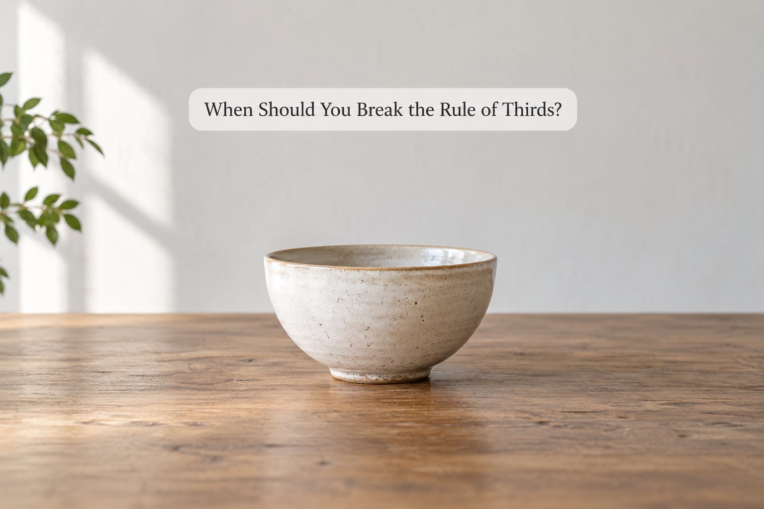
- One dominant subject and nothing else. A single bowl, a lone tree, one person in a wide room. Centre it and the emptiness on both sides stops looking accidental.
- A reflection that needs to read as a whole. Water, mirrors, shop windows. A centred reflection keeps the surface line honest instead of skewing it.
- Scale and isolation. A tiny figure under a huge sky. Centring the small thing inside the big frame makes the size difference hit harder than any off-centre placement would.
- Leading lines that pull to a vanishing point. A corridor, a rail track, a hallway. Put the vanishing point dead centre and the frame becomes a bull’s-eye that drags the eye straight in.
- Deliberate empty space. A lone chair, a wide bare wall, a subject facing into nothing. Centre the emptiness and it becomes the subject, which off-centre framing would dilute.
Now the seven in detail, because the trigger condition matters more than the placement.
Symmetry and reflections
A subject with a matching left and right half wants the middle of the frame. Cathedral interiors, mirrored shopfronts, still water at dawn, a hotel facade lit evenly across the front, a set of stairs shot from straight on.
When the two halves match, any off-centre placement is a lie about the geometry. You are telling the viewer the scene leans one way when it does not, and the error reads as a crooked camera rather than a choice.
The one refinement worth trying is the hybrid: symmetrical frame, slightly off-centre subject. Ken Skela has written about this pattern, where a symmetrical foreground holds the picture together while the subject sits just off the vertical axis so the frame is not dead.
Formal portraits and confrontational looks
A headshot, a passport photo, a mugshot-style environmental portrait, a formal black-tie shot. All of these want the face centred, eyes on the vertical axis, head near the top third with headroom above.
Off-centre portraits work when you want to imply a narrative, or leave room for text in a layout. Centered portraits work when you want the viewer to feel looked at. Photographers on r/PhotographyAdvice generally land on the same split: centre a still or formally posed subject, shift off-centre when you want dynamic energy.
A single dominant subject
One subject with nothing competing with it. Centre placement turns the surrounding space into a frame around the subject rather than a set of leftover regions. This is the case that covers still life, product photography, minimalism, and a lot of street work.
On r/photocritique the pushback against the idea that centred subjects are amateurish comes up often, and the argument is well made: if the subject’s geometry is centred, then centre placement is a type of composition, not an absence of one.
Emphasis on scale and isolation
A person dwarfed by a landscape, a tree alone in a flat field, a boat far out on open water. Here the small thing goes in the middle and the big thing wraps around it.
It feels counterintuitive because the instinct is to push the small subject to a power point so it doesn’t get lost. But a centred small subject inside a large frame gets lost in exactly the right way, and the loss is the message.
Edge and corner placement for tension
This is the one most articles leave out. Push a subject hard against a frame edge, or into a corner, and the frame starts to feel unstable. The viewer senses that something is about to leave or enter.
It works for street frames where someone is walking out of shot, for a surfer at the lip of a wave, for a hand on a door handle. Keep some visual weight on the opposite side of the frame so the tension has something to push against.
Leading lines to a central vanishing point
Rail tracks, a tunnel, a hallway, a road running to the horizon, a row of windows. When these lines converge, the convergence point is the strongest thing in the picture.
Put that point in the middle and you get a bull’s-eye composition that yanks the eye forward. This is the one case where a dead-centre placement produces movement rather than stillness.
Deliberate negative space
A subject with a large, empty, evenly weighted area around it. A minimalist wall, a lone chair, a person facing an empty stretch of beach.
The trick here is that the empty area has to be intentional rather than leftover. Centre the subject and give the space equal weight on all sides, and the frame reads as a decision. Off-centre it and the same space reads as a framing mistake.
How to Choose Between Rule-of-Thirds and Centered Composition
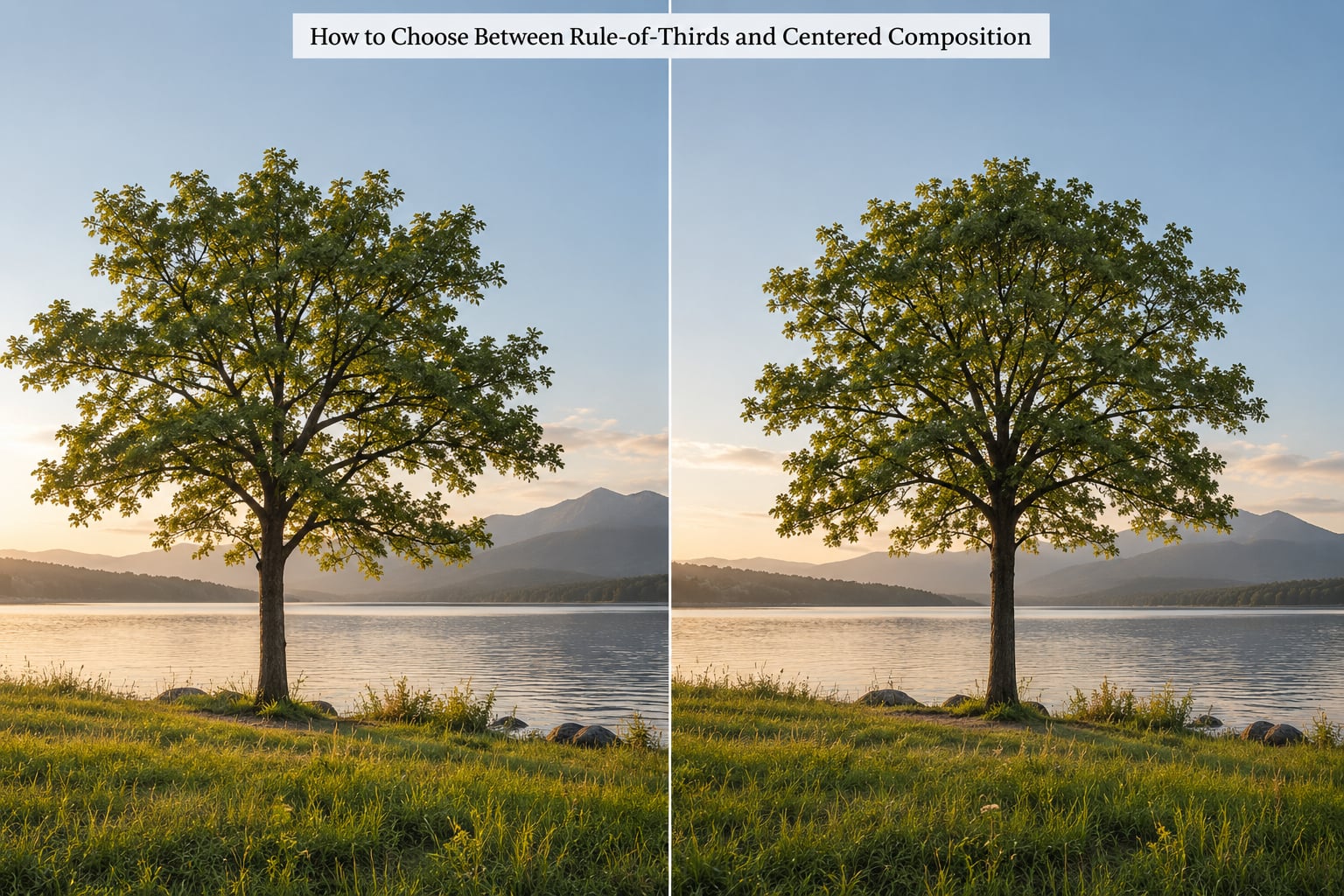
Ask four questions before you lift the camera. If the answer to the first two is yes, centre the subject. If it is no, work on the grid.
- Does the subject have a matching left and right half, or a front face, or a shape that pulls to the middle? Centre it.
- Is the emptiness around the subject part of the idea? Centre it so the space reads as deliberate.
- Is the subject moving, looking away, or travelling somewhere in the frame? Put it on a third and give it lead room.
- Is there one dominant element plus something smaller worth holding? Split them across the frame on separate power points.
Two honest caveats. Beginners should stay on the grid until the deviations stop being accidents, which for most people takes a season of shooting. And if a subject is moving fast, or the light is going, you will not have time for this test at all, so default to the grid and move on.
A comparison table helps more than it sounds here, because the same subject can go either way depending on what you want the picture to do:
| Composition choice | Visual effect | Where it fits best |
|---|---|---|
| Rule of thirds | Movement, looking room, implied travel | Street, wildlife, action, wide landscapes |
| Centred symmetry | Stillness, order, formality | Architecture, reflections, formal portraits |
| Centred with scale | Isolation, awe, smallness | Vast landscapes, open fields, big skies |
| Edge or corner | Unease, anticipation, cut-off energy | Street, sport, documentary moments |
| Leading lines to centre | Forward pull, depth, tunnel effect | Corridors, tracks, roads, architecture |
| Golden ratio (phi grid) | Soft movement, less rigid than thirds | Natural scenes, foliage, relaxed landscapes |
On the golden ratio, since it comes up constantly: it is a tighter, slightly off-centre version of the same idea, sitting at about 0.618 rather than 0.667. Use thirds when you want clear, readable structure. Use the phi grid when a scene looks too mechanical on the thirds and you want movement without the hard thirds division.
How to Break the Rule of Thirds Without Losing Balance
A centred subject only works if the frame is balanced around it. Visual weight comes from size, contrast, brightness, colour saturation, and how much detail an area holds, so a large dim area can outweigh a small bright one.
Work through this sequence in the viewfinder rather than in your head.
- Place the subject dead centre first. Take the shot, look at it, and decide whether the eye stops there.
- Nudge the camera sideways until the frame balances. A few centimetres is usually enough to fix a slightly lopsided centred shot.
- Change your height or distance instead of shifting sideways. Dropping to a low angle often fixes a centred frame that looks flat.
- Move closer and simplify. Most bad centred frames are bad because three things are fighting for the middle. Cut to one.
- Check the edges. Centred subjects expose background clutter on both sides that an off-centre frame would have hidden. Step sideways until the edges are clean.
One last habit worth keeping: shoot the same scene both ways before you commit. Five seconds on the grid, five seconds centred, then pick the one where the eye stays longest. It turns a habit into a decision.
Common Composition Mistakes When Ignoring the Grid
These are the frames that get posted with an apology. Each has a fix.
Accidental tangencies
A horizon line that touches a head, a post that lines up with a shoulder, a tree growing out of someone’s ear. Tangencies read as visual stumbles, even to people who cannot name why.
Fix: shift by a few centimetres. Look at the edges of the frame and the corners first, since that is where accidental alignments hide.
A dead-centre subject with a dead-centre horizon
Both at the middle means the frame has no internal structure at all. This is the most common centred-frame failure.
Fix: move the horizon to the upper or lower third and keep the subject centred. The two placements reinforce each other and the frame stops feeling halved.
Weak visual weight
The subject is centred but tiny and low-contrast, so the eye wanders to a bright corner instead. Centring an insignificant subject does not give it importance.
Fix: either commit by getting closer until the subject fills real estate, or move it back to a third so the frame admits it is small on purpose.
Clutter behind the subject
Once the subject sits in the middle, everything behind it lines up with it. Tangent pile-ups that an off-centre frame hid are now exposed.
Fix: change your angle. A two-step move to the side is usually enough to clean up the background without losing the symmetry.
Centring by accident, not on purpose
You framed it in the middle because you ran out of time, and it shows. Forum threads on this topic come back to the same point: the viewer cannot tell a deliberate deviation from a mis-frame just by looking.
Fix: if you cannot say what the centre placement is doing, it is probably not doing anything. Recompose to the grid.
How to Test Your Composition in Different Genres
The same centred frame behaves differently depending on what you are shooting. These are the adjustments that matter.
Portraits and headshots
Centre the face, keep eyes on the vertical axis, leave headroom above. Shift off-centre only when you want the subject to look like they are about to move out of frame.
Wide scenic views
Put the horizon on a third. If the point of the shot is how small something is, centre the small thing instead and let the horizon sit high or low so the scale reads.
Street photography
Edge and corner placement earns its keep here. Centred frames work when a single figure is walking straight at the camera and you want the confrontation.
Flowers and small subjects
A single stem centred against a plain background reads as a considered portrait of the flower. Move it to a third when the background has detail worth showing.
Architecture
Symmetrical facades, staircases, and interiors go straight to the middle. For everything else, keep verticals vertical and let the perspective carry the frame.
Everyday life and vertical formats
In 9:16 frames for Reels or TikTok, the interface covers the top and bottom of the screen, so centre placement is more forgiving than in a 3:2 still. Place your subject slightly above the middle of the frame and keep faces out of the bottom band.
If your phone has a grid setting, turn it on so you can see when you are on the line and when you have chosen to leave it. Camera menus vary by brand, but the option is usually under image quality, composition assist, or shooting assist.
Frequently Asked Questions
Is it always better to ignore the rule of thirds?
No. The grid is a strong default that solves the most common framing problems quickly. Ignoring it works when the subject is symmetrical, static, meant to be confronted, or when scale and emptiness are the point. If you cannot say what a centred placement is doing for the image, stay on the grid.
When is a centered composition stronger than thirds-based framing?
Centre the subject when it has a matching left and right half, when a face is looking straight at the camera, when there is exactly one dominant element and nothing competing, or when the empty space around it is deliberately part of the idea. In each case the middle placement makes the geometry or the isolation read more clearly.
Should I turn off the camera grid when composing a photograph?
Keep it on. The grid is a measurement tool, not a leash, and it costs you nothing to have the lines visible while you decide to ignore them. Turning it off early on removes the reference that lets you see whether your centred frame was a decision or a drift.
How do I stop a centered subject from looking like a mistake?
Make the balance visible. Move off tangencies, clean up the background edges, keep the horizon on a third so it does not bisect the frame, and make sure the visual weight around the centre supports the subject. A centred frame reads as intentional when every part of it points at the same place.
What is the easiest way to practice breaking compositional rules?
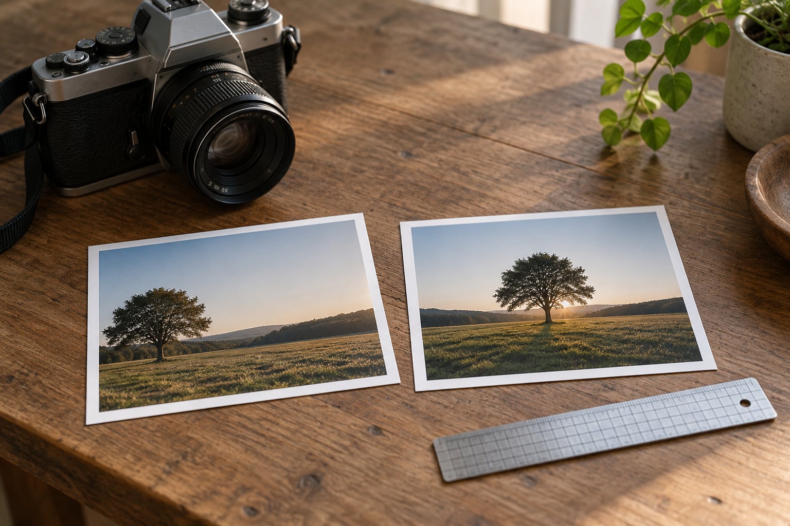
Shoot one scene twice in a row. Frame it on the thirds intersections, then put the camera down, step back, and frame the same scene in the middle. Compare the two at full size and note which one made your eye stop. Ten repetitions of that exercise teaches more than a month of grid-only shooting.
Start With One Intentional Change
On your next walk, shoot one scene twice: once on the thirds intersections, once dead centre. Look at both at full size and ask which one made your eye stop. That single comparison is the fastest way to find out when to break the rule of thirds for your own subjects rather than guessing.