Negative space in photography is the empty or unoccupied area that surrounds your main subject — plain sky, still water, a bare wall, a shadow. Learning how to use negative space in photos is mostly about three decisions: what the subject is, which direction the open space should sit in, and how much of it to keep. Get those right and a busy frame turns calm, even with the same camera and the same light.
The technique gets a bad reputation because people hear it as "empty background." It isn’t. Negative space is an active part of the picture that carries mood, scale and direction, and once you can see it you’ll start finding it everywhere — a cyclist against a blank wall, a single chair in an empty room, a boat crossing a wide stretch of water.
No special gear needed. What helps is a repeatable process, and that’s what the steps below give you.
Table of Contents
- What You Need
- Step-by-Step
- Start by defining the main subject
- Choose a direction for the empty space
- Use framing and perspective to create space
- Check the balance of the frame
- Fine-tune the composition before you press the shutter
- Common Mistakes
- Tips for using negative space in different photography genres
- Wide outdoor scenery and seascapes
- Street photography
- Portrait photography
- Still life and food photography
- Everyday life and travel
- Frequently Asked Questions
- What is negative space on a photo?
- What is the golden rule of negative space?
- Can you give me an example of a negative space photo?
- How much negative space should I leave around a subject?
- Should the subject be in the centre when using negative space?
- Can you create negative space in editing?
- Conclusion
What You Need
You need a camera with a viewfinder or a live view screen, one lens, and about ten quiet minutes. That’s the whole kit.
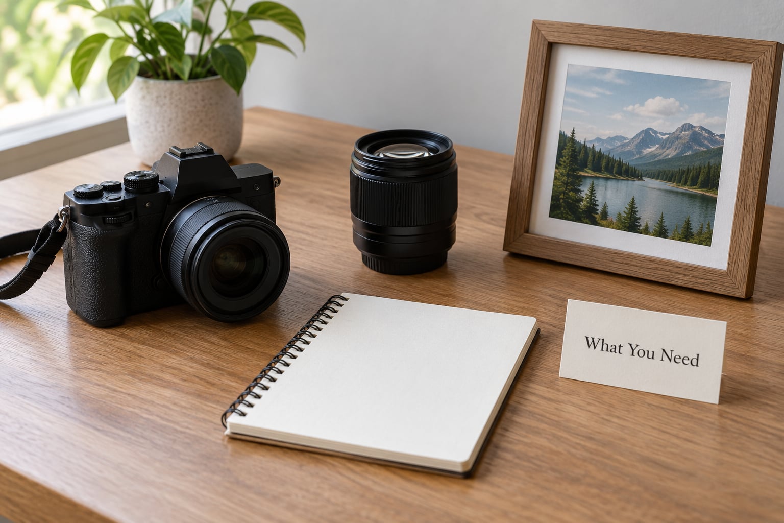
Any camera does this job. A phone works, a mirrorless body works, an old film SLR works. What actually affects your negative space is the focal length and how far away you stand, not the sensor or the megapixel count. A wider lens lets you include more empty area around a small subject; a longer lens compresses that area and makes the space feel tighter.
Bring or use three things that genuinely change the result:
- A single fixed focal length to start with, so you stop swapping lenses and shifting your mind. Any zoom is fine, just pick one end and stay there for a session.
- A way to check the edges of the frame — the live view grid on your camera is ideal. You are looking for half-subjects and stray branches touching the border, not for technical quality.
- A short plan for where the subject goes, decided before you lift the camera. One line in a phone note is plenty: subject on the right third, open space to the left, no horizon through the middle.
Light matters less than people assume. Overcast or open shade gives you even tones across the empty area, which makes it read as deliberate shape rather than a blown-out void. Harsh midday sun creates hard shadows in the negative space, and those shadows compete with your subject.
Step-by-Step
Here is the full process, in the order I’d actually work in it.
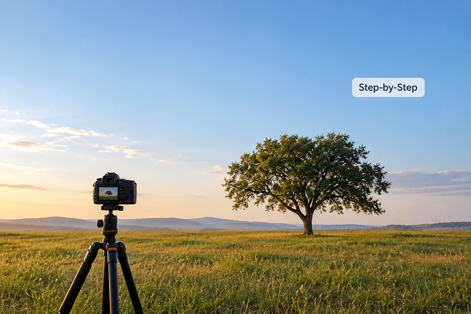
Start by defining the main subject
Name your subject in one word before you compose anything. Tree, cyclist, window, hand. If you cannot name it in one word, you probably have two subjects fighting, and the picture will feel busy no matter how you arrange the space.
This is where the perception gap bites. You see the scene with two eyes in three dimensions — you notice the tree, the fence, the car behind it and the shape of the hill all at once. The camera sees one flat rectangle and records every one of those details as equally important. Naming the subject is you deciding what the camera should privilege.
Quick test: squint at the scene until colours blur. Whatever shape still reads is your subject. If two shapes still read strongly, you have a competition to resolve.
Choose a direction for the empty space
Put the open space on the side your subject faces or moves toward. A runner moving left needs room on the left, otherwise the frame feels like a door slamming in her face. A person looking off to the right needs the right side of the frame emptier than the left.
This is called room to look into, and it is the rule beginners miss most often. They leave empty space evenly on both sides, which flattens everything. The whole picture goes flat because there is no implied movement across the frame.
Two other directions work well. Place the space above the subject for a sense of weight and smallness, or below it when you want the subject grounded and heavy. A wide outdoor view with a low horizon gives most of the frame to sky and reads as open; a high horizon flips that and feels closed and pressing.
Use framing and perspective to create space
Walk until the background behind your subject is the plainest thing you can find. Sideways movement changes the background far more than zooming ever will — a tree moves against a completely different background from three steps left than it does from the same spot at a different focal length.
Lower the camera for a subject that should feel isolated, and raise it when you want the empty area to read as ground and distance. A slightly high viewpoint on a person standing on an empty beach turns the sand into a large clean plane around them.
Zoom in a little and then crop. Shooting a bit wider than you need gives you options in editing, and the "zoom before you crop" habit is what separates a tight, accidental crop from a considered one. Keep the frame loose and the open area will take care of itself.
You can also build space with architecture. Doorways, arches, windows, the gap between two buildings, a stair rail — all of them are ready-made frames. Put your subject inside one and the negative space has already done half the work.
Check the balance of the frame
Now look at the empty area honestly. Does it feel calm and intentional, or empty and awkward? The difference between the two is dead space: unoccupied area where the viewer’s eye arrives and finds nothing worth looking at.
Here is the two-second check that helps most. Cover the subject with your hand, or blink and look at the picture for an instant without focusing on the main object. If a big blank rectangle grabs attention before the subject does, you have dead space. Real negative space is nearly invisible on its own and only reads once the subject pulls the eye back.
Balance works on weight, not symmetry. A big heavy subject — a large tree, a dark silhouette, a bright sky — needs more empty space around it than a small light one. If the subject feels crowded, give it more room. If the frame feels top-heavy with a small subject low in it, shift the subject up or move the horizon.
Fine-tune the composition before you press the shutter
Last pass, about fifteen seconds. Walk the four edges of the frame and clear anything that touches them — a cut-off branch, a sliver of another person’s shoulder, half a building. Edge clutter is the most common reason a photo feels untidy even when the subject is well placed.
Then place the subject on a third-line rather than dead centre, unless the symmetry is the whole point. Centre placement works when the space is even on both sides and the subject is dead centre on a vertical or horizontal line. Centre placement fails when the subject is centred by accident.
Take three frames: one slightly tighter than you planned, one exactly as planned, one looser. Compare them at small size on the back of the camera. The one where the negative space feels relaxed is the one, and it is rarely the one you would have chosen with your eyes open.
Common Mistakes
These five account for most of the compositions that don’t work. Each has a quick fix.
| Mistake | What it looks like | Fix |
|---|---|---|
| Filling every part of the frame | The subject shares attention with three or four competing objects | Pick one subject, crop the rest out, or step closer to remove background detail |
| Subject centred without a reason | The subject floats in the middle with equal clutter on all sides | Move it to a third-line and add space on the side it faces |
| Treating the empty area as wasted | You shoot a sparse frame, assume it failed, and add clutter back | Read the empty area as a shape with tone and texture, not a gap to fill |
| Unbalanced space becoming dead space | A large blank rectangle pulls the eye away from the subject | Shift the subject into the heavy third, or fill one corner with a deliberate small detail |
| Editing mistakes at the edges | Half-subjects or bright slivers along the border after a crop | Check the four edges last, before saving, every single time |
One more worth naming: confusing negative space with a blurred background. Out-of-focus highlights and negative space are different tools. A shallow depth of field blurs what is still there — the background objects stay in the frame as shapes and colours. Negative space removes them. If the background detail is gone, that is negative space; if it is there and soft, that is bokeh. They can work together, but only one of them simplifies.
And if you filled most of the frame with smooth sky or a flat wall, check for banding in the shadows when you get home. Long clean gradients are where digital files fall apart. A touch of grain hides it.
Tips for using negative space in different photography genres
The principle holds across genres. What changes is which direction the space should sit in.
Wide outdoor scenery and seascapes
Give the sky the larger share of the frame and let the land be a simple band or a single silhouette. Put the horizon low when you want openness and scale, high when the weather is the story. Watch for a lone fence post or a distant boat that the eye snags on — one small break in the empty area is often the thing that makes it read as a photograph instead of an error.
Street photography
Find walls, doorways and shuttered shopfronts and wait for a passer-by to enter one. The wall does the work and your subject only has to be recognisable. Leave the space in the direction they are walking, and keep your distance long enough that strangers aren’t obvious.
Portrait photography
Place the person off-centre with headroom and space in the direction of their gaze. In tight head-and-shoulder portraits the negative space is mostly a plain background, so look for a wall or hedge with an even tone and no stripes. Leaving space above a head that is already near the top edge is the fastest way to make a portrait look accidental.
Still life and food photography
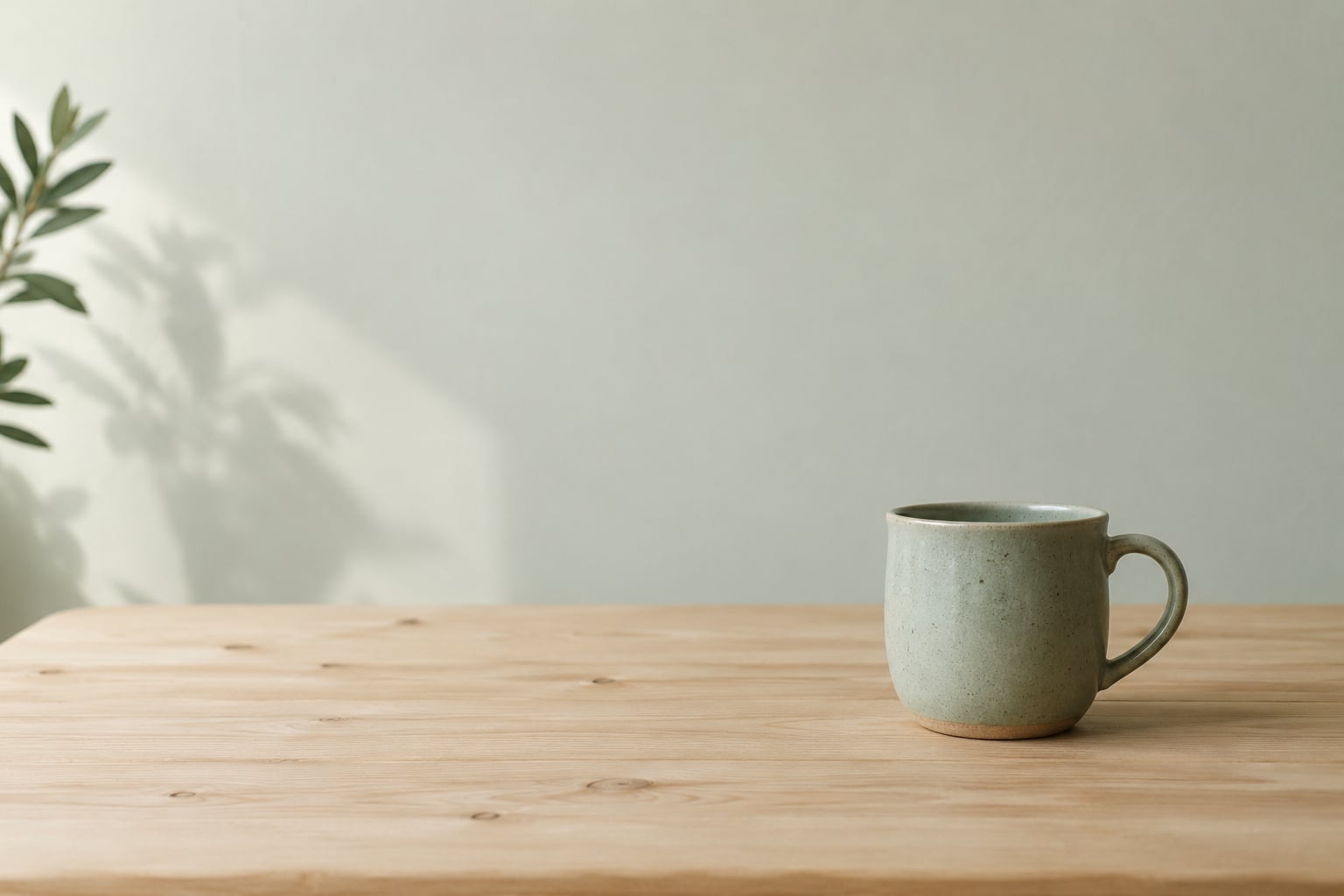
Empty surface next to the object carries the same job as empty sky next to a tree. Shoot a single cup on a broad plain table with the cup on a third-line, and let the table run to the frame edge. Watch for crumbs and reflections, since a shiny surface turns your clean negative area into a distraction.
Everyday life and travel
A single chair by an empty window. A coat on a hook with bare wall around it. These are the easiest negative space shots to make and the easiest to overthink — resist adding a second object to fill the quiet. Travel gives you empty space for free in stairwells, harbours and quiet streets; take the version without the tour group in it.
Frequently Asked Questions
What is negative space on a photo?
Negative space is any area of a photograph that is not occupied by the subject or its supporting details — sky, water, wall, floor, shadow. Positive space is the opposite: the subject itself and anything that directly supports it. The two sit together in every image, and learning how to use negative space in photos means deciding how much of the unoccupied area to keep and where to put it.
What is the golden rule of negative space?
The most quoted rule is directional: position your subject off-centre and leave more empty space in the direction the subject is facing or moving. It works because viewers read a picture as motion, and motion needs somewhere to go. A cyclist framed with space in front looks like she is travelling; framed with space behind, she looks like she is braking.
Can you give me an example of a negative space photo?
A lone tree on the right third of the frame with open fog filling the left two thirds is a clean example: one small positive shape, one large calm negative area, and clear visual weight. Other good ones are a single chair against a blank wall, a boat crossing a wide stretch of water, or a bird framed inside an archway. In each, the subject reads instantly because nothing competes with it.
How much negative space should I leave around a subject?
Give heavier subjects more room. A large dark silhouette needs a generous empty area; a small light object can carry a tighter frame. Then run a two-second check: cover the subject with your hand and look at the picture. If a blank rectangle grabs your attention before the subject does, you have dead space rather than negative space, and the subject should move or grow.
Should the subject be in the centre when using negative space?
Centre placement works when it is deliberate and the space is balanced on both sides, so the frame reads as symmetrical. It fails most often when a subject ends up centred by accident in a cluttered frame. If there is no symmetry to justify the middle, move the subject onto a rule-of-thirds line and leave more space on the side it faces.
Can you create negative space in editing?
Yes, partly. Cropping, straightening, removing distractions with a healing or brush tool, and dodging or burning to darken a corner can all increase the sense of open space around a subject. You cannot invent negative space that was not in the frame — if the background was full of detail, cloning it out usually looks worse than the original.
Conclusion
Your first move is small: pick one subject, reserve one clean area around it, and shoot the simplest version of that frame before adding anything. Do that on the next ten photos you take and the eye for negative space will start forming on its own. What you are really training is the ability to leave something alone.