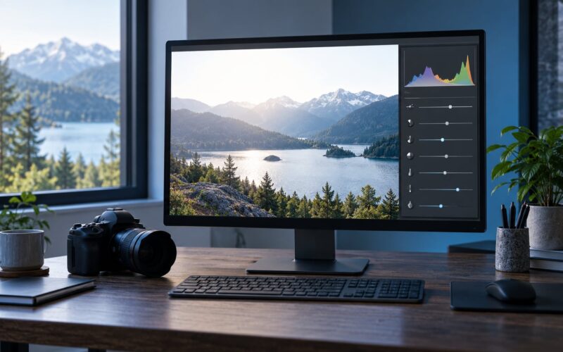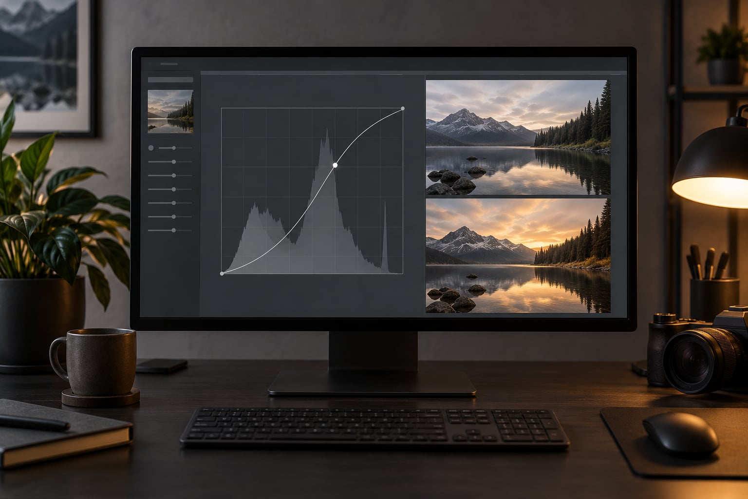
A curves adjustment is a photo editing control that reshapes an image’s brightness by dragging points on a graph called a tone curve, letting you change shadows, midtones and highlights independently instead of sliding one global brightness value. Learning what a curves adjustment is and how to use it takes about ten minutes, and it is the first control I reach for when a photo looks flat.
The curve has been in Photoshop, Lightroom, Camera Raw, Affinity Photo, GIMP and Photopea for years, and phone apps such as Snapseed ship a version of it too. Used properly it never destroys data, because it moves existing tones around instead of adding brightness out of nowhere. That is the whole idea behind the tool, and once it clicks the rest is just practice.
Table of Contents
- What You Need for a Curves Adjustment
- How to Use a Curves Adjustment Step by Step
- What Is a Curves Adjustment?
- How to Read the Curves Graph and Histogram
- How to Make Shadows, Midtones, and Highlights Cleaner
- How to Use RGB Color Curves for Targeted Color Changes
- How to Apply Curves Without Making the Image Look Washed Out
- Common Curves Adjustment Mistakes and Better Alternatives
- Frequently Asked Questions
- What does a curves adjustment do in photo editing?
- Is it better to use curves or sliders?
- How do I brighten a photo with curves?
- What is an S-curve used for?
- How do I use curves to increase contrast?
- Can I use curves on a phone or free editing app?
- Conclusion
What You Need for a Curves Adjustment
A curves adjustment is not a preset or a filter. It is a tool, and all it needs is a photo and an editor that has one. Here is what to have open before you start.
- An image. A RAW file gives you the most room, because the camera has recorded more tonal information than a JPEG keeps. A 16-bit TIFF is the next best thing.
- An editor with a tone curve. In Photoshop it is Curves (Image > Adjustments > Curves, or a Curves adjustment layer). In Lightroom Classic and Adobe Camera Raw it is the Tone Curve panel. Affinity Photo, GIMP and the browser-based Photopea all have their own version, and Snapseed has one under Tune Image.
- An adjustment layer. In Photoshop and Affinity Photo this is the non-destructive route. It sits above your pixels, can be masked, and can be switched off without losing anything.
- Basic comfort with a histogram. That bar graph behind the curve tells you where your tones are, and it is the fastest way to see whether an edit is clipping anything.
One technical note before you begin. If you are editing an 8-bit file, strong curves can create banding, where smooth gradients break into visible steps. Editing RAW or a 16-bit file mostly removes that problem, and most serious work happens there anyway.
How to Use a Curves Adjustment Step by Step
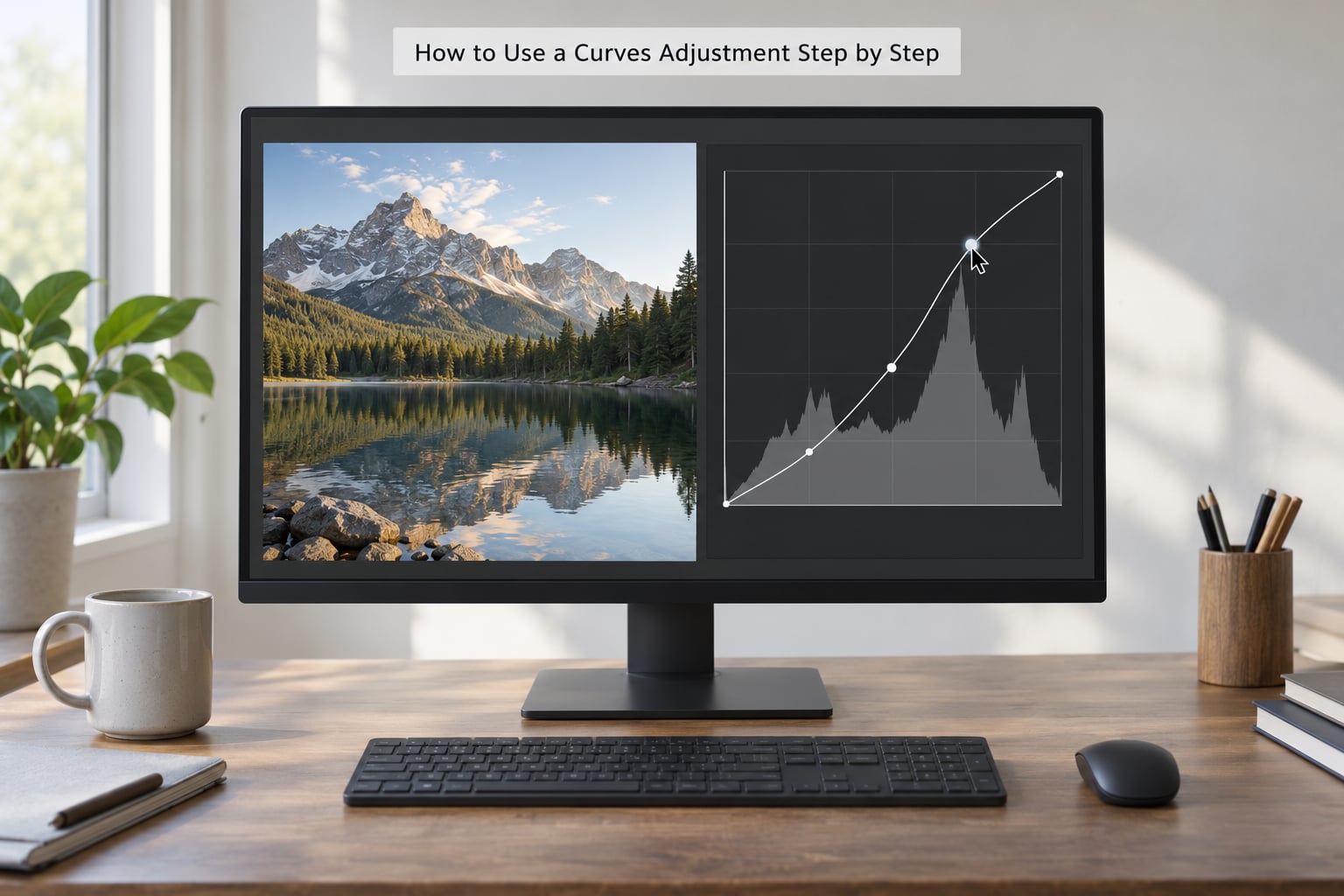
In Photoshop the fastest route is a keyboard shortcut: press Cmd+M on a Mac or Ctrl+M on Windows and the Curves dialog opens on the current adjustment layer, or creates one if none exists. That shortcut is the single most useful thing to remember here, because opening the tool quickly is what turns curves from homework into a habit.
Adding a curves adjustment layer properly takes four steps:
- Open the Layers panel with Cmd+Alt+J (Mac) or Ctrl+Alt+J (Windows).
- Click the half-filled circle icon at the bottom of the panel, the Create new fill or adjustment layer icon.
- Choose Curves from the menu that appears. In Photoshop you can also use Layer > New Adjustment Layer > Curves.
- Rename the layer to something you will recognise later, such as Contrast S-curve, and click OK.
From there, the basic workflow in most photos runs in this order:
- Set the black point. Select the leftmost point under the histogram and drag it right until the darkest pixels just start to clump. Hold Alt on Windows or Option on Mac to see the clipping values appear while you drag.
- Set the white point. Drag the rightmost point left until the brightest pixels just start to clump, using the same modifier key to read the numbers.
- Move the midtone. The centre point controls the bulk of the image. Drag it up to brighten, down to darken, and keep the moves small.
- Add contrast with an S-shape. Drag a point in the lower quarter slightly down and a point in the upper quarter slightly up, so the curve bends into a gentle S.
- Read the histogram again. Nothing should be piled up hard against either end of the scale.
A few keyboard habits pay off fast. Holding Alt or Option while dragging a point makes the movement very fine, which is how you avoid overshooting on the first try. Clicking a point to select it and pressing Delete removes it, and the Reset button at the bottom of the dialog puts the curve back to a straight line when an edit goes wrong.
You can also save the result. The menu beside the presets icon stores the current curve as a reusable preset, and Copy and Paste Settings works the same way, so a correction you like on one photo can be dropped onto the rest of a shoot.
What Is a Curves Adjustment?
A curves adjustment is a photo editing control that reshapes an image’s tonal range by dragging points on a graph called a tone curve. The graph maps every existing brightness value in the picture (input) to a new brightness value (output), so shadows, midtones and highlights can each be pushed separately. Applied through an adjustment layer, it changes brightness and contrast non-destructively.
The default curve is a straight diagonal line, and a straight line means no change: what comes in is what goes out. Every pixel with a brightness of 128 stays at 128 until you move a point.
This is what separates curves from the sliders people learn first. Brightness lifts everything at once. Exposure moves the whole image along the scale, which also shifts the histogram. Contrast pushes the ends apart but treats every tone between them in the same generic way. Curves let you decide, tone by tone, what happens in between.
How to Read the Curves Graph and Histogram
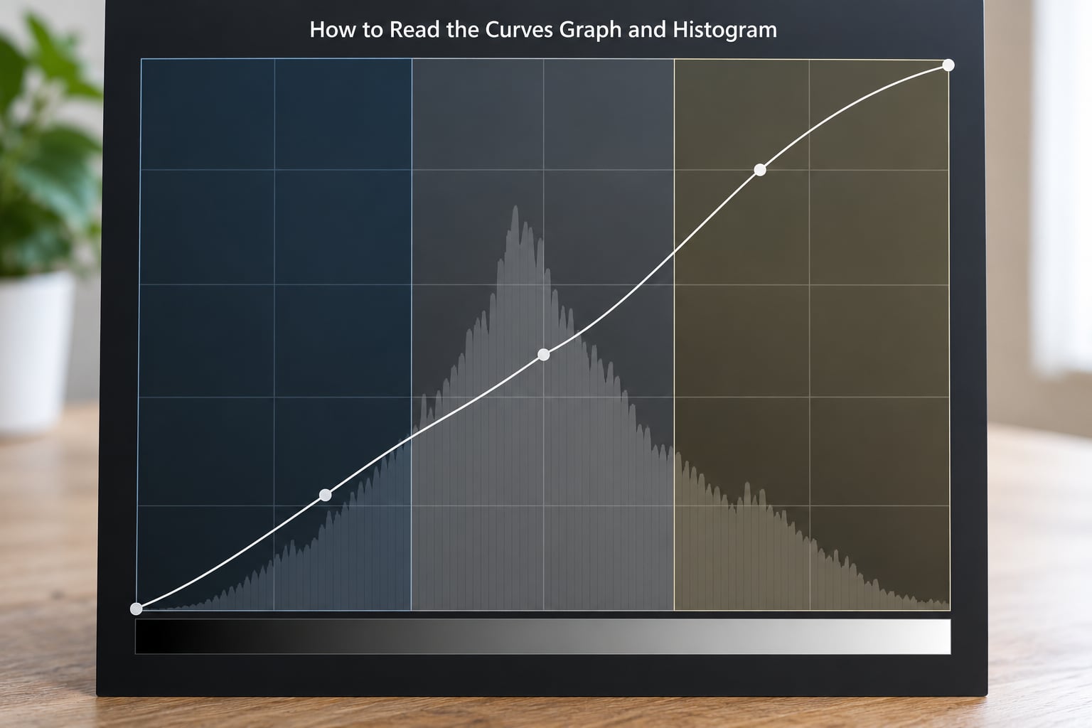
The square graph is the control surface, and the bars behind it are the histogram, a count of how many pixels sit at each brightness. Along the bottom is input, from black on the left to white on the right. Up the side is output, from black at the bottom to white at the top.
Divide the bottom axis into three rough zones. The left quarter is shadows, the middle half is midtones, and the right quarter is highlights. A point dragged up inside a zone brightens that zone; dragged down, it darkens it.
The one thing that surprises beginners is described on the forums as the parabolic curve. Points are not independent. The line stays smooth between them, so moving a single point reshapes the curve on both sides of it. That is useful once you know it, because one point can produce a soft bend rather than a visible kink.
The histogram is your clipping alarm. Data pressed flat against the left edge means crushed shadows with no detail left in them. Data pressed against the right edge means blown highlights. In the individual red, green and blue channels, a hard edge at either side of one channel alone means you are clipping that channel, which is how colour starts to break.
How to Make Shadows, Midtones, and Highlights Cleaner
Most flat photos need less than people expect. I usually start with points around 10 to 20 on the way up from each end of the curve, and work in small moves.
- Deepen shadows. Pull a point in the lower quarter down by five to ten. This adds depth to the dark areas and, because you are only touching the bottom of the curve, leaves the midtones alone.
- Lift midtones. Raise the centre point a touch. This is the strongest control in the tool, so keep it under about ten units unless the image is genuinely flat.
- Recover highlights. Bring a point in the upper quarter down slightly. If highlights are only near clipping, this pulls them back while keeping detail.
- Add contrast. Combine a small downward move low down with a small upward move high up, producing the familiar S-curve.
- Soften a hard image. Do the opposite and bend the curve the other way, which is the inverted S-curve. It eases contrast without touching the black and white points.
If you only want the tone change and not the extra saturation a strong S-curve brings, switch the adjustment layer’s blending mode to Luminosity. The shape of the curve still applies, but the colour shifts are held back.
How to Use RGB Color Curves for Targeted Color Changes
The channel buttons above the graph (RGB, red, yellow, green, cyan, blue, magenta, or individual red, green and blue) decide whether you edit the composite image or one colour at a time. Editing a single channel curve is the practical way to correct a colour cast that only affects part of the tonal range.
A landscape shot with blue shadows, for example, can be fixed by opening the red channel and lifting its lower quarter slightly, which removes some of the blue without touching skin or sky tones higher up. The reverse works for a warm cast: pull the blue channel down in the shadows.
Two warnings here. A strong composite S-curve increases saturation as a side effect, which is why faces can turn orange-red even though you only touched brightness. And pushing one channel past its limit at either end clips that channel, producing flat patches of impossible colour. When a cast is a straight overall colour shift, the White Balance tool or Camera Raw’s eyedropper will get you there faster and more honestly.
How to Apply Curves Without Making the Image Look Washed Out
Two habits prevent most of the washed-out results beginners hit. First, work on an adjustment layer rather than Image > Adjustments > Curves, which bakes the change into your pixels permanently. Second, keep the adjustment layer’s opacity under 100 percent and dial it back until the effect looks like it belongs to the original scene.
For local work, paint on the layer’s mask. A curves adjustment dropped into the blacks and painted only onto the background will deepen a sky’s tones without touching a person standing in front of it. This is the technique most worth learning after the basics, because it is how a single correction stops flattening the whole frame.
Compare constantly. The on-image adjustment tool in the Properties panel gives you a small on/off control you can hold down, so you can flick between the before and after in place. If the difference is hard to see, the edit is probably too strong.
Common Curves Adjustment Mistakes and Better Alternatives
Almost every beginner curve mistake comes from the same place: expecting one drag to solve the whole image.
- Dragging a point into an extreme shape. A deep S-curve on a JPEG produces flat black patches and flat white patches where no detail remains. Move less.
- Adjusting every channel at once. Changing red, green and blue in the same session usually ends in a colour cast you did not want. Fix luminance first, then touch one channel if you still need to.
- Using curves when exposure would do. If the whole image is simply too bright or too dark, the Exposure slider is the correct tool, because curves cannot create tonal range that was never recorded.
- Never looking at the histogram. You cannot see clipping in the preview easily at normal screen brightness, but the histogram shows it immediately.
- Applying a global change to a local problem. If only part of the frame needs work, mask it instead of compromising the whole image.
- Editing an 8-bit file too aggressively. Banding shows up first in skies. Switch to 16-bit or go back to the RAW file.
Levels and Curves overlap, and choosing wrongly wastes time. The comparison that matters is simple: Levels works at three fixed points, black, grey and white, while curves lets you adjust any number of points, up to sixteen. Use Levels when you are setting endpoints or correcting a global exposure shift, and curves when the tone between the endpoints needs attention.
Against the Brightness and Contrast slider, the difference is isolation. The slider cannot tell a shadow from a highlight, so both move together. A curve can hold a highlight still while it deepens a shadow, which is why it is the better tool for skies, backlit portraits and high-contrast scenes.
Frequently Asked Questions
What does a curves adjustment do in photo editing?
A curves adjustment remaps the brightness values in your image. It takes every existing tone (input) and assigns it a new tone (output), so you can brighten or darken shadows, midtones and highlights independently, add contrast, and correct colour casts on a single channel. Because it redistributes tones rather than adding brightness out of nowhere, it rarely destroys detail when used gently.
Is it better to use curves or sliders?
Neither is better in general, they suit different jobs. Sliders such as Exposure and Brightness are faster and safer for global changes, and Levels is ideal for setting black and white endpoints. Curves win when you need to affect one part of the tonal range without disturbing the rest, such as lifting shadows while holding highlights, or deepening a sky without touching skin tones.
How do I brighten a photo with curves?
Open the curves tool and drag the centre point upward slightly, since midtones carry most of the image. If the image is only dark in its lower tones, move a point in the left quarter instead. Keep the moves small, watch the histogram for data piling up at the right edge, and lower the adjustment layer opacity if the result looks overdone.
What is an S-curve used for?
An S-curve is used to increase contrast. You pull a point in the lower quarter slightly down and a point in the upper quarter slightly up, so dark tones get darker and light tones get lighter while midtones stay put. Keep it gentle, because a strong S-curve clips shadows and highlights and also raises colour saturation as a side effect.
How do I use curves to increase contrast?
Add a curves adjustment layer, then drag a point near the lower left slightly downward and a point near the upper right slightly upward. That S-shape widens the distance between your darkest and lightest tones without changing overall brightness. Check the histogram afterwards, and switch the layer blending mode to Luminosity if the added saturation becomes a problem.
Can I use curves on a phone or free editing app?
Yes. Snapseed has a Curves tool under Tune Image, and Lightroom Mobile and the free Photoshop Express app include tone curve controls. Photopea is a free browser-based editor with a full Curves dialog that behaves much like the Photoshop one, which makes it the easiest way to practise the exact technique described here without installing anything.
Conclusion
Open your curves tool now and make one small move: drag the centre point up by five and watch what happens to the midtones. Then check the histogram, toggle the layer off to compare, and decide whether you needed more or less. Repeating that loop once per photo teaches the tool faster than any tutorial, and 2026 is a fine year to start.