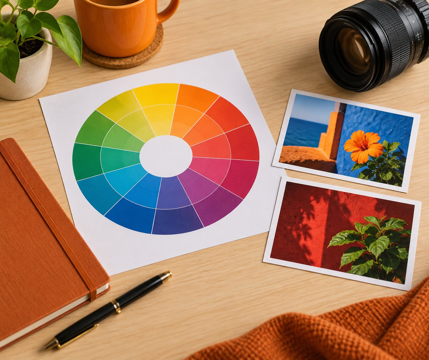
Complementary colors in photography are pairs of hues that sit directly opposite each other on the color wheel, about 180 degrees apart on the hue axis. Blue and orange, red and green, yellow and purple are the three classic pairs, and putting them side by side in a frame makes both look more vivid while pushing your subject forward.
That is the whole theory in one sentence. The rest of this guide is about what the effect actually does to an image, how to find the pairs when you are standing in front of a subject, and how to push them in Lightroom without wrecking skin tones.
Table of Contents
- What Are Complementary Colors in Photography?
- How Do Opposite Colors Affect a Photograph?
- What Are the Main Complementary Color Pairs?
- Blue and orange
- Red and green
- Yellow and purple
- How Do You Use Complementary Colors When Taking Photos?
- How Can You Use Complementary Colors in Photo Editing?
- Reinforcing a pair in the HSL panel
- Split toning for the teal-and-orange look
- What Mistakes Do Photographers Make With Complementary Colors?
- Frequently Asked Questions
- Are complementary colors always red and green?
- What is the difference between complementary colors and contrasting colors?
- Do complementary colors make a photograph look better automatically?
- How do I find complementary colors in nature photography?
- Should I increase saturation to show complementary colors in editing?
- Are complementary colors the same as split complementary colors?
- Conclusion
What Are Complementary Colors in Photography?
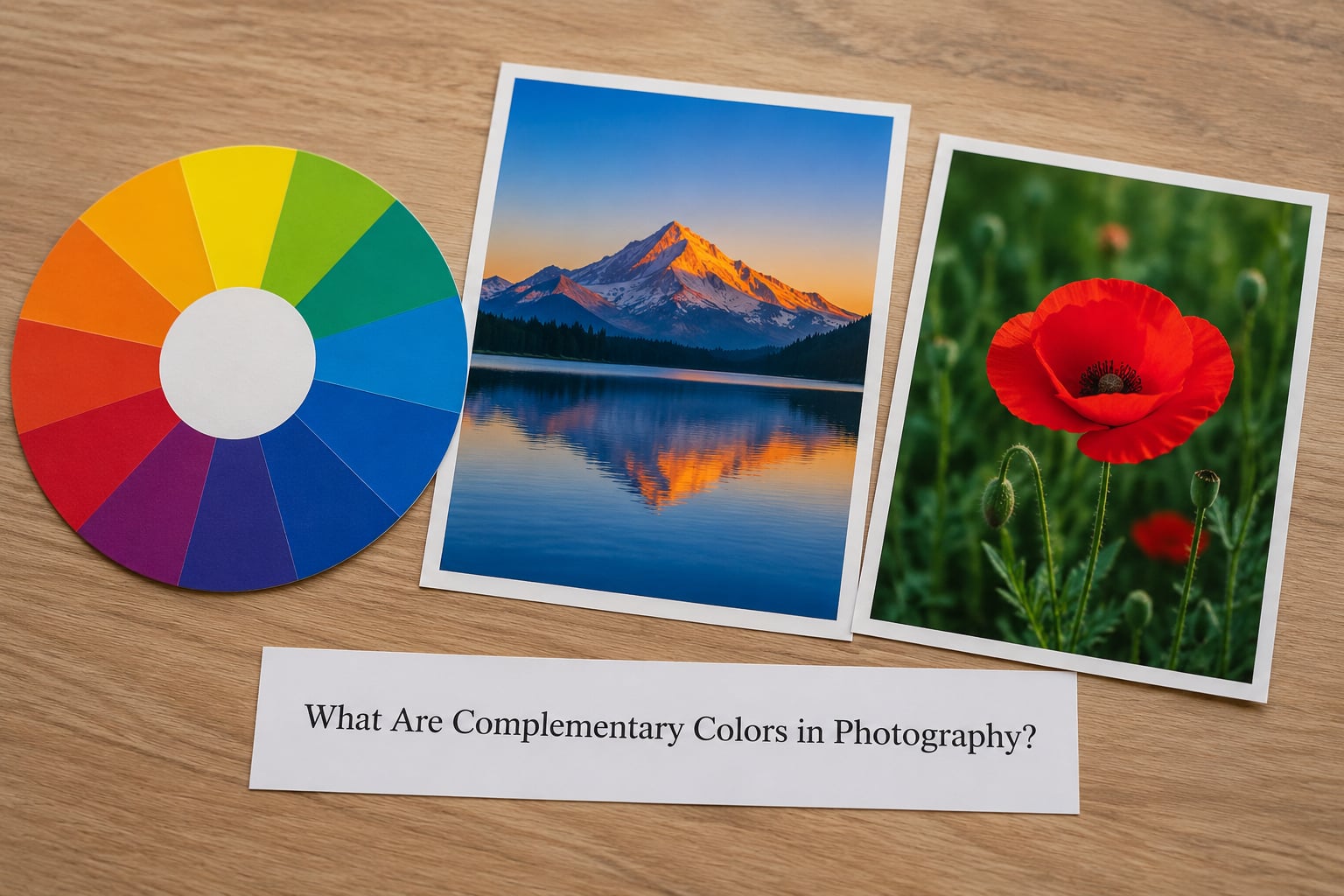
Complementary colors are the colors on opposite ends of a straight line drawn through the center of the color wheel. One of the pair is always warm and the other always cool. Because our visual system reacts strongly to that opposition, each color makes the other look more saturated than it would on its own.
Here is the fast version of the three classic pairs, the same list you will find in most color theory references:
- Blue and orange — the cinematic pair, and the one most people mean when they say complementary
- Red and green — the Christmas pair, useful in foliage and autumn scenes
- Yellow and purple (magenta) — the third pair, bright and playful
One note on spelling: the correct word is complementary. A lot of photography pages write “complimentary,” which is a different word entirely, and it is the single most common misspelling you will see on this topic.
The wheel itself is not a hard-edged set of six colors. It is a continuum, so a sky-blue coat and a sodium-orange wall count as complementary even though neither is a textbook primary. Exact matching is not required, and beginners who insist on it tend to overwork their images.
How Do Opposite Colors Affect a Photograph?
The main effect is called simultaneous contrast. When two opposing hues sit within about a degree or two of each other in the frame, each one pushes the other toward its own opposite, so both read as stronger than they really are. Put a red kayak on green water and the water looks greener and the kayak looks redder.
That gives you four practical effects:
- Subject separation. A warm subject against a cool background separates without needing a rim light or a hard shadow.
- Attention. Viewers scan an image for the strongest contrast first, so a complementary pairing decides where they look first.
- Perceived sharpness. Edges where two strongly different hues meet read crisper than edges inside a single tonal range.
- Mood. Warm plus cool feels energetic; that is the whole basis of the teal-and-orange grade you see in film-style presets.
None of this means every photograph needs a complementary pair. A foggy forest in near-monochrome, a close-up of peeling paint, or a quiet documentary frame can be better off without one. Strong color contrast is a tool, and like any tool it costs something when used everywhere.
It also does not make colors photograph badly. Midday sun kills complementary contrast faster than anything else, because the light itself is high-contrast and the shadows lose their color. Overcast light and open shade are your friends here; hard noon sun is not.
What Are the Main Complementary Color Pairs?
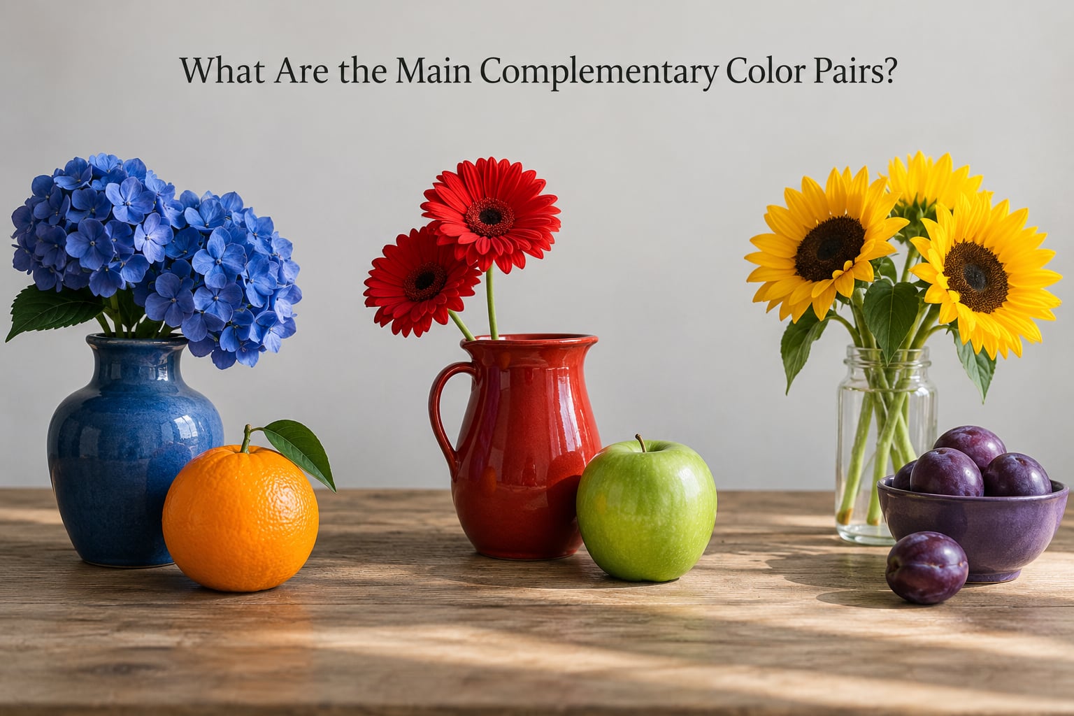
Every complementary pair has the same structure: a primary color on one side, a secondary made from the other two primaries on the other. That is why there are exactly three traditional pairs on the RYB wheel.
| Pair | Hue positions | Warm or cool | Where you meet it |
|---|---|---|---|
| Blue and orange | About 210 degrees and 30 degrees | Cool and warm | Sunset water, city lights against a blue evening sky, orange jackets on a blue-hour street |
| Red and green | About 0 degrees and 120 degrees | Warm and cool | Autumn maple against green grass, a red door on a green house, holly in snow |
| Yellow and purple | About 60 degrees and 240 degrees | Warm and cool | Yellow fields against violet dusk, a yellow bike beside a purple storefront |
Blue and orange
This is the pair that dominates film emulation and travel work, and it gets criticized for exactly that reason. Blue-and-orange grading is the least surprising look in current photography, so if you go there, earn it with a genuine pair in the scene rather than pushing the sliders until every shadow turns teal.
It also does the most useful work. Sunset scenes, orange-lit shopfronts under a deepening blue sky, autumn trees against a cold river, warm window light against a cold interior wall — all of these have the pair built in already, and the job is mostly to notice it.
Red and green
The hardest pair to use without looking like a holiday card, because most of us first meet it on wrapping paper. It works when one color is clearly dominant and the other is an accent, and when the two are not the same brightness.
A red canoe on a green lake reads as strong contrast. A red canoe on a green lake with a red jacket in the same frame reads as chaos. Autumn is where this pair belongs: warm red and orange leaves against the cooler green that has not turned yet, or the deep green of conifers behind a maple.
Yellow and purple
People often call the second color purple when it is really magenta. On the traditional wheel, the complement of yellow is the purple made from red and blue, which sits much closer to magenta than to the violet you get mixing blue paint into red.
That pair is bright and slightly playful, which makes it a good fit for street details, market scenes, and any frame where you want a small pop rather than a moody grade. Yellow flowers against a purple shadow, a yellow sign against a dusk sky, or a plate of food on a violet cloth all give you a clean accent.
Beyond those three, a fuller wheel gives you teal against tangerine and lime against magenta. Those extended pairs come from the RGB wheel rather than the paint wheel, which is why they show up in editing presets more often than in art class.
How Do You Use Complementary Colors When Taking Photos?
Out in the field the theory only works if you can see the pairs fast. Most photographers do it with one question: what color is directly behind my subject?
A few habits that help:
- Check the background before the pose. A red jacket against a green hedge is either your strongest frame or your worst one, and it is decided before the subject arrives.
- Move the subject, not the color. Changing your angle by 20 degrees often puts a complementary background behind someone who was blending in.
- Use clothing and props. When you control the setup, this is the easiest lever you have. One saturated accent item is usually enough.
- Let the light decide temperature. Side light at golden hour warms whatever it hits, so the subject goes warm while the shaded background stays cool. That is a complementary pair built entirely by the sun.
- Watch the clock. The warm-to-cool split is strongest in the hour after sunrise and the hour before sunset, and it flattens out after that.
Deciding which color dominates is where beginners hesitate, and the answer is usually simple: let the color with more area in the frame dominate, and make the accent small and bright. A common rule of thumb borrowed from design is the 60/30/10 split, where about 60 percent of the frame carries the dominant color, 30 percent a supporting tone, and 10 percent the accent. Nobody will measure your frame, but the ratio stops you from splitting the difference evenly, which is where the contrast goes flat.
For a consistent body of work, pick one pair per project and stay on it. A series shot entirely on the blue and orange pair will hold together as a story even when the locations are completely different.
How Can You Use Complementary Colors in Photo Editing?
In post you have three options: reinforce a pair that is already there, introduce one that was not in the frame, or dial an existing pair back when it fights.
To find out what you have, use a color picker on the subject and one on the background, then check whether the two hue values sit about 180 degrees apart on a 0-360 scale. There are also phone apps that sample colors from a scene directly, which is useful when you cannot control the wardrobe and need to build a palette around whatever the subject is wearing.
Reinforcing a pair in the HSL panel
The HSL panel is where most people start, and the trick is that you are usually subtracting rather than adding. Start with the Basic panel: set Temp toward warm if you want the orange side to dominate, or toward cool if you want the blue side to.
Then work the HSL sliders in this order:
- Align. Pull the warm hue away from the opposite cool hue and push its saturation up slightly, usually no more than plus 10.
- Subtract. Drop the saturation of the competing or distracting hue, often minus 20 to minus 40, so the pair reads without shouting.
- Adjust luminance. Raise the accent hue by 10 to 15 so the smaller color carries, or lower it so it settles back.
- Check skin. If orange is your accent and your subject is a person, pull the Orange luminance back down by 10 to 15 so skin stays skin and does not go chalky or shiny.
Hold Alt while dragging any slider and you get a before-and-after view of just that color, which makes the third step much easier to judge.
Split toning for the teal-and-orange look
Split toning is the fastest route to a coherent warm-cool grade. Drop the split slider toward the shadows, move the shadow hue toward the cool end around 240 degrees, and set shadow saturation low, roughly 10 to 20. Then move the highlight hue toward warm, near 45 degrees, and keep highlight saturation around 15.
That gives warm highlights and cool shadows, which is the cinematic impression people describe as teal and orange even though pure teal rarely appears anywhere in the image.
One tone curve mechanic is worth knowing, because it catches people out. If you pull a channel down in the shadows, that color’s complement comes up. Lowering blue in the shadows does not just remove blue, it introduces warmth, which is the cheapest way to separate a subject from a cool background.
What Mistakes Do Photographers Make With Complementary Colors?
- Forcing the scheme onto every subject. If you are hunting for a complementary pair in a frame that does not have one, the result looks staged and slightly wrong. Skip it.
- Confusing complementary with similar. Neighboring hues on the wheel, like blue and green, are analogous and calm. Directly opposite hues, like blue and orange, are complementary and loud. They are opposites, not substitutes.
- Matching the two colors in equal area. Half the frame in each hue cancels the contrast out and gives you visual fatigue. Push the areas apart and pick a clear dominant.
- Pushing saturation to prove the point. Full saturation on both hues turns skin orange and shadows green. Muted versions of a complementary pair read more like film and less like a filter.
- Ignoring the light. A pair that looked obvious in the field can disappear in harsh midday sun, and no amount of editing brings back color the light never recorded.
- Reading magenta as purple. If your third pair looks more pink than violet in the file, your white balance is probably too cool.
One honest note on blue and orange: plenty of photographers consider it overused because of Hollywood grading. That criticism is fair, and the answer is not to avoid the pair but to earn it. Photograph a real orange light against a real blue sky and it earns itself.
And when colors clash rather than complement, you usually do not need more saturation. You need one of the two pulled back, or the darker one made darker.
Frequently Asked Questions
Are complementary colors always red and green?
No. There are three classic pairs on the traditional color wheel: red and green, blue and orange, and yellow and purple. On the RGB wheel used for digital work, the primary pairs are red and cyan, green and magenta, and blue and yellow. Red and green is only the pair most people picture first, because it is the one they learned in art class.
What is the difference between complementary colors and contrasting colors?
Contrasting is the broad term for anything that creates visible difference, which includes light versus dark, sharp versus soft, and complementary versus similar hues. Complementary is one specific kind of contrast: two hues sitting directly opposite each other on the color wheel. A black-and-white portrait has strong contrast but no complementary pair in it.
Do complementary colors make a photograph look better automatically?
No. They create the conditions for a stronger image, not the image itself. Complementary contrast draws the eye and separates a subject, but it does not fix weak light, an unclear subject, or a cluttered frame. Plenty of good photographs, especially in monochrome or in fog and mist, work far better without any strong color opposition at all.
How do I find complementary colors in nature photography?
Look at what is directly behind your subject and name its color, then name the hue opposite it. A green birch behind a red subject gives you a pair instantly. Keep a small printed color wheel in your camera bag, watch the time of day, and remember that overcast light and open shade hold color far better than harsh midday sun.
Should I increase saturation to show complementary colors in editing?
Usually not by much. If both hues are already vivid, adding saturation tends to cancel the effect and can turn skin tones orange. A better move is to raise saturation slightly on the hue you want dominant, drop the competing hue by 20 to 40 points, and check skin tones in the HSL panel before you commit to a stronger look.
Are complementary colors the same as split complementary colors?
They are related but different. A complementary scheme uses one hue and the hue directly opposite it, which is a two-color pairing. A split complementary scheme drops the direct opposite and uses the two hues sitting immediately beside it instead, so you get three colors. The result is more variety and usually a calmer frame than a straight complementary pair.
Conclusion
Start with the next photo you take. Look at what is already behind your subject, name that color out loud, then name the hue directly opposite it on the wheel. If a real pair is there, make it do work by keeping one color dominant and the other small. If there is not, leave it alone and move on. The contrast is a tool, and it does its best work when it is the one decision in the frame rather than the whole picture.