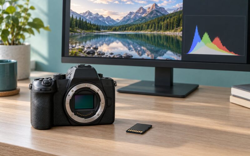
A consistent look across photos means every frame in a set shares the same white balance, contrast, color treatment and overall mood, so the group reads as one body of work instead of a pile of unrelated shots. You get there by repeating the same choices at the camera, applying one base treatment in the edit, and reviewing the finished set side by side before anything leaves your computer.
None of that requires expensive gear. What it requires is a fixed set of decisions and the discipline to reuse them, which is why the photographers with the most recognizable work often have the dullest, most boring camera setup.
The order below is the one I keep coming back to: shoot RAW with white balance set manually, cull hard, apply a base preset that leaves temperature and tint alone, edit one frame from each scene fully, copy the settings across, then fix the outliers in grid view. Once the recipe exists, a set of a couple hundred frames takes roughly 30 to 45 minutes of editing plus a short grid review. Panel names are written for Lightroom Classic on desktop, with Capture One differences noted where they matter. Updated for 2026.
Table of Contents
- What You Need to Keep a Consistent Look Across Photos
- Step-by-Step: A Repeatable Workflow for One Recognizable Look
- 1. Choose a visual direction before you edit
- 2. Set camera and lighting defaults that repeat
- 3. Use one repeatable editing sequence for a consistent look
- 4. Review the set as a group, not photo by photo
- 5. Save a reusable style recipe
- Common Mistakes
- Frequently Asked Questions
- Should I use the same editing preset for every photo?
- How do I make photos look consistent when they were taken in different lighting?
- Is consistency better achieved with a preset or by editing each photo manually?
- How can I keep a photo diary visually recognizable without making every image identical?
- What should I save in a reusable photography workflow?
- Can I keep a consistent look across photos with a smartphone?
What You Need to Keep a Consistent Look Across Photos
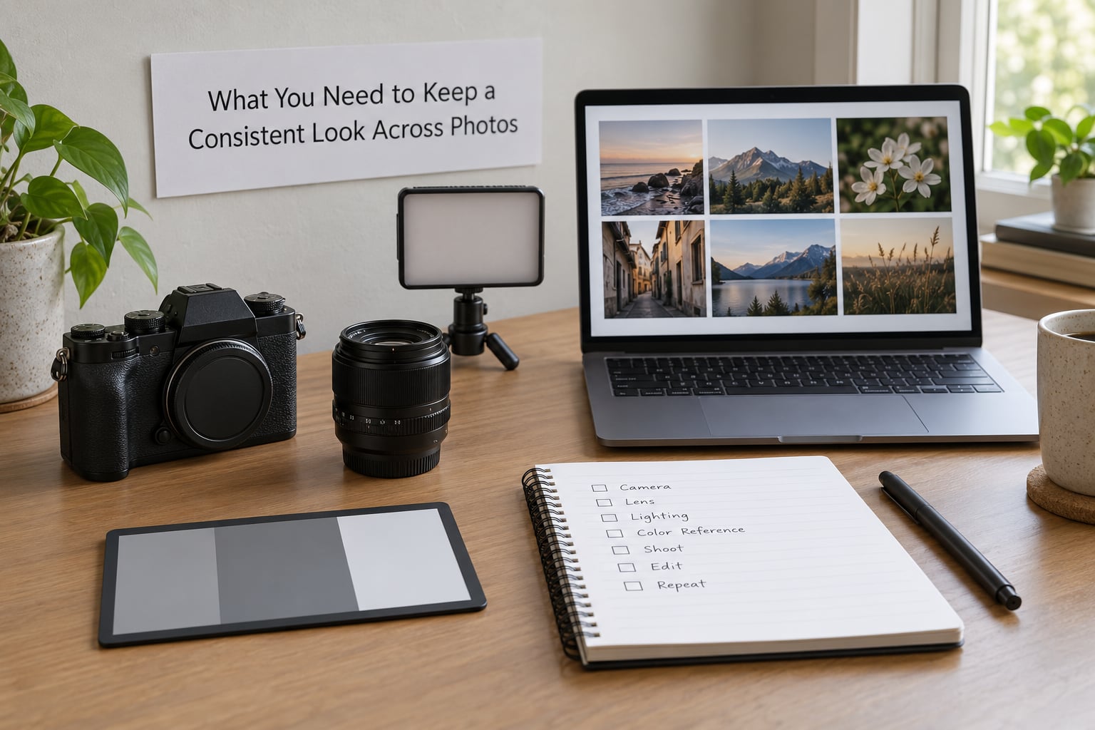
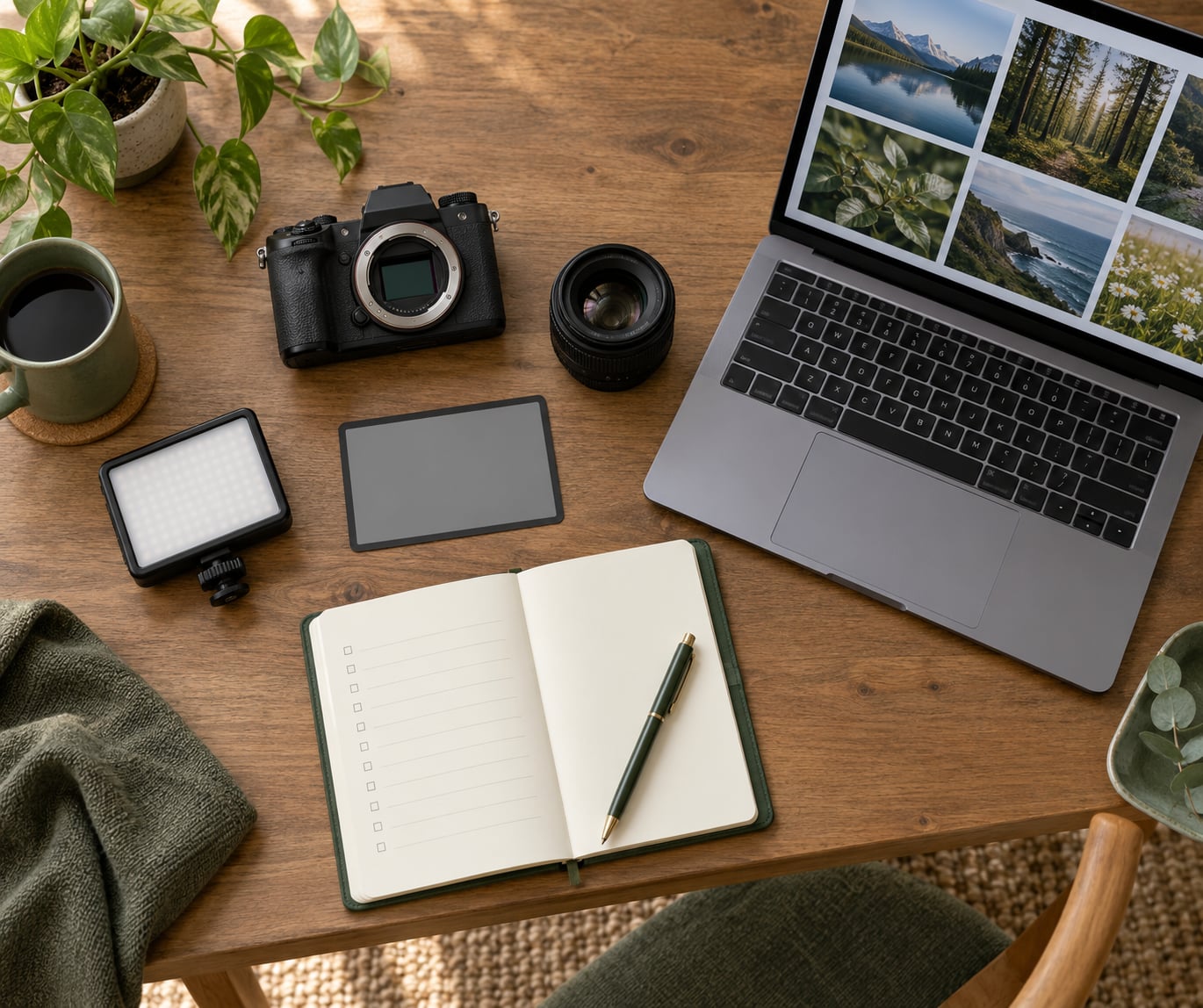
The gear list for this is short. A camera that shoots RAW, any lens you will use for the whole series, one light source you can position the same way each time, editing software, and a few organizational habits. That last item does more work than the first four.
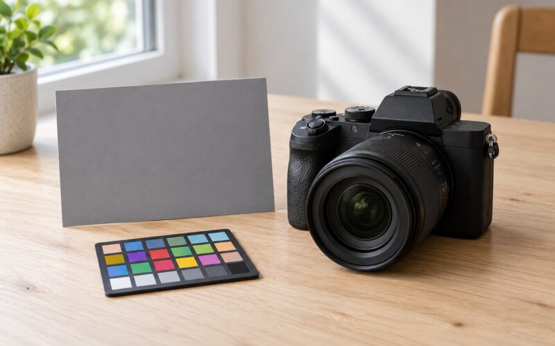
A grey or color reference card sitting in the scene for one frame at the start of every location pays for itself immediately. It gives you a neutral to check your white balance against, and it is the fastest way to catch a set that drifted warm while you were indoors and cool once you stepped outside.
Editing software matters less than people think. Lightroom Classic, Capture One, Affinity Photo and a phone app all support the same three ingredients: a base preset, copy or sync settings, and a reference image beside the one you are working on. What you cannot fake is fixing the capture stage first, because a white balance error baked into a JPEG cannot be undone in any of them.
Organizational habits are the quiet part. A folder per date, a naming convention you never have to think about, one collection for the keepers, and a second folder for the frames you still might want. Organizing before editing means you are not scrolling through four hundred thumbnails with an open Develop module, which is where a lot of tired, inconsistent galleries come from.
A smartphone can absolutely carry a consistent look. Lock the exposure and focus, shoot in RAW or the most neutral processing mode available, keep the same lens and camera position for a series, and apply one editing recipe on export. The gap between phone and dedicated camera work is mostly about light control, not color, and color is where consistency actually lives.
Step-by-Step: A Repeatable Workflow for One Recognizable Look
Five stages, in this order, each one feeding the next. Skipping stage one is what makes a set look like five different shooters handed the same camera.
1. Choose a visual direction before you edit
Write the direction down in one sentence before you open a single file. Something like soft shadows, muted greens, warm skin, nothing pushed past the point where a stranger looks tired. The sentence matters because it gives you a tie-breaker on every slider move that comes later.
Then define the handful of things that stay fixed: a color palette, a contrast range, how much shadow detail you keep, how sharp the frame feels, and the overall mood. Five decisions, written down, is plenty. Consistency comes from repeating the same choices, and you can only repeat what you have actually decided.
Build a small mood board before you build the preset. Twelve to twenty reference images, mostly ones you admire and a few of your own frames you already like, arranged in a grid you can see at a glance. Keep it somewhere you will actually look at it, because a mood board in a folder you never open is decoration, not a tool.
Test your base preset on eight to twelve photos from wildly different conditions before you trust it. Pick one in open shade, one in direct sun, one indoors with mixed light, one portrait in the shade, and a few of each. If the preset holds those together, it will hold a series together. If it does not, the preset is too aggressive, and the fix is almost always to pull back on the sliders that shift color rather than on contrast.
2. Set camera and lighting defaults that repeat
This is the stage that decides whether editing has an easy job or a hopeless one. Every variable you leave on automatic becomes a variable you will chase later.
- Shoot RAW. JPEG white balance and JPEG color are locked at capture. You cannot rescue a warm indoor frame later without wrecking the skin tones.
- Set white balance manually. Use a custom Kelvin value or a preset matched to the light, then check it with a grey card at the start of each location. Automatic white balance changes frame to frame and is the single biggest source of a patchy set.
- Fix your exposure mode and metering pattern. Manual exposure with a single metering pattern gives you frame-to-frame predictability that aperture priority never will.
- Keep focal length repeatable. Pick one focal length or one zoom range for the series and stay inside it. A 24 mm frame next to an 85 mm frame has a different perspective and a different compression feel, and viewers notice even when they cannot name why.
- Use a custom picture style. If your camera has one, set it to something neutral or flat. It costs you a little dynamic range and gives you a flatter starting point to grade from.
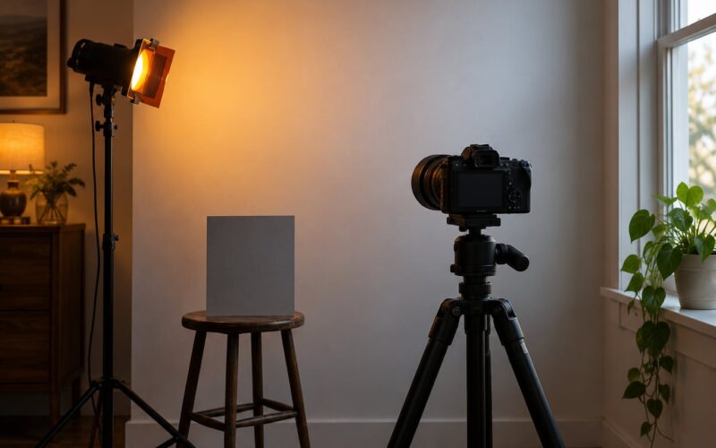
- Keep the light direction and the background predictable. Same window, same side of the subject, same distance to the background. Lighting consistency does more for a set’s cohesion than any slider.
Where I fail on this is time of day. A series shot across one afternoon in flat light will hold together far more easily than one shot at golden hour, noon and dusk, no matter how good the edit. Pick your conditions, then shoot.
3. Use one repeatable editing sequence for a consistent look
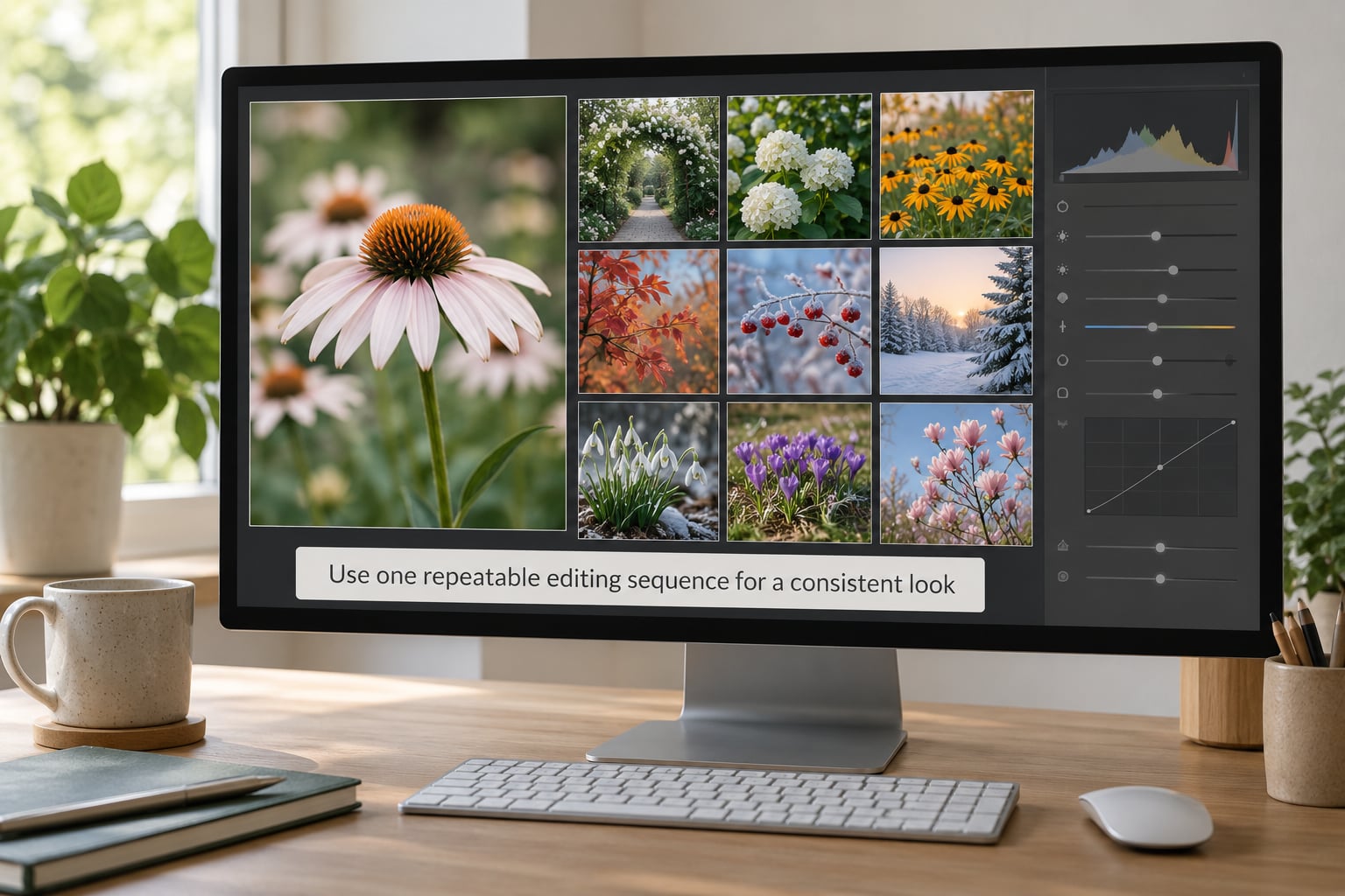
Consistency here comes from order, not from a single dramatic preset. Edit in the same sequence every time, and each decision gets a fixed input instead of your mood at eleven at night.
- Import and organize first. Get the whole set into one folder and one collection before any Develop work starts.
- Crop and straighten. Use the same aspect ratio for the whole series if it is a series. Mixed aspect ratios read as mixed intent.
- White balance. Set temperature and tint from the reference card or a neutral area, then leave them alone. This is where a consistent look across photos is won or lost.
- Exposure and contrast. Get the brightness right first, then set the contrast range and black point with a tone curve.
- Color. Adjust saturation, highlights, shadows and midtone luminance, then use HSL ranges only to nudge specific colors rather than to re-balance the whole frame.
- Detail. Sharpening amount, masking and noise reduction, applied last and kept light.
- Creative styling. Crop, split toning, grain or a final curve move, applied with restraint.
Your base preset should sit between steps one and two, and it should be boring on purpose. Many working photographers keep temperature, tint and HSL out of the base preset entirely, because those three are what push skin tones apart when they are applied blindly to a frame that already has a different light in it. A base preset that sets exposure character, contrast range, color treatment and detail gets you most of the way without that risk.
Edit one photo from each scene completely, all the way through the sequence. Then use Copy Settings, or Paste Settings with the sync options switched off, to move it across the frames from that scene. Auto-sync is faster and it will quietly apply your exposure correction to a frame three stops brighter, which is the most common way people conclude their preset does not work.
Keep one reference image beside the frame you are working on. Lightroom’s Reference View does this in about a click, and a mood board does it in any other program. Without a reference, your eyes adapt to each frame in turn and every edit drifts warmer than the last.
4. Review the set as a group, not photo by photo
Single-image judging is the reason sets drift. Your eyes reset against whatever is brightest, so a slightly dark frame looks fine alone and wrong in context.
Switch to Library grid view, sort by capture time, and scan in that order. Look for four things: a frame that is clearly brighter or darker than its neighbors, a frame that is warmer or cooler, a frame whose crop breaks the pattern, and a frame where the contrast is visibly heavier. Time grouping is more useful than face grouping here, because drift accumulates along a shoot.
Fix outliers with small local adjustments rather than by rewriting the whole frame. A temporary adjustment brush on the stray warm frame is a quick fix that keeps the rest of your recipe intact; re-editing the entire frame from scratch is how sets get muddy.
| Keep identical across the set | Vary per photo |
|---|---|
| Aspect ratio and crop style | Exact framing and subject placement |
| Tone curve shape and contrast range | Exposure correction to suit the scene brightness |
| Black point and highlight roll-off | How much shadow detail you recover |
| HSL ranges and color treatment | Selective nudges to a single color |
| White balance intent and light direction | The final temp and tint value per frame |
| Sharpening amount and export settings | Noise reduction in the darkest frames |
Keep the grid open while you fix things. Two passes is usually enough, and the second pass should find one or two frames rather than twenty. If it finds twenty, the base preset is too strong.
5. Save a reusable style recipe
Consistency that lives only in your head gets lost on the week you are tired. Write it down and save it where the software can use it.
- Export your camera setup and name it clearly, so loading it takes one click instead of eight taps.
- Save the base preset and any scene-specific variants with names that describe what they do, not what they are called.
- Save export presets for each destination: web gallery, social feed, print. Different output, same look.
- Use snapshots for the finished state of a key frame, so you can return to a treatment you liked without hunting for it.
- Set your calibration once per camera and lens, then stop touching it.
- Keep the folder and naming convention fixed. Date, project, sequence number. Boring is correct here.
- Write a one-page style guide. Your mood board, your preset names, your export settings, your two or three non-negotiables. This is what makes the next series fast and recognizable.
Then let the style change on purpose. A recipe you never update eventually becomes the reason your work stops interesting you. Make one adjustment at a time, apply it to a whole new set, and compare it against a grid of the old ones before you commit.
Common Mistakes
Almost every inconsistent set traces back to one of these. Each has a fix you can apply before you start rather than after.
Changing white balance in every frame. If you adjust temp and tint per photo until each one looks right on its own, the set drifts warm over an afternoon and blue after sunset. Fix: set white balance once per lighting condition and hold it, using a reference card rather than your memory of what the room looked like.
Over-editing each photo separately. Starting from scratch on every frame means every frame gets a slightly different hand. Fix: apply the base preset to the whole set first, then edit one frame per scene and copy it across.
Using auto-sync when you meant copy settings. Auto-sync pushes your exposure, contrast and curve values onto frames with completely different brightness, and the results look nothing like the frame you approved. Fix: turn sync off, use Copy and Paste Settings, and check the first pasted frame before doing the rest.
Copying edits and trusting the result. Paste Settings is a starting point, not a finish. Fix: keep Reference View on and look at each frame for a few seconds after pasting.
Stacking unrelated filters. A warm film emulation on some frames and a cool one on others reads as a filter collection, not a style. Fix: one treatment for the whole set, at most one subtle overlay on top.
Making consistency so extreme that variation disappears. When every frame has identical contrast, identical color and identical cropping, the set reads as flat and slightly lifeless. Fix: keep the recipe fixed and let the scene vary. Different light and different composition inside a fixed treatment is what makes a set interesting.
Judging one photo at a time. Fix: grid view, capture-time order, two passes.
Culling too lightly. Editing every frame you shot guarantees some weak images carry the recipe. Fix: pick the keepers before you edit, and be ruthless. A shorter, better set is easier to keep consistent.
| Symptom | Likely cause | Fix |
|---|---|---|
| Same preset, every frame looks different | Preset includes temperature, tint or HSL | Remove those three from the base preset and set white balance per scene |
| Frame is dramatically too bright or dark after pasting | Auto-sync applied an exposure correction | Switch to Copy and Paste Settings instead |
| Skin tones drift between similar frames | Mixed light sources in the same set | Sample each frame from the same neutral reference and correct locally |
| Set gets warmer toward the end | Screen adaptation, or judging without a reference | Keep Reference View or a mood board open while editing |
| Grid looks patchy even though every frame was approved alone | Frames culled after editing, or edited in no fixed order | Cull first, then review the grid in capture-time order |
| Flat, lifeless results | Over-correction in the base preset | Halve the strength and rebuild from a milder recipe |
| Gallery colors shift between screens | ProPhoto RGB export for web delivery | Export web images in sRGB and convert for print separately |
Two tips that pay off quickly. First, edit in the same room at the same time of day whenever you can; screens and ambient light change your perception more than any slider. Second, deliver a proof grid before you deliver the full gallery. A client who spots three mismatched frames in a thumbnail grid will mention them forever.
Frequently Asked Questions
Should I use the same editing preset for every photo?
Use the same base preset on every photo in a set, but do not stop there. A preset sets one identical starting point; each frame still needs its own exposure correction, and white balance usually needs setting per lighting condition. The preset should handle contrast range, color treatment, detail and tone curve while leaving temperature, tint and HSL alone. Edit one frame per scene fully, then copy those settings across the rest.
How do I make photos look consistent when they were taken in different lighting?
Start at capture. Shoot RAW, set white balance manually to a custom value for each light source, and photograph a grey or color reference card in every location. In the edit, sample neutral from the card or a known neutral area, match temperature and tint, and correct anything that shifts with a local adjustment rather than a global one. Expect some frames to need more work; that is normal and it is why you cull before editing.
Is consistency better achieved with a preset or by editing each photo manually?
A preset, because manual editing on every frame is how sets drift. The reason preset results disappoint people is usually that the preset is too strong or that auto-sync pasted exposure values onto frames with different brightness. Build a mild base preset, keep temperature, tint and HSL out of it, apply it to the set, then correct each frame individually for exposure and white balance.
How can I keep a photo diary visually recognizable without making every image identical?
Fix the recipe and let the scene vary. Keep crop style, aspect ratio, tone curve, contrast range, color treatment and export settings constant, while changing framing, subject, exposure correction and shadow recovery from frame to frame. Then check the whole set in a grid view in capture-time order and fix the two or three frames that break the pattern. Consistent treatment with varied content is what makes a series feel intentional.
What should I save in a reusable photography workflow?
Save your camera configuration as a custom mode or profile, your base preset and any scene-specific variants, one export preset per destination, your monitor calibration, your folder structure and naming convention, and a short style guide listing your mood board and non-negotiables. Saving all five means a new series starts from the same place every time instead of from memory, which is where inconsistency usually starts.
Can I keep a consistent look across photos with a smartphone?
Yes. Lock exposure and focus, use RAW or the most neutral processing mode available, keep the same lens and camera position for a series, and avoid mixing flash and ambient light within one set. Edit the whole batch with one recipe on export, and stay in sRGB. The gap between phone and dedicated camera work is mostly light control and dynamic range, not color, so consistency is well within reach.
If you do one thing from this guide, make it the next one: shoot the next set with white balance set manually and a grey card in the first frame. Everything else in the workflow gets easier once the capture stage stops fighting you.