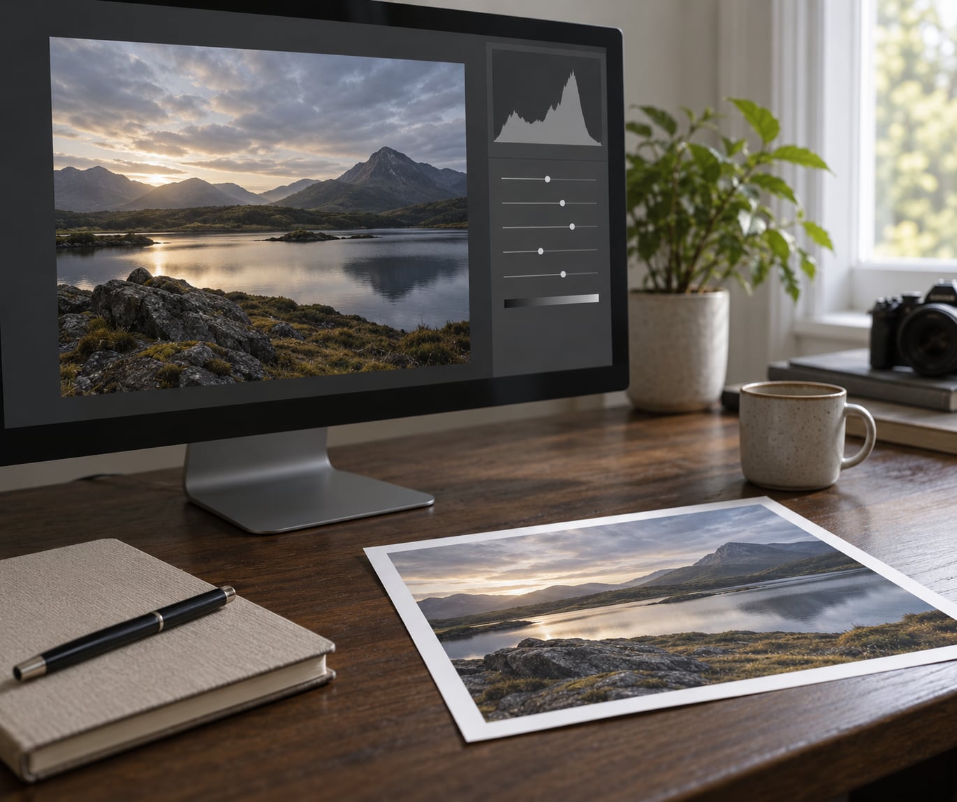
Levels is a tonal adjustment tool that remaps the brightness values of your photo. You move three handles — a black point, a midpoint and a white point — to control shadows, midtones and highlights, and the histogram beside them shows exactly what those moves do to your image.
Almost every editor has it. In Lightroom the panel sits in the middle of the Develop module, in Capture One it lives on the Tone tab, in GIMP it is under Colors. Same idea, slightly different furniture.
Table of Contents
- What Are Levels in Photo Editing?
- Why a photo looks flat is usually visible in the histogram
- How Do Levels Change Black, White, and Midtones?
- What Are Input, Output, and Gamma in a Levels Tool?
- How Do You Use Levels to Improve a Photo?
- What Are Levels vs. Brightness, Contrast, and Curves?
- When Should You Use Levels Instead of Other Tools?
- What Are Common Levels Mistakes and How Do You Fix Them?
- Frequently Asked Questions
- Should I use Levels before or after adjusting exposure?
- Are Levels better than Curves for beginners?
- Why does my photo become grainy after I use Levels?
- What should the black point, white point, and gamma values be?
- Can I use Levels to make a photo black and white?
- Does Levels change the original photo if I use it as an adjustment layer?
- Conclusion
What Are Levels in Photo Editing?
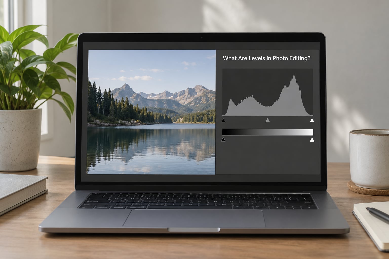
Before the controls, a word of clarification. When people search this question, a chunk of the results are about beginner, intermediate and advanced photography skill tiers, or about audio levels on a camera. This guide is about neither. Levels here means the tonal tool, full stop.
What makes Levels useful is that it works on the raw brightness numbers behind your image. In an 8-bit file, every pixel holds a value somewhere between 0 (pure black) and 255 (pure white), and the histogram is just a count of how many pixels sit at each of those 256 values. Levels lets you decide which value counts as black, which counts as white, and what happens to everything in between.
Five things to carry away from this page:
- Levels is a linear remap of brightness values, not a creative filter.
- The three input handles control shadows, midtones and highlights respectively.
- Moving a handle inward past real image data clips those pixels permanently.
- Output levels mostly serve the purpose of deliberately darkening or fading an image.
- Levels belongs near the start of your workflow, before colour and before sharpening.
Why a photo looks flat is usually visible in the histogram
Open the histogram and you can diagnose most tonal problems at a glance. If the data is bunched up in the middle and never reaches either end, the photo is flat — muddy shadows, dull whites, the whole middle of the range compressed into a narrow band. Drag the outer handles outward to spread that band back across the full 0 to 255 range and the photo gains contrast without you touching a single slider labelled “contrast”.
If the data slams hard up against 255 on the right, you have clipped highlights, and those pixels are gone. No amount of editing brings them back, which is why getting this right in the first minute saves pain later.
How Do Levels Change Black, White, and Midtones?
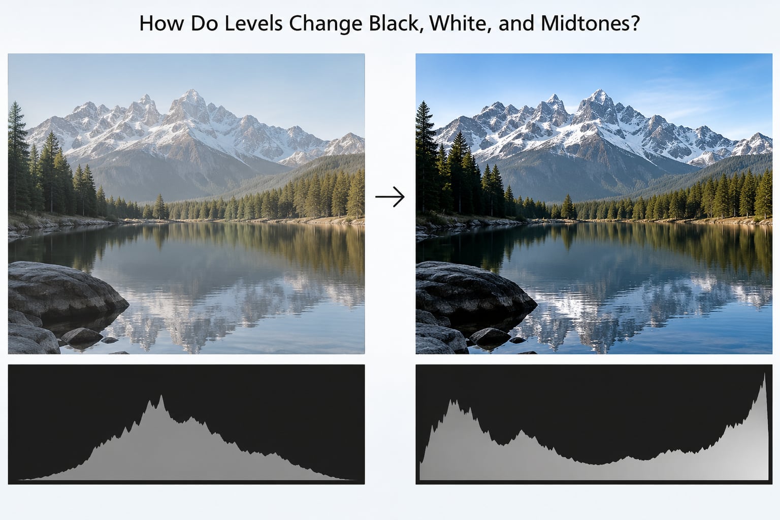
Every photograph is described in three tonal regions. Shadows carry the dark end, from deep blacks up to roughly a quarter of the range. Midtones cover the middle, where skin tones, most natural colour and ordinary detail live. Highlights run from the upper quarter to pure white, and they hold skies, light sources and specular shine.
Each input handle maps onto one region, and each handle does exactly one job.
| Control | What it changes | What it does to the image |
|---|---|---|
| Black point (left handle) | Shadows | Sliding it inward makes everything darker than that value collapse to pure black, deepening shadows and adding contrast. |
| Midpoint (centre handle) | Midtones | Sliding it inward lightens midtones; sliding it outward darkens them. Endpoints stay where they are. |
| White point (right handle) | Highlights | Sliding it inward forces everything brighter to pure white, brightening highlights and adding punch. |
| Output black (lower bar) | Overall level floor | Moving it inward darkens the whole image uniformly without touching contrast. |
| Output white (lower bar) | Overall level ceiling | Moving it inward lightens the whole image uniformly; leaving it short of the edge fades the image to grey. |
Here is the trap almost every beginner falls into: dragging all three input handles hard against the edges. Do that on an already decent photo and you get something harsh and lifeless, because you have thrown away shadow and highlight detail along with the mush. Levels is about setting the true endpoints of your data, not about maximising them.
A better habit is to hold Option on Mac or Alt on Windows while you drag. The histogram switches to a clipping preview, painting clipped areas in a warning colour so you can see exactly how much you are about to destroy.
What Are Input, Output, and Gamma in a Levels Tool?
Input levels are the top half of the panel: the histogram plus three handles. They define which brightness values in your file become black, white and mid-grey. This is where ninety percent of Levels work happens, and it is the part worth learning properly.
Output levels are the two handles in the narrow bar underneath. They do not read the histogram at all. They simply set the darkest and brightest value the image is allowed to reach after processing, effectively setting a new floor and ceiling for the whole picture.
That makes output levels useful in a few specific situations. Set the output white short of the far edge and your image fades toward grey, which is a quick way to get a soft, hazy look or a matte finish. Set the output black above zero and the image lifts off pure black, which is the classic film-style washed look. Most of the time you leave them alone.
Gamma is the technical name for the middle handle. It is positioned at brightness value 128, which is why it sits exactly in the middle of the histogram by default. Because 128 is the midpoint of the 0 to 255 range, moving that handle shifts the midtones without altering your chosen black and white points at all. Set gamma below 1.00 and midtones brighten; above 1.00 and they darken.
Levels and Curves do the same broad job with different machinery. Levels is linear and blunt — a straight-line remap that anyone can predict. Curves is non-linear: you drag a line or a spline into whatever shape you want, which means far more control and far more room to make a mess. Levels is what most people should master first. Photos that look dull after a Levels pass rarely need Curves at all.
Exposure is different again. It slides all values together to change overall brightness without redistributing them, so it never fixes a flat photo on its own.
How Do You Use Levels to Improve a Photo?
Here is a workflow that holds up on almost any photograph, from a phone JPEG to a RAW file.
- Fix exposure before anything else. If the photo is grossly under or overexposed, deal with that first. Levels fixes distribution, not overall brightness.
- Open the histogram and read the shape. Note where your data starts, where it ends, and whether it is bunched or spread.
- Set the black point. Drag the left handle to roughly where the histogram first rises off the baseline. Go a touch further and you deepen shadows; stop short and your blacks stay milky.
- Set the white point. Drag the right handle to roughly where the histogram tapers back to zero. Take care near bright skies, where a hard push creates a hard edge where detail ran out.
- Adjust the midpoint last. Slide the centre handle inward to open the image up, or outward to take the brightness down. Small moves count here.
- Check the output bars. Leave them at their defaults unless you are deliberately fading or lifting the image.
- Toggle before and after. In most editors a keyboard shortcut flips between the original and your edit. Do this every single time; it catches overcorrection faster than anything else.
- Move on to colour. With tone in a sensible range, move to white balance and saturation, then sharpen last.
One thing worth adding: in Photoshop, Capture One, Affinity and other layer-based editors, add Levels as an adjustment layer rather than applying it destructively. You can mask it, reduce its opacity, or hide it entirely to compare.
What Are Levels vs. Brightness, Contrast, and Curves?
This is the question that comes up most often on photography forums, and the honest answer is that the tools overlap and the order matters more than the choice. Use this table as a starting point, not a rulebook.
| Tool | What it does | Best for | Beginner verdict |
|---|---|---|---|
| Levels | Remaps brightness values between a chosen black, midtone and white point | Flat photos, dull skies, faded scans, dark silhouettes, matching a whole shoot | Learn this one first |
| Brightness / Contrast | Pushes all values brighter or darker, or squeezes the range around a pivot | Quick one-click nudges on an already-fine image | Fine as a touch-up, risky as a starting point |
| Curves | Non-linear control; you shape the tone response with a line or spline | Precise, localised contrast and a final creative look | Powerful, easy to overuse |
| Exposure | Slides the whole tonal range together without redistributing it | Getting overall brightness right before Levels | Use early, then leave it |
| Shadows / Highlights | Adjusts one tonal region while protecting the others | Opening crushed shadows or taming blown highlights | A gentler alternative to Levels endpoints |
Levels and Brightness/Contrast look similar but behave differently. Contrast in most editors pivots around a middle value and can crush blacks or blow highlights to get there. Levels lets you set the endpoints explicitly, which is why a good Levels pass gives you contrast that still has detail in it.
One difference that surprises people: Levels and Curves applied to RGB also shift colour. Pushing a big tonal range makes colours more saturated as a side effect, because you are stretching the distance between the colour values. If you want contrast without the extra punch, look for a luma or Lab-based curve that adjusts brightness only. Several editors expose this in their Curves panel or in an advanced workspace.
When Should You Use Levels Instead of Other Tools?
Reach for Levels when the problem is that the tonal range is wrong rather than too bright or too dark.
A dull sky over a landscape usually sits in a narrow band of the histogram with no true white anywhere. Setting the white point properly on just the sky, ideally with a mask on an adjustment layer, brings the colour and detail back without touching the foreground.
Old prints and scanned negatives often look washed out with compressed blacks and milky whites. Levels handles this cleanly because a scan is a fixed 0 to 255 file, and re-establishing the endpoints is exactly what the tool is for.
Silhouettes and backlit scenes are a strong case too. You cannot invent detail in the shadows, but you can lift what is there and let the shape read clearly.
Shooting a whole set under one light? Set Levels once on the first frame, save it as a preset, and apply it across the shoot. Consistent tone across a series matters more than a hero look on a single frame.
A colour cast is also a Levels job. Switch the channel menu from RGB to Red, then Green, then Blue, and adjust each channel’s black point until a neutral object in the frame reads as neutral grey. It sounds fiddly; it takes about fifteen seconds once you have done it twice.
And know when to leave it alone. If the histogram already reaches both ends naturally, the tone is correct and extra contrast only adds noise in the shadows. Not every photo needs a Levels pass.
What Are Common Levels Mistakes and How Do You Fix Them?
Clipped highlights. The white point sits inside a block of real image data, and everything brighter is now solid white. Hold Option or Alt while dragging to preview the clipping, then back the handle off until the warning colour shrinks to a hairline.
Crushed blacks. The mirror image. Details in a dark jacket or in foliage merge into one black mass. Lift the black point until the histogram no longer touches the left edge.
Empty grey midtones. The histogram looks reasonable at both ends but the middle is hollow, which makes the image look lifeless. Nudge the midpoint handle to push midtones back toward the centre.
Banding. Aggressive stretching on an 8-bit file can reveal visible steps in smooth gradients like skies. Work from a 16-bit file where you can, keep large adjustments modest, and add very light noise rather than dithering by hand.
Over-saturated colour. A strong Levels pass stretches colour along with tone. Pull saturation back afterwards, or switch to a luma-only curve for the contrast step.
The comb or slinky histogram. Gaps and spikes across the graph appear when a small amount of data gets stretched across a wide range. It is a sign you have stretched too far. Ease the endpoints back in and the spikes close up.
Halos around edges. These come from per-channel adjustments or from sharpening done before tone is set. Reorder: Levels first, then sharpening, and check edges on a high-contrast subject.
One thing to accept early is that every edit costs a little information. Every adjustment layer keeps the original underneath, so you can always go back, but a destructive edit is a one-way door. Work non-destructively wherever your software allows.
Frequently Asked Questions
Should I use Levels before or after adjusting exposure?
Exposure first. Exposure shifts the whole tonal range up or down without redistributing it, so if a photo is badly under or overexposed, Levels has the wrong data to work with. Once the overall brightness is sensible and the histogram sits roughly in place, set the black point, the white point, and then the midpoint. Levels then refines the distribution rather than fighting it.
Are Levels better than Curves for beginners?
For most people, yes, at least to begin with. Levels uses three fixed controls with an obvious meaning, so a beginner can predict the result before dragging anything. Curves offers finer control but plenty more ways to make a photo worse by accident. Learn Levels well, and you will find many photos no longer need Curves at all. Curves earns its place later, for a specific look.
Why does my photo become grainy after I use Levels?
Noise lives mostly in the shadows. When you move the black point inward and stretch the tonal range, those noisy dark pixels get stretched across a wider band, so they become visible as grain or colour speckle. Working from a RAW file, applying noise reduction before the Levels pass, and keeping shadow adjustments modest all help. If a photo is already noisy, stop at the black point and lift it less.
What should the black point, white point, and gamma values be?
There is no universal number, and anyone who gives you one is guessing. Set the black point where your histogram first rises off the baseline and the white point where it tapers back to zero, holding Option or Alt to watch for clipping. Leave gamma at its default position of 128 unless the image needs to be lighter or darker overall. Judge by eye, then check by flipping between before and after.
Can I use Levels to make a photo black and white?
Not properly, though you can desaturate and then use Levels to set the tone of the resulting greyscale, which is a useful starting point. For a real black and white conversion, move to a dedicated tool: a Black and White adjustment in Photoshop, a B and W mix in Capture One, or the HSL panel. Those give you control over how each colour converts to grey. Levels is still the right tool for the final tonal polish afterwards.
Does Levels change the original photo if I use it as an adjustment layer?
No. An adjustment layer sits above your image and changes only how that image is displayed, leaving the pixels underneath untouched. You can lower its opacity, mask it, or hide it to compare against the original at any time. Applying Levels destructively from a menu instead does modify the pixels permanently, so use an adjustment layer whenever your software offers one.
Conclusion
Levels is the tool that decides which brightness values in your photo count as black, which count as white, and how everything between them is spaced. That single decision fixes flat scans, dull skies, washed prints and mismatched frames from one shoot.
Start with the histogram, not a slider. Read where your data begins and ends, set the black point just inside that range, set the white point just inside the other end, then move the midpoint in small steps. Flip between the original and the edit before you save, and you will avoid the clipped, over-contrasted look that gives Levels a bad name.
Once the tone is right, move on to colour, and leave sharpening until last.