Fall photos look dull because autumn light is usually flat, and your camera records flat light truthfully while your eyes quietly adapt to it. Overcast skies strip the warmth out of the colour, midday sun burns it off, and in-camera processing flattens whatever is remaining. Correct exposure and white balance first, then restrained colour and contrast.
I spent years blaming my editing before I realised most of my autumn shots were dull the instant the shutter fired. The light was the problem, and no slider brings back colour the camera never recorded. Once I learned to diagnose the cause first, the same trip photos started matching what I had seen with my own eyes.
Here is the diagnostic route. Work through it in order and you will stop guessing at sliders.
Table of Contents
- What Makes Fall Photos Look Flat?
- Why Do Fall Photos Look Dull After Shooting?
- Why Do Fall Photos Look Dull in Overcast Light?
- What Camera Settings Help Fall Photos Look Better?
- Fall Photo Problems, Symptoms, and Fixes at a Glance
- How Do You Fix Dull Fall Photos in Editing Software?
- Start With White Balance and Exposure
- Restore Color Without Making Foliage Fake
- Add Contrast, Texture, and Atmospheric Depth
- What Editing Mistakes Make Fall Photos Look Worse?
- Frequently Asked Questions
- Can you fix fall photos that already look dull?
- Why do my fall photos look more yellow than the scene?
- Should I shoot fall photos in RAW or JPEG?
- Is black and white the best way to fix dull autumn photos?
- How can I improve fall photos taken on a phone?
- How do I edit multiple fall photos consistently?
- Conclusion: Start With the Light, Then Refine the Color
What Makes Fall Photos Look Flat?
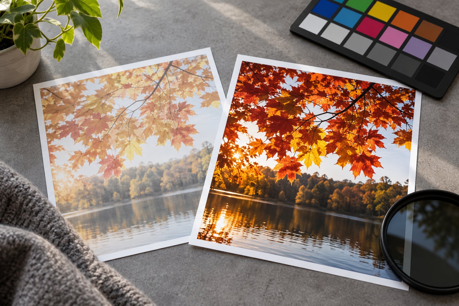
Dull means two specific things at once: low saturation and low tonal contrast. Colour is muted, and the brightest and darkest parts of the frame sit close together, so nothing feels close enough to touch.
Six things cause it, and they stack. Flat or overcast light lowers the colour separation between a red maple and an orange one before the light ever reaches your subject. Midday sun makes the problem worse by sending light through the shortest path in the atmosphere, which strips warm tones. Your eyes then adjust to that scene and stop noticing how weak the colour actually was.
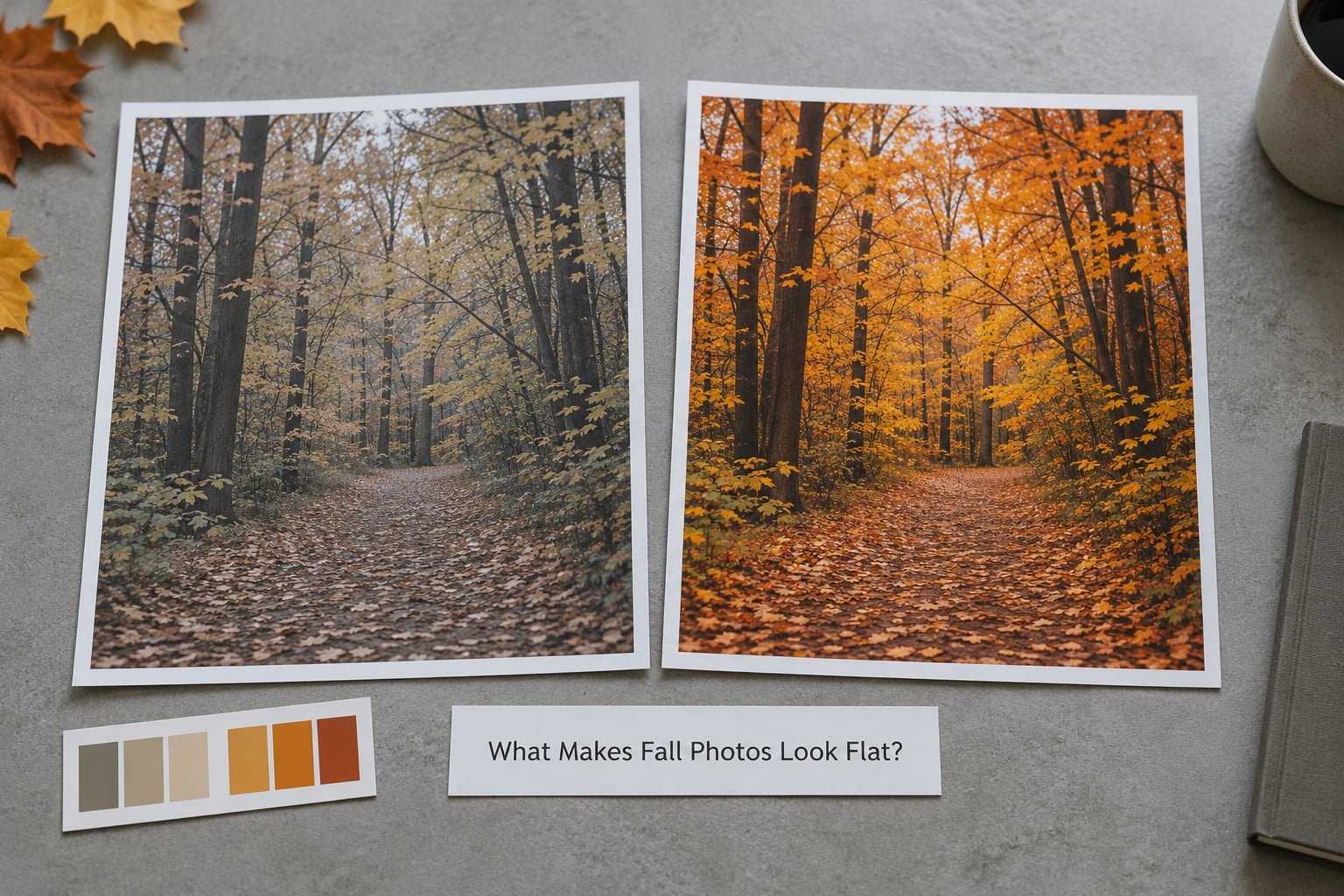
Add an exposure mistake, a white balance guess, or a camera picture control set to something flatter, and you get the flat grey-green file most people complain about on forums like r/photocritique and DPReview.
A Polarizing filter rotated 90 degrees from the sun, and simply shooting near sunrise or sunset, both cut the haze that washes autumn colour out before you edit a single pixel.
Why Do Fall Photos Look Dull After Shooting?
Run this checklist in order before you decide anything is broken. First, check the original file rather than the version your phone app or editing program cached. Then confirm whether you shot RAW or JPEG, because the two behave very differently once dullness creeps in.
Next, look at the lighting condition. A file shot under a bright overcast sky will be dull by physics, while a file shot in open sun at noon will be dull for a different reason. Check for a colour cast with the white balance eyedropper on a neutral surface such as a path or a fence post.
Finally, open the histogram. If the tones bunch in the middle with nothing near either end, you have a contrast problem. If the tones run hard against both edges, you have clipping, and the dullness is coming from the other direction entirely.
One more check that catches people out: if the image was taken through a window, a glass display, a lens filter with haze, or a phone case with a scratched protector, no edit will fully recover it.
Why Do Fall Photos Look Dull in Overcast Light?
Clouds act like an enormous softbox wrapped around the whole sky. That removes the hard directional shadows which normally separate one leaf from the leaf behind it, and it spreads sunlight from blue to red across the whole spectrum evenly. Equal light from all directions is clean light, but it is colourless light.
The result is a scene with very little colour separation. Yellow leaves sit at almost the same luminance as the orange ones beside them, so they merge into a single brownish mass. Shadow areas lift, highlights soften, and the histogram compresses toward the middle third of the range.
The Photography Forum still gets questions like this, and the classic answer there is to accept the weather and add a Polarizing filter. That advice is half right. A Polarizing filter helps most on bright hazy days because it cuts scattered light, but on a heavy grey overcast it removes very little.
So how do you tell normal overcast softness from a real mistake? Overcast softness still has detail in the leaves and clean edges. If the file is dull and muddy, with lifted blacks and no separation, the light is only part of the story.
Check the exposure next. A Flickr beginner discussion puts it neatly: slight underexposure gives dull greyish colour, while overexposure gives washed-out colour. Both get blamed on bad editing, and both are actually capture problems.
What Camera Settings Help Fall Photos Look Better?
Shoot RAW whenever your camera allows it. A RAW file keeps the flat colour data intact so you can rebuild it later, while a JPEG bakes your camera’s interpretation into the file the moment you press the shutter.
If you do shoot JPEG, switch the picture control or colour profile from Flat or Neutral to Standard. Many cameras also carry a vivid or saturated option that overshoots, so Standard is usually the better starting point for autumn. On phones, compare Vivid and Natural modes side by side on the same tree.
Set white balance to a specific value rather than Auto. Auto will swing warm in the shade and cool in the open, which makes a set of shots from one walk impossible to match later.
Watch your histogram for clipping. Protect warm highlights with a slightly negative exposure compensation if red or orange channels are hitting the ceiling, because clipped colour cannot be un-clipped, only faked.
Timing matters more than gear. Low, raking light in the first hour after sunrise and the last hour before sunset gives you warm colour and long shadows. Backlighting a tree with the sun behind it lights the leaves from the inside, though you will need to expose for the foliage and accept a darker background.
A circular Polarizing filter used at roughly 90 degrees to the sun darkens a blue sky and cuts atmospheric haze from distant trees. Watch the sky, since it darkens unevenly at wide angles.
Fall Photo Problems, Symptoms, and Fixes at a Glance
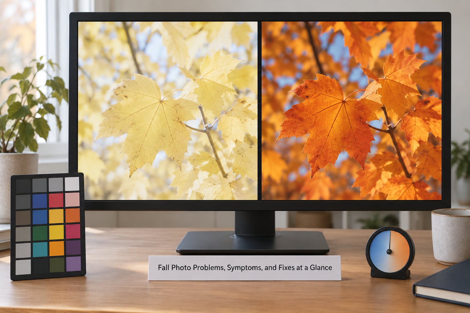
| What you see | What is causing it | Fastest fix |
|---|---|---|
| Muddy leaves with no separation between colours | Overcast light with no directional shadows | Add midtone contrast with Texture, then a small amount of Dehaze |
| Everything looks yellow-orange, including neutral objects | White balance set too warm | Use the white balance eyedropper on a grey or neutral surface and nudge tint |
| Grey, lifeless sky behind good foliage | Haze and scattered light | Lower Dehaze slightly, then darken the sky with a graduated or brush mask |
| Whole image soft with no depth | Low tonal contrast, tones bunched in the middle | Raise contrast or add a gentle S-curve instead of pushing Clarity |
| Dull grey-green instead of warm colour | Uncorrected colour cast from shade or mixed light | Set white balance from the file, then correct the remaining cast in the HSL panel |
| Flat file that refuses to improve with any slider | Camera picture control on Flat, or an overcast JPEG with no headroom | Shoot RAW next time; here, work with texture and tonal contrast and accept a modest result |
| Looks dull on your laptop, fine on the camera screen | Uncalibrated display and a bright viewing room | Lower screen brightness to match ambient light and judge edits in a dim room |
| Neon oranges and clipped reds | Saturation pushed before tone was corrected | Reset saturation to zero, use Vibrance instead, and pull red luminance down |
How Do You Fix Dull Fall Photos in Editing Software?
The order matters more than the slider values. Get exposure and white balance honest first, then colour, then micro-contrast and depth. Work in Lightroom, Adobe Camera Raw, GIMP, Affinity Photo, or any tool with equivalent tone and colour controls, and keep every step non-destructive so you can back up.
Start With White Balance and Exposure
Open the white balance eyedropper and click a neutral surface in the frame, such as a grey rock, a white fence post, or a patch of sky away from the sun. That sets the colour temperature and tint correctly instead of your guess.
Then set the black point and white point. Drag the shadows slider until true blacks sit near zero, and pull highlights down until the brightest leaf edges stop clipping. A dull file is very often a file with everything pushed into the middle.
Add contrast here, before any colour work. A simple S-curve in the tone curve panel separates the midtones more gently than the contrast slider, and it will not push colour around the way Clarity does.
Stop at this point and look at the histogram. If the tones now spread across the range with detail preserved at both ends, your tonal foundation is sound.
Restore Color Without Making Foliage Fake
Use Vibrance, not Saturation, for the first pass. Vibrance boosts muted colours more than already-vivid ones, so greyish yellows lift while bright reds stay under control. Saturation pushes every pixel equally, which is exactly how autumn reds turn into traffic cones.
Open the HSL panel and work on the specific colours. Nudging yellow saturation and luminance up separates golden leaves from pale ones. Dragging green hue toward yellow lets summer foliage blend into the autumn palette instead of fighting it.
Lower red luminance rather than raising red saturation. Bright reds that approach pure white look synthetic, and pulling their luminance down lets them read as deep, wet autumn red rather than a flat neon patch.
For a scene without people, a worked example: a maple against a pale sky, shot under thin cloud, reads dull at the default import. Setting white balance with the eyedropper, adding a gentle S-curve, moving Vibrance to roughly plus 20, raising yellow luminance slightly, and pulling red luminance down a few points brings the colour back without any slider hitting a clipping warning.
Use the adjustment brush or adjustment point tool for leaves that need more than the rest of the frame. Mask carefully and keep the strength low, because mask edges are where edits announce themselves.
Add Contrast, Texture, and Atmospheric Depth
Reach for Texture first on foliage. It adds fine detail with very little shift in saturation, so leaf veins get crisper without the colour drifting.
Use Clarity more sparingly. It works on midtone contrast and it pushes saturation slightly, so strong settings create crunchy, glowing edges around branches and halos along bright leaf borders.
Dehaze handles atmospheric haze and washed-out skies. A small negative amount clears distance between tree lines, and a small positive amount restores punch to a flat grey background. Large values make skies look painted and give foliage a plastic sheen.
For depth, mask the foreground slightly darker and the background slightly lighter. Aerial perspective is what separates a wooded valley from a wall of leaves, and a gentle mask recreates it in seconds.
Finish with sharpening applied to detail only, and check the corners of the frame where over-sharpening shows up first.
What Editing Mistakes Make Fall Photos Look Worse?
Over-saturation comes first on the list because it is the most common fix beginners reach for. Reset it to zero, set Vibrance instead, and if red still looks hot, drop red luminance.
Excessive warmth is the second. A strong temperature push makes every leaf the same orange and turns a natural mixed-colour scene into one flat wash. Correct white balance first, then judge warmth with the eyedropper still handy.
Global dehaze is the third. It affects the entire frame rather than the hazy parts, which is why skies go chalky and foliage edges glow. Apply it through a mask over distant trees, or keep it under a small amount.
Heavy clarity is the fourth. It creates dark halos around high-contrast edges, which on autumn subjects means every bright leaf outline gets an unnatural glow.
Crushed shadows are the fifth. Pulling shadows to black to make a frame feel punchy destroys the dark leaf detail that gives an autumn scene its depth, so stop while you can still read texture.
Sharpening every edge is the sixth. Foliage is the worst subject for global sharpening because thin twigs and leaf gaps produce a crawling, crunchy mess at any strength above mild.
Masking indiscriminately is the seventh. Sloppy mask edges and feathered selections catch the eye immediately, so build masks at low strength and zoom in to check the boundary before you commit.
Frequently Asked Questions
Can you fix fall photos that already look dull?
Usually yes, partly. If you shot RAW you can recover most of the colour by fixing white balance, rebuilding tonal range, and adding restrained vibrance. If you shot a JPEG that was already flat, the data is compressed and some of it is simply gone, so you are rebuilding an approximation rather than recovering the original. Overcast frames are harder than underexposed ones, because dullness came from the light itself.
Why do my fall photos look more yellow than the scene?
Two common causes. First, Auto white balance often reads shaded autumn light as neutral and compensates with a warm bias. Second, in autumn a large share of the frame really is yellow and orange, so a global adjustment shifts everything together. Set white balance with the eyedropper on a neutral surface, then use the HSL panel to move the yellow channel instead of the global temperature slider.
Should I shoot fall photos in RAW or JPEG?
RAW, whenever your camera offers it. RAW keeps flat colour data intact so white balance and tone can be rebuilt later, while JPEG bakes the camera’s processing into the file permanently. JPEG is fine for casual sharing, and turning off in-camera picture control, using Standard, and shooting in good light narrows the gap. Storage and culling time are the real costs of RAW, not image quality.
Is black and white the best way to fix dull autumn photos?
Not as a rescue, but it works well as a fallback. Converting to monochrome hides a colour problem by removing colour, which some beginners find satisfying, yet the file still has low tonal contrast and dull detail underneath. Fix exposure and contrast first, then decide. Plenty of autumn scenes look stronger in colour, and a good black and white conversion is easy once the tones are right.
How can I improve fall photos taken on a phone?
Shoot in RAW or Pro mode if your phone offers it, since that bypasses the automatic computational processing that flattens scenes. In the stock camera, compare Vivid and Natural modes on the same tree. In editing, lower exposure slightly to protect bright leaves, then raise vibrance instead of saturation and correct white balance with a neutral reference. Tap the screen on a tree trunk to set exposure for the foliage, not the sky.
How do I edit multiple fall photos consistently?
Pick your first frame, set a fixed white balance value for the whole set, apply it to all files, then sync the basic tone and colour adjustments with a paste or sync command in Lightroom or your equivalent tool. Finally, paste the settings and finish each image individually with local masks. Users posting on r/photocritique say the same thing repeatedly: one slider never fixes it, layered adjustments in a consistent order do.
Conclusion: Start With the Light, Then Refine the Color
Why do fall photos look dull? Because the light was flat or harsh, your eyes adapted to it, and your camera recorded it without adding anything back. Nothing you do in editing changes that origin.
So run the sequence: check the file type, look at the histogram, correct white balance with an eyedropper, rebuild the tonal range, add vibrance, work the HSL panel on yellow and red, finish with Texture and a small masked Dehaze. Six steps, in that order, on one photo before you touch the rest of the shoot.
And next October, shoot RAW, set white balance yourself, and get out at golden hour. That is where the colour lives.