To create a photo style guide for yourself, gather twenty to thirty of your own best photos, write down the choices they share in terms you can check, then add a short editing recipe and a one-page reference you shoot and edit against. It takes an evening to build and about an hour every few months to keep current.
Most photographers I know can feel what they like and cannot say it. They scroll back through a holiday set and see that one frame works and the other six do not, without being able to name the difference. That gap between taste and language is the whole problem. A style guide closes it.
Every high-ranking guide on this topic is written for a brand, a client or a team. None of them are for the person holding the camera with no brief, no budget holder and nobody to hand the rules to. That is what this process is for: one photographer, one document, no ceremony.
Table of Contents
- What You Need
- Step-by-Step
- 1. Collect Photos That Feel Like You
- 2. Identify the Traits You Want to Repeat
- 3. Turn Preferences into Clear Rules
- 4. Add Your Editing Defaults
- 5. Build a One-Page Style Reference
- 6. Test It on a New Photo Project
- 7. Review and Refine Every Few Months
- Common Mistakes
- Frequently Asked Questions
- How long should a personal photo style guide be?
- What should I include in a photography style guide?
- Should a photo style guide include camera settings or editing presets?
- How do I create a style guide when my photography subjects are different?
- How often should I update my photo style guide?
- Conclusion
What You Need
The whole job is done with things you already own. Nothing here requires a purchase.
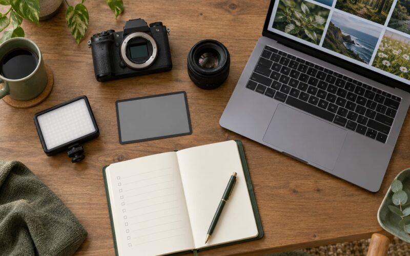
- Twenty to thirty representative photos. Your fifteen best, plus a handful you disliked. The weak ones matter as much as the strong ones because they show the habits you want to stop.
- A contact sheet or a single folder. Put them in one folder or one Lightroom grid so you see them side by side instead of one at a time.
- A notes app or a text document. Phone notes are fine. You will be typing on location ideas before long.
- Your editing software, already open. Whatever you use, with a copy of the values from a favourite image ready to read back.
- An uninterrupted hour. Review is the slow part. Rushed, it turns into a list of adjectives.
Step-by-Step
Seven stages, roughly an hour each the first time and much less after that. The order matters more than the pace.
1. Collect Photos That Feel Like You
Start with a sample that already looks like you, because the point is to document what is there rather than design something new. Pull fifteen images you would happily print, then five you were disappointed by.
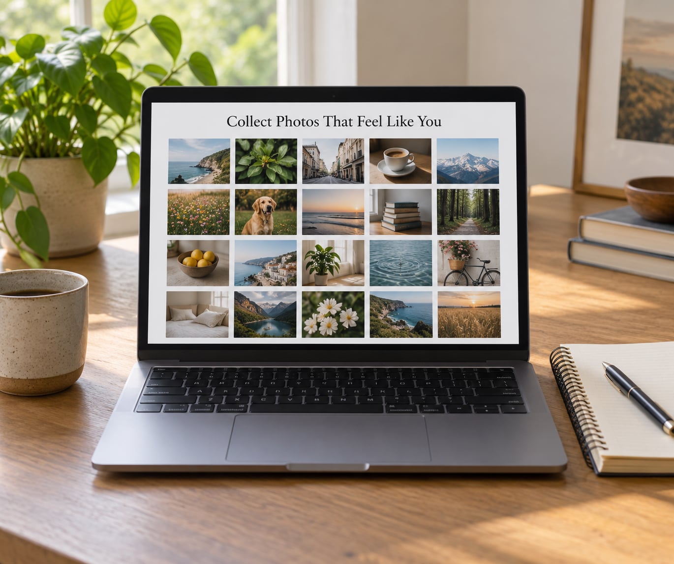
Put all twenty in one view. Label each one in five places: subject, light, colour, composition, mood. Use your own words, and be specific.
Instead of “nice light”, write “low sun from behind the subject, rim on the shoulder, face two stops darker”. Instead of “good composition”, write “subject in the left third, headroom above, empty road on the right”. Specificity is what makes the next step possible.
Read the labels back across all twenty. Whatever word or phrase appears three or more times is already a habit. That is the raw material for your guide.
2. Identify the Traits You Want to Repeat
Traits are things another photographer could see in your work without you explaining them.
Sort your labels into five columns: subjects you keep choosing, framing habits, light you prefer, colour and tone, and emotional register. The last one gets skipped by most guides and it matters most, because a quiet observational mood pulls everything else into line.
For each column, ask a second question. Is this something I chose, or something that happened because of the camera I have? A single 35mm lens and no flash are real constraints. Write them in the guide as constraints, not as preferences, so you stop resenting them later.
You should end up with roughly ten to fifteen traits. More than twenty and no image can hold them all.
3. Turn Preferences into Clear Rules
A rule works if someone else could photograph beside you and match your result.
Bad: “make photos look better”. Good: “crop to 3:2, keep the horizon level, no more than one clear subject in frame”. Each rule gets three parts: the instruction, a limit, and an exception.
- Instruction: “Shoot wide, keep the subject small in frame.”
- Limit: “Subject fills no more than a third of the frame in at least eight of ten frames.”
- Exception: “Close-ups are allowed when the texture of the surface is the point.”
Exceptions are what keep a guide from turning into a straitjacket. Every rule without one will eventually break a photo you wanted to take, and you will stop trusting the whole document.
4. Add Your Editing Defaults
Editing defaults are a starting point, not a destination. They save you from rebuilding the same sliders twenty times.
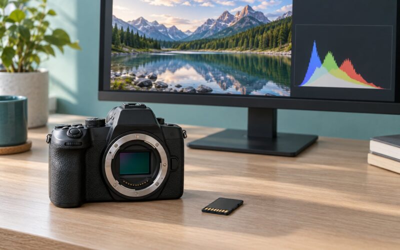
Pick one image you love, read off its values, and write them down as a neutral base: white balance temperature and tint, contrast, highlight and shadow recovery, texture, clarity, vibrance, grain and sharpening. Note the export too: file format, colour space, long-edge resolution, aspect ratio.
The five basics of photo editing, in the order most people need them, are exposure and white balance, contrast and tone curve, colour and saturation, crop and straighten, then sharpening and output. Start there and stop adding.
Now build one preset from those values and treat it as the first ten minutes of every edit, not the final one. The photographers who get consistent results are the ones who stop starting from zero, and building your own preset beats adopting someone else’s every time.
RAW capture is worth keeping in the guide as a rule rather than a preference. It is what lets the preset stay gentle instead of correcting a bad white balance baked into the file.
5. Build a One-Page Style Reference
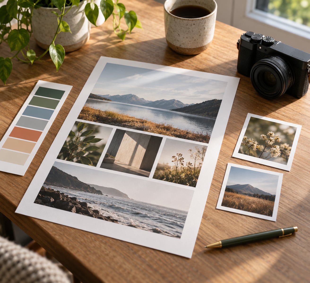
Compress everything into one page you can print and stick above the desk, or keep as a pinned note on your phone.
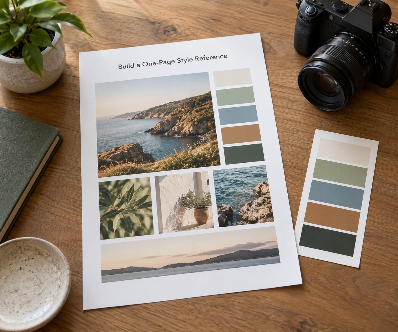
Here is the layout that works. Fill in the right-hand column with your own values.
| Section | What to write | Example value |
|---|---|---|
| Look statement | One sentence, mood first | Quiet and observational, nothing staged |
| Subjects | Three things you always shoot | Doorways, hands at work, long shadows |
| Light | Time of day and direction | Last two hours, side or back light only |
| Focal length and depth | Your working range | 35mm and 85mm, wide open when the subject is a person |
| Framing | Aspect ratio and margins | 3:2, horizon level, 10% breathing room |
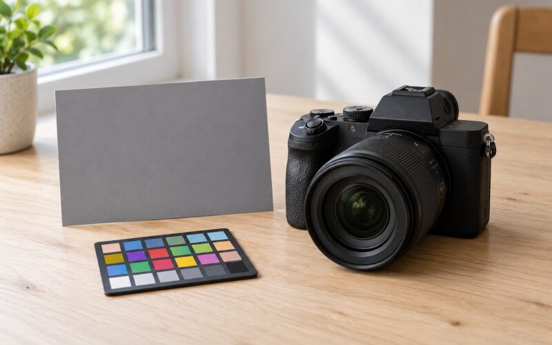
| Colour | Palette and saturation level | Desaturated, greens pulled toward grey, no skin orange |
| Edit base | Preset name and starting values | Base_Quiet_v1, WB 5200K, contrast +8 |
| Output | Format, colour space, size | JPEG, sRGB, 3000px long edge |
| Naming | File convention | 2026-04-12_street_03.jpg |
| Review date | When you revisit it | First Sunday of each quarter |
Add two small example frames beside it: one that passes your rules, one that breaks them. Do/don’t pairs teach faster than any paragraph.
6. Test It on a New Photo Project
A guide you never shoot is a journal entry.
Pick a small assignment, ten to twenty frames, somewhere you do not know well. A different street, a different hour of day. Familiar ground hides inconsistencies because you already know the light there.
Shoot against the rules, then log every deviation with the reason. Some will be the guide being wrong, and some will be the guide working and you not trusting it. You cannot tell which without writing them down.
Edit the whole set with the same preset in the same order. Then lay the frames out together and ask one question: would anyone guess these came from different days, different weather and different moods?
7. Review and Refine Every Few Months
Block about forty minutes at the start of each quarter. Style shifts slowly, and a guide you never touch will start lying for you within a year.
Compare the last twenty frames you were happy with against the guide line by line. Where you broke a rule on purpose and the result was better, rewrite the rule. Where the rule produced a photo you deleted, retire it.
Keep a dated copy of each revision. Two versions of the same document six months apart tell you more about how you have developed as a photographer than a single polished page ever will.
When a rule serves one genre but fights another, split the guide into a shared core and a short appendix per subject. One document gets brittle fast when you shoot street and nature and portraits in the same month.
Common Mistakes
Rules written as feelings. “More moody” cannot be checked; “shadows two stops under midtones, greens desaturated 15%” can. Fix: rewrite every rule as something measurable or countable, and delete the ones you cannot.
Copying someone else’s guide wholesale. This is the most common failure in the photography forums, usually paired with buying a preset pack that never quite matches how the buyer edits anyway. You inherit someone else’s taste and spend months fighting it in the edit. Fix: use other photographers’ work as reference images to analyse, never as a document to adopt.
Over-editing to prove the guide. A new style guide turns people into preset salespeople for their own taste. If every frame has heavy grain, crushed blacks and heavy vignetting, you are applying rules instead of making photographs. Fix: the guide sets a floor, not a ceiling.
Making it fifteen pages long. Nobody reads a fifteen-page personal document, including the person who wrote it. Fix: one page for the rules, and the long version lives in your notes app where you can search it.
Judging it from a single image. One frame tells you about one frame. Fix: judge the guide over ten or more, because consistency is a pattern and a pattern needs a sample size.
Confusing consistency with sameness. A feed of twenty identical-looking photos is not a style, it is a filter. Real style holds the light and colour together while the subject changes completely. Fix: allow more variation in subject and framing than in tone.
A few habits make the whole thing stick. Keep the guide where you will actually see it, review it after every finished project rather than on a schedule you will forget, and let the exceptions pile up on the page — they are the honest record of what you actually like.
Frequently Asked Questions
How long should a personal photo style guide be?
One page is the target. Ten to fifteen rules covering subjects, light, framing, colour, editing base and output specs will fit on a single sheet you can print or pin. Anything longer gets skipped, and a guide you do not read changes nothing. Keep the extended version, with examples and revision history, in a separate document.
What should I include in a photography style guide?
Six blocks cover most people: a one-sentence look statement, the subjects you choose, your light preferences, framing and focal length habits, an editing base with your preset values, and output settings including file format, colour space and resolution. Add gear constraints and a review date if you shoot more than one genre. Reference frames do more work than extra prose.
Should a photo style guide include camera settings or editing presets?
Include both, but keep them separate. Camera settings belong under shooting rules, because they describe what you aim for, not what must happen. Preset values belong under editing, framed as a starting point you adjust per image. If the guide treats preset values as fixed, every photo drifts toward looking processed instead of photographed.
How do I create a style guide when my photography subjects are different?
Split it into a shared core and a short appendix per subject. Put the traits that hold across everything, usually tone, colour, grain and output specs, in the core. Give each subject its own page for subjects, light and framing that suit it. One flat document covering everything either gets vague or gets violated every time you change genre.
How often should I update my photo style guide?
Every three months works well, or right after a finished project that surprised you. Look at your twenty best recent frames, compare them against the rules, and rewrite or retire anything no longer true. Save each revision with its date so you can see which rules were temporary. Annual reviews are too slow to keep up with how fast editing habits change.
Conclusion
A photo style guide is not a preset you apply to escape thinking. It is a written record of the choices you already make, arranged so you can repeat them on a bad-light Tuesday when instinct is not showing up.
Start now: open one folder, pull twenty photos, and write down three preferences that show up in most of them. Ten minutes of that will tell you more than another month of hunting for reference images.