
What makes a good black and white photo is structure, not desaturation. The strongest monochrome images carry a clear subject, deliberate tonal contrast, visible texture, and lines that lead the eye, so nothing depends on color to hold the frame together. Updated for 2026, here is how those pieces work and how to judge your own frames.
Most disappointing monochrome frames were fine in color. They had a subject, decent light and a workable exposure. What they lacked was a reason to exist without hue, so removing color exposed an image with nothing underneath.
The fix is not a filter. It is deciding what the picture is doing before you make it, then making sure light, tone and composition all point at the same thing.
Table of Contents
- What Makes a Good Black and White Photo?
- What Makes a Good Black and White Photo Tick: The Five Elements
- How Do Composition and Visual Hierarchy Work in Monochrome?
- Why Does Light and Tonal Contrast Matter?
- How Do Texture and Detail Make a Monochrome Photograph Strong?
- How Can Subject and Mood Make a Black and White Photo More Effective?
- What Makes a Black and White Photograph Technically Strong?
- How Do You Edit a Black and White Photo Without Making It Look Flat?
- How Can You Tell Whether a Black and White Photograph Is Good?
- Frequently Asked Questions
- How do I know if a color photo will convert well to black and white?
- Should I shoot in camera black and white mode or convert later?
- Why does my black and white conversion look flat and gray?
- How do color filters change a black and white photo?
- Do black and white photos need to be dramatic or high contrast?
- Conclusion: Start With the Reason for Going Monochrome
What Makes a Good Black and White Photo?
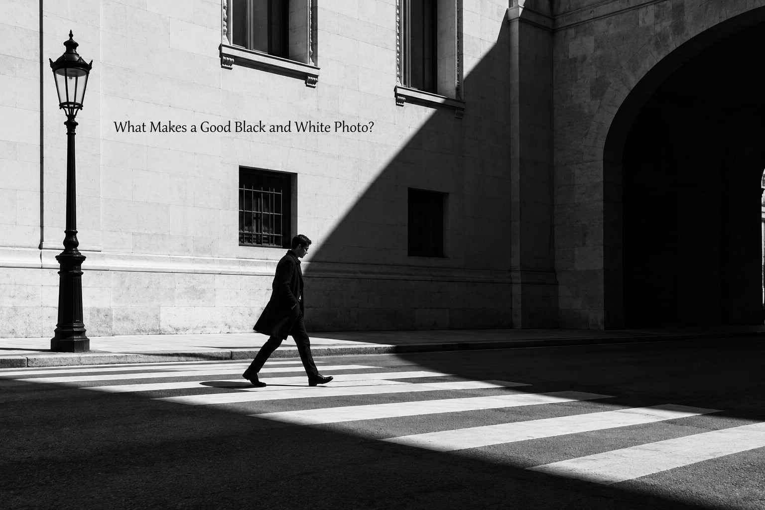
A good monochrome photograph has five working parts: a subject the viewer can name in one breath, tonal contrast that separates that subject from its surroundings, texture that rewards a second look, lines or shapes that steer the eye, and exposure control that keeps detail in the highlights and shadows. Get those five working and the image holds up even on a badly calibrated monitor.
What Makes a Good Black and White Photo Tick: The Five Elements
- A readable subject. You should be able to say what the picture is about in a short sentence. If you cannot, the frame is a texture study at best.
- Tonal separation. The subject sits at a different brightness from what surrounds it. Two shades, not one, is enough to hold attention.
- Texture. Rough surfaces, worn edges, fabric weave, peeling paint, rain on glass. Texture gives a flat frame something to hold.
- Shape and line. Curves, diagonals and repeating forms create movement and stop a static scene feeling dead.
- Controlled range. Blacks that hold shadow and whites that hold highlight, with the midtones doing the describing.
Five things that often stand in for those elements: interesting light, a background that differs in tone from the subject, a moment or gesture, a viewpoint nobody else took, and editing restraint. Any one of them will rescue an average composition.
How Do Composition and Visual Hierarchy Work in Monochrome?
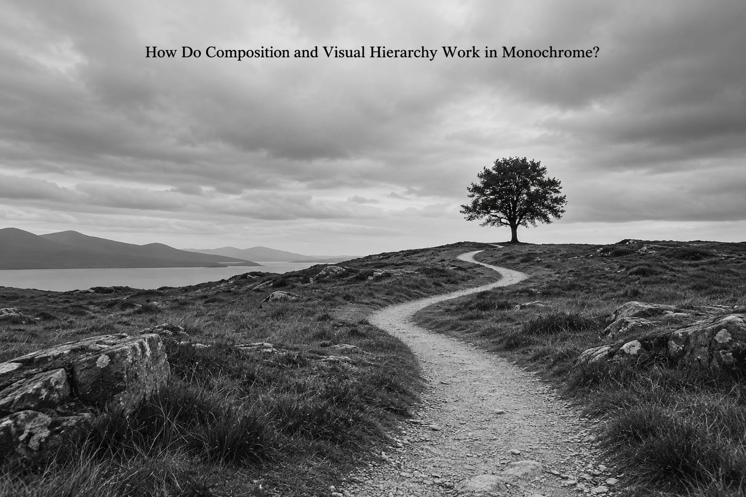
Composition in monochrome works like composition anywhere else, with one difference: you lose a whole layer of separation. A red coat in color pulls the eye instantly because it differs in hue. In black and white, a red coat and a grey wall can land on nearly the same tone, and your subject disappears.
So the hierarchy has to come from somewhere else. Six levers do most of the work.
- Leading lines. Walls, kerbs, railings, shadows and road markings that run from an edge of the frame toward the subject. Put the line at the edge, not through the middle.
- Negative space. Empty tone around the subject. In black and white, empty space carries real weight, and it does not need detail to feel intentional.
- Framing. Doorways, arches, branches and windows that isolate the subject without cropping into it.
- Scale. A small figure under a wide sky, or a close crop that fills the frame, both create impact in a way color never would.
- Balance. In monochrome, light areas carry more visual weight than dark ones. Counter a bright sky with a dark foreground mass and the frame settles.
- A single focal point. Monochrome frames rarely survive three competing subjects. Pick the one that matters.
If you want a rule to take away: look at your frame as squares of gray with nothing labeled. Where does your eye land first, and was that on purpose?
Why Does Light and Tonal Contrast Matter?
Light is the material of a black and white photo. Color tells you what something is made of; tone tells you what it feels like to stand next to it. That is why strong monochrome shots are nearly always lit deliberately.
Hard light, the kind that comes from a clear sky at midday, throws sharp edges and dark shadows, which suits architecture, street scenes and anything with strong shape. Soft light from overcast skies or open shade wraps around a subject and gives you a smooth midtone ramp, which suits portraits, mist and quiet outdoor scenes.
Direction matters as much as quality. Side light rakes across a surface and turns texture into shadow, which is why a textured wall shot at an angle in late light beats the same wall shot head-on at noon. Backlight does something else again: it can strip a subject to a silhouette, or rim the edges while the front falls into shadow.
Tonal range is the span from featureless black to featureless white, including everything in between. A good monochrome frame uses that span on purpose, not by accident. Put the subject in the brightest part of the image if you want it to dominate; sink it into shadow if the mood is meant to be secretive or heavy.
The most common failure is a middle-gray frame where nothing is black and nothing is white. Fix that before anything else.
How Do Texture and Detail Make a Monochrome Photograph Strong?
Texture is what monochrome photography gets for free. Color competes for attention, and a flat blue sky can swallow a rough brick wall next to it. In black and white, that brick wall becomes one of the most interesting things in the frame.
It works because texture has its own tonal pattern. Every edge, weave, crack and weathering mark creates a small area of light and shade, and the eye reads that pattern as detail even from across a room.
Look for it in places that get less attention than they deserve: peeling paint on an old door, ripples in water under a bridge, gravel at the edge of a path, corrugated metal, knitted wool, cut grass, fog on a window, the surface of an unlacquered table. Bricks, railings and staircases fall into the same category, which is why repeating architectural forms are such reliable monochrome subjects.
The pairing that works best is texture against simplicity. A rough hand against a plain wall, or weathered wood beside smooth concrete, gives the frame one busy area and one quiet area, and the contrast between them holds attention.
Watch the gap between texture and noise. Strong grain can read as texture until you look closely and realize it is just ISO noise. One pass of careful noise reduction before sharpening keeps that distinction clear.
How Can Subject and Mood Make a Black and White Photo More Effective?
The decision to remove color works best when it answers a question. What would this look like if hue disappeared? If the answer is that shape, gesture and relationship would carry the frame, monochrome is the right tool. If the answer is that the picture falls apart, keep the color.
Genres lean monochrome for predictable reasons. Portraits gain shape and expression without makeup or clothing competing for attention. Street scenes lose distracting signage and neon while keeping gesture and timing, which is most of the work anyway. Architecture becomes a study of line, mass and light. Seascapes and forests get atmosphere from tonal depth rather than green. Documentary work stays current, since the absence of color feels less tied to a particular year.
| Scene | Strong in monochrome | Better in color |
|---|---|---|
| Autumn foliage | Shape and branch structure | Color change between species |
| Sunset or sunrise | Silhouettes, layered ridges | Warm to cool color gradient |
| Food | Rustic surfaces, steam, plating shape | Freshness and ingredient color |
| Rainbow | Not worth converting | The color is the subject |
| Graffiti | Forms and wall texture | When lettering carries meaning |
| Portrait at golden hour | Skin tone and shadow shape | When skin tone matters to the story |
On mood, monochrome tends toward the serious and the timeless. It reads as documentary, which makes it effective for social observation, and as memory, which is why family archives and old photographs feel monochrome even when the originals had color. If your intention is celebration or play, color usually says it faster.
What Makes a Black and White Photograph Technically Strong?
Technically, a monochrome frame is correct when the tonal message survives without your eyes adjusting. That comes down to four things: accurate exposure, a deliberate black point and white point, control over where the midtones sit, and sharpness placed where it helps.
Shoot RAW when you can. Color files are where the work happens, because the conversion reads color luminance rather than a finished tone curve, and RAW gives you the latitude to set that black and white point after the fact.
Color filters are the traditional tool for shaping tone at the moment of exposure, and they still work digitally as a preview. The rule behind all of them is the same: the filter darkens its own color most, so darkening a sky means pulling foliage lighter by comparison.
| Filter | Darkens | Lighter by comparison | Typical use |
|---|---|---|---|
| Red | Sky, dark blue | Foliage, midtone detail | Heavy contrast, dramatic skies |
| Orange | Sky strongly | Foliage, texture | Wide views with haze |
| Yellow | Blue skies lightly | Skin tones, foliage | Portraits, gentle separation |
| Green | Red and skin tones | Foliage and pale detail | Forest and foliage emphasis |
Watch the histogram rather than the screen. A frame pushed hard against both ends looks dramatic in the histogram and terrible in the print, and it is where crushed blacks and blown highlights come from. Leave a little room at both ends and the tone holds.
How Do You Edit a Black and White Photo Without Making It Look Flat?
Flat monochrome usually means one of three things: the conversion ignored the colors that mattered, the contrast curve was left untouched, or the local adjustments stopped halfway. A short ordered sequence fixes all three.
Start with exposure and white balance, since both affect how color converts to tone. Correct the white balance before desaturating, not after, because the red response of the sensor changes how skin and warm light render in gray.
Then convert to monochrome using a mix that lets you weight each color channel separately. Once in black and white, you can reweight the mix after the fact, which saves a trip back to the color file.
Next, set the black and white points deliberately. Drop the black point until shadows just begin to lose detail, pull the white point until highlights just begin to lose detail, then place the midtones with the curve. If the picture feels foggy, the midtones are sitting too high.
After that, use local adjustments instead of global ones. Dodge and burn the subject and the background separately to control separation, add a modest amount of texture and clarity so surfaces read, and dodge the eyes in a portrait. Keep the brush soft and the effect small; the goal is that nobody notices the edit.
Finish with sharpening at the point where it helps, then a small amount of grain if the frame looks too clean. Film grain comes with real character, and a little of it settles an image into itself.
A few common mistakes to avoid: desaturating before neutralizing a color cast, raising global contrast before the tones are placed, applying clarity everywhere at once, and pushing blacks to pure black out of habit rather than intent.
How Can You Tell Whether a Black and White Photograph Is Good?
Six checks is what I come back to most, and it works whether or not I like the subject.
- Subject clarity. Can you name what the picture is about in one sentence without hedging?
- Focal point. Does the eye land somewhere specific first, and is that somewhere intentional?
- Tonal separation. Is the subject at least a couple of shades away from its background?
- Purpose. Does the image document something, describe something or express something? More than one of those at once usually means none.
- Distraction. Walk the four edges. Anything bright, sharp or oddly placed there is a problem.
- Durability. Squint until detail vanishes. If a clear large shape still reads, the composition is sound.
Two habits help. View the frame at thumbnail size, where hierarchy either holds up or collapses, and then again large, where texture either holds up or turns to mush. The failures show up at one of those two sizes every time.
Frequently Asked Questions
How do I know if a color photo will convert well to black and white?
Look at the frame with color removed in your head or with a live monochrome preview. You need a subject that sits at least two tonal steps from its background, light falling across it in a readable direction, and surfaces with visible texture. If the subject merges into the background once hue is gone, the frame needs a different position, a tighter crop or a change of light before conversion.
Should I shoot in camera black and white mode or convert later?
Shoot in color and convert later whenever your camera allows it. The monochrome display mode is genuinely useful for judging composition and lines, so use it as a preview while you shoot. Save a RAW file as well, since the conversion reads color luminance and gives you far more control than an in-camera JPEG.
Why does my black and white conversion look flat and gray?
Nine times out of ten the midtones are sitting too high, so nothing in the frame is truly black or truly white. Drag the black point down until shadows just start losing detail, pull the white point up until highlights just start losing detail, then place the midtones with the curve. Fixing exposure before converting helps as much as anything else.
How do color filters change a black and white photo?
A filter darkens light of its own color, and everything else appears lighter by comparison. Red and orange filters deepen skies and separate foliage from backgrounds. Yellow lightens a blue sky enough to lift a face away from it. Green filters suit dense foliage, though they deepen skin and are rarely used for portraits. Digitally you can preview the same effect before shooting.
Do black and white photos need to be dramatic or high contrast?
No. Quiet, low-contrast monochrome works beautifully: a soft-lit portrait, a misty shoreline, a snow scene with a single dark tree. Low key and high key are both legitimate approaches, and plenty of strong monochrome photographs sit gently in the middle of the range. What matters is that the tone matches the mood you wanted, not that the image shouts.
Conclusion: Start With the Reason for Going Monochrome
What makes a good black and white photo comes down to one decision made before the shutter: the picture has to hold a subject, a tonal range and a structure that survive without color. Contrast, texture, shape, lines and control of the midtones are the tools, and none of them require a particular camera.
Here is a first action that costs you nothing. Take one recent color photograph you already like, remove the color, and walk through the six checks above before you touch the contrast slider. Where the frame goes flat tells you which element is missing, and that single diagnosis will teach you more than a month of trying different filters.
Keep the color version, too. Knowing exactly when a scene deserves the color is what makes the monochrome choices mean something.