Short answer: a monitor makes its own light, and a photo print does not. Your display pushes out far more light than the lamp bouncing around the room where you hold the print, so an image that looks perfectly exposed on screen will always read as dark once it lands on paper. The fix is to match the screen to the print, not the print to the screen.
That is why most people asking why do my prints look darker than my screen have a working file and a working printer. Something in the middle is lying to them, and it is usually a brightness slider nobody thought about.
Photo editing software on this site assumes a fairly specific viewing setup: a calibrated display at a printable luminance, a neutral room, and a paper white you can judge. Skip any of those and your judgment drifts.
Table of Contents
- What Causes the Difference Between Screen and Print Brightness?
- How Monitors, Paper, and Print Services Change the Result
- Common Printing and Color-Management Mistakes
- Adjusting the file before the screen
- Not knowing which brightness control you moved
- Leaving the wrong media type selected
- Running colour management twice
- Cranking ink density to fix brightness
- Judging the print under the wrong light
- How to Match Your Print More Closely to Your Screen
- Which Print and Viewing Choices Help Prints Look Brighter?
- How to Tell Whether the Problem Is Your Screen or the Print
- Frequently Asked Questions
- Why do my photo prints look darker than the image on my monitor?
- Does matte photo paper always look darker than glossy paper?
- Should I increase brightness before sending photos to a print lab?
- Can a dark-looking monitor be the reason my prints look wrong?
- What is the best way to compare screen images with printed photos?
- Do I need to calibrate my monitor to make print colors more accurate?
- Conclusion
What Causes the Difference Between Screen and Print Brightness?
A display pushes light at you from a few inches away. Paper sits in front of you and returns maybe a small share of the light hitting it, and that light comes from the ceiling instead of from the image itself. Two different things, two different brightness ranges.
Add to that the fact that most laptop and monitor brightness sliders are set near the top end of their range, and you get the standard complaint. You brightened the file until the shadows opened up on screen, and the print reproduced that brightened file under much dimmer conditions.
The main causes, roughly in the order they show up in my own troubleshooting:
- The display is too bright. The single biggest cause, and the one that costs nothing to test.
- You brightened the file to suit the screen. Often done unconsciously, shadow by shadow.
- The paper type in the printer driver is wrong. The driver compensates with heavier ink and the print goes muddy.
- Colour management is running twice. The image gets converted, then converted again.
- The viewing light is misleading you. Judging a print under shop fluorescents or a bright window is not the same as judging it at home.
| Cause | What it looks like | What to do about it |
|---|---|---|
| Monitor or laptop too bright | Dark on matte paper, only acceptable on glossy, worse at night | Drop the on-screen brightness to roughly 100-120 cd/m2, often around 35-45% on the hardware slider |
| File brightened to suit the screen | Skin and sky look good on screen, print has lost shadow detail | Put screen brightness back up, then check the histogram and pull exposure back down |
| Wrong paper type in the driver | Colours off, blacks heavy, whole print dull | Match the media type in the driver to the paper actually loaded in the tray |
| Colour management applied twice | Colours shift, and differ between one program and another | Turn colour management off in the app and leave it on in the driver |
| Ink density turned up to fix darkness | Blacks heavy, shadow areas smeared or glossy | Return ink density to the default and fix the cause upstream |
| Source file underexposed | Print is dim in every room, not just against a bright screen | Add exposure in the RAW developer, not in the print dialog |
| Print judged in the wrong light | Looked dark in the shop, fine once home | Compare under neutral room light at a normal viewing distance |
How Monitors, Paper, and Print Services Change the Result
Not all screens are wrong by the same amount. A cheap general-purpose monitor is usually too bright, and often too contrasty, and sometimes has a colour cast that has nothing to do with your file. A laptop screen in a bright room is cranked to maximum, and that is exactly the setting where images look great and print terribly. A good photo-editing display with a hardware brightness control lets you set a real target; a general-purpose one mostly gives you a guess.
Paper changes the result as much as the display does. Matte papers hold dye rather than resin, which gives a soft, low-contrast surface with slightly duller whites and heavier-looking blacks. Satin and glossy papers are resin-coated, so they hold a brighter white and more apparent contrast, plus a specular reflection that can look dark to you when you tilt it toward a light. Metallic papers add a reflective layer and read brighter from some angles, darker from others.
Print labs add their own variables. A lab works from your file using the ICC profile of the paper you picked, then clips anything outside the paper gamut and re-renders the rest with a perceptual intent. That is a deliberate set of choices, and it explains why the same file can look different from two labs. Labs that offer an overcast preview of your file are simulating bright outdoor light, which no print in your living room will match.
Then there is your own eyes. A print held at arm’s length in daylight looks different from the same print on a wall at dusk, because your eyes keep adapting to whatever light level you are sitting in. Plenty of people hand a print over and say it looks fine at home.
Common Printing and Color-Management Mistakes
Almost every fix I know for dark prints is a mistake correction rather than a purchase. Work down this list before you touch your file.
Adjusting the file before the screen
If you lift shadows in your editor to make a dark image look right on a screen set to maximum brightness, you have baked in a correction for the wrong viewing condition. Put the screen to a printable level first, then decide whether the file still needs help.
Not knowing which brightness control you moved
There are at least four of them, and they stack. The graphics card or GPU control panel, the monitor’s own on-screen display, a brightness slider inside your editing software, and the brightness setting in the printer driver. Change all four and you will not be able to tell which one did it. Audit them one at a time and record what you set.
Leaving the wrong media type selected
The printer driver needs to know what paper is in the tray, because matte, satin and glossy surfaces absorb ink differently. Choose the wrong one and the driver over-inks to compensate, which reads as a dark, lifeless print. This one is a menu setting, and it is worth checking every single time you change paper.
Running colour management twice
Pick one place for the conversion. Either the application does it and the driver is set to let the file through untouched, or the driver does it and the application sends raw data. Doing both means the image is converted, then converted again, and the second pass usually lands darker and duller than either intent.
Cranking ink density to fix brightness
It works for about one print, and then you have heavy blacks, smeared shadow detail and wasted ink. Put it back to default. If the print needs to be lighter, the problem is upstream in the screen or the file, not in the ink.
Judging the print under the wrong light
Warm household bulbs, cool overhead LEDs and shop fluorescents all shift how a print reads. Judge under neutral room light, at a normal viewing distance, with your print next to something you already know rather than across the room from the screen.
How to Match Your Print More Closely to Your Screen
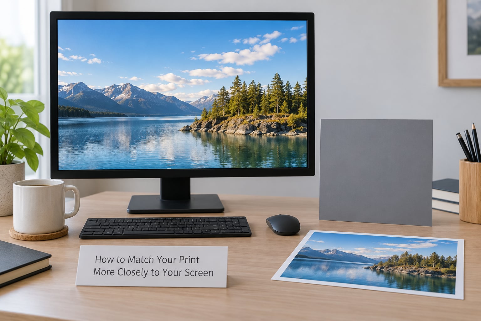
Most of this costs nothing. Do it in order, and stop as soon as the test print agrees with the file.
- Check the file first. Open the histogram in your editor. If the tones are jammed against the left edge, the file is underexposed and no monitor setting will save the print. If the right edge is clipped, you have the opposite problem.
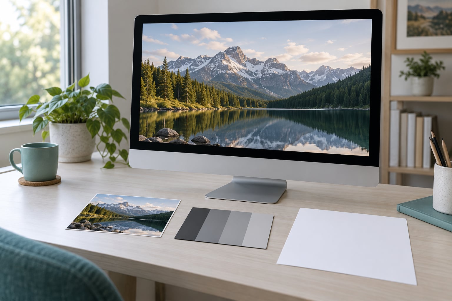
- Set the screen to a printable level. Aim for 100-120 cd/m2, the range photo-editing displays are normally calibrated to. Without a meter, use the rough method: a sheet of white paper held next to the screen should look close to the screen’s white. On a typical monitor that lands the hardware brightness slider around 35-45%.
- Fix the room. Turn off the overhead light, close the blind, and give your eyes a couple of minutes to settle. Any warm or strongly tinted source makes colour judgments unreliable.
- Set the paper correctly in the driver. Select the exact media type and finish. Leave ink density and colour enhancement at their defaults.
- Soft proof before you commit. In Lightroom Classic, choose the printer’s paper profile under View > Soft Proofing, then switch on Simulate Paper White. In Photoshop, use View > Proof Setup for the working CMYK profile and turn on View > Proof Colors, with Gamut Warning on to flag anything the paper cannot hold.
- Print one test strip, not a full sheet. Put a small crop or a scaled-down file on one sheet, containing skin tones, black text on white, a neutral grey patch, a saturated colour, and the deepest shadows you care about. That single sheet tells you more than ten finished prints.
- Compare in room light. Hold the test strip beside the screen at normal distance and look at the white paper, not at the colours first. If the print’s paper white reads darker than your screen’s white, the screen is still too bright.
Software calibration tools are worth adding once the basics hold. They set the display to a known profile and let you soft proof against a paper profile without a hardware sensor.
Which Print and Viewing Choices Help Prints Look Brighter?
You are not chasing a number here, you are removing variables that push the print darker than it needs to be.
Finish. Satin and glossy coatings hold a brighter white and read brighter under normal room light than matte papers do. Matte is not a defect, it is a different look with a lower maximum contrast.
Viewing light level. A print under a bright window shows more of its range than the same print under a dim lamp. Judge it where it will actually hang, not in the brightest room in your house.
Screen brightness. This is the one that moves the most, and it is the one nobody sets. 100-120 cd/m2, roughly 35-45% on a typical slider, is the number the forums keep circling, and it works.
Image exposure. Fix any genuine underexposure in your RAW developer, where you can see a histogram, instead of in a print dialog where you cannot.
Home printer versus lab. A home inkjet gives you control over media type and quality settings, and it needs them set correctly every time. A lab handles the profile and the paper mapping for you, which removes a whole category of mistakes but adds its own rendering choices. A well-run lab print will usually be brighter and more consistent than a home print from the same file.
Nobody promises a perfect match. A reflective print under room light and an emissive display at your desk will never be the same, and the honest goal is a print that looks right on its own terms.
How to Tell Whether the Problem Is Your Screen or the Print
Run this before you change anything in the file. It takes five minutes and it tells you which half of the system to work on.
- Put a neutral grey or white image on screen. A grey card photo, or a plain white wall in a photo. Anything without a colour cast.
- Hold your print next to the screen in normal room light. Compare the whites and the mid greys, not the colours.
- Lower the screen brightness slowly until the two agree. If the print suddenly looks correct, the screen was the problem. If it makes no difference, the print itself is dark.
- Check the print against a second reference. A known-good print of a similar image tells you whether the printer or the paper is behaving oddly.
- Look at the print in a second room. If it looks fine in dim light and dark in bright light, you have a viewing condition problem, not a colour management one.
If the print reads dark under every light and every room, stop and check the histogram. That is a file problem, and it is the one case where editing the original is the right call.
Frequently Asked Questions
Why do my photo prints look darker than the image on my monitor?
Because your screen emits light and the print reflects it. A monitor set near maximum brightness throws far more light at you than a lamp in your room returns off paper, so an image that looks well exposed on screen reads as dark once printed. Lower the display to roughly 100-120 cd/m2 and judge the file again before editing it.
Does matte photo paper always look darker than glossy paper?
Softer, yes, and that is by design. Matte surfaces hold dye rather than resin, giving lower contrast and slightly duller whites, so they usually read a little darker and flatter. Satin and glossy coatings hold a brighter white and more apparent contrast. Neither is wrong; they simply suit different images and different rooms.
Should I increase brightness before sending photos to a print lab?
No. Most labs work from your file using the paper profile and re-render what the paper cannot hold. If you pre-brighten, you fight that process and often end up with a washed-out result. Fix genuine underexposure in your RAW developer, upload a colour-managed file, and pick a paper that suits the image.
Can a dark-looking monitor be the reason my prints look wrong?
It is the most common reason. Forum users on dpreview and talkphotography keep naming screen brightness as cause number one, and one of them put it plainly: calibration works for colour but not for brightness. That means you still have to set the display by eye or by meter for print work, even after you calibrate it.
What is the best way to compare screen images with printed photos?
Put them side by side in neutral room light at a normal viewing distance and compare the white areas first. Hold the print next to the screen, then lower the screen brightness until the two agree. Judge in the place the print will hang, since eye adaptation changes what you see within seconds.
Do I need to calibrate my monitor to make print colors more accurate?
It helps a lot with colour accuracy and only a little with perceived brightness. Calibration fixes colour casts, white point and gamma, and gives you a reliable paper profile to soft proof against. Brightness still has to be set separately, which is why calibrating alone rarely solves a dark-print complaint.
Conclusion
Start with the screen, not the file. Set your display to a printable level around 100-120 cd/m2, view in neutral room light, and print one small test sheet. If the whites on that sheet match the whites on your screen, the problem was your screen all along.
Only once that test agrees is it worth editing brightness in your file. Most of the time you will not need to, and the paper in your drawer will look the way you expected it to.