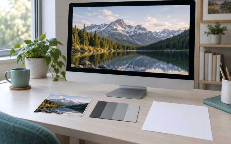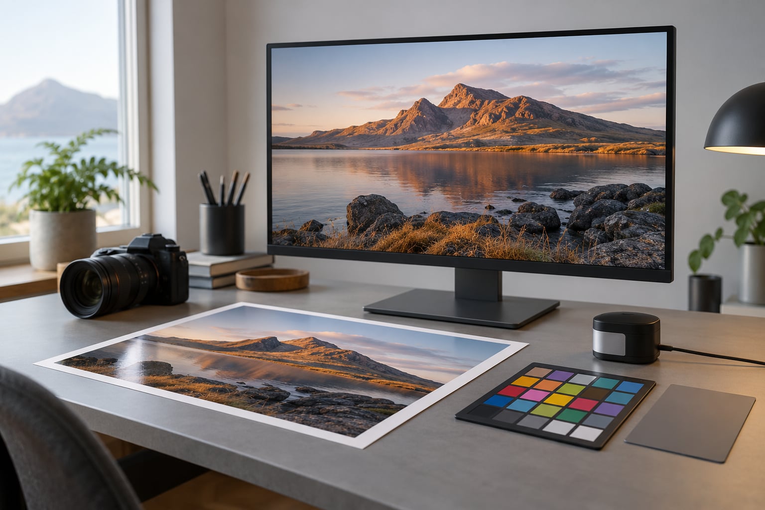
A print can never match your screen exactly, because a monitor emits light while paper reflects it. But you can get close enough that most viewers won’t notice, and — more importantly — you can make that result repeatable every time you hit print. Here is the short version of how to print photos that match the screen: calibrate the monitor, keep the file in a defined color space, soft proof it for the exact paper, then test print and adjust one variable at a time.
One piece of housekeeping before we start. In this guide, screen means your computer monitor or display. If you landed here looking to transfer a photo onto a t-shirt or hoodie, that is screen printing on fabric, a completely different process with its own color rules. This guide is about getting an inkjet, a photo lab, or a print shop to reproduce what you see on your display.
The whole workflow takes about an hour to set up properly, then roughly ten minutes per image once the profile is saved.
And this is the point most guides bury: your printer never sees your screen. It only reads the image file. If your monitor is uncalibrated and you “fix” a color that only ever looked wrong on screen, that correction gets saved into the file and the print comes out permanently wrong. Calibration is what stops the mistake from being baked in.
The entire process in six steps:
- Calibrate the monitor and control the room around it.
- Open the original file and keep its embedded color profile intact.
- Soft proof with the ICC profile for your printer and paper.
- Set the driver, paper type, scaling and output size properly.
- Print a small test and compare it under neutral light.
- Save the setup as a preset and make the final print.
Table of Contents
- What You Need
- Step-by-Step: How to Print Photos That Match the Screen
- 1. Calibrate the Monitor and Set a Stable Viewing Environment
- 2. Start With a Color-Managed Image
- 3. Soft Proof for the Printer and Paper
- 4. Choose the Right Print Settings and Output Size
- 5. Print a Test and Compare Under Controlled Light
- 6. Save the Profile and Make the Final Print
- Common Mistakes That Cause Screen-to-Print Color Differences
- Quick Tips for More Consistent Photo Prints
- Frequently Asked Questions
- Can photo prints match the screen exactly?
- Do I need to calibrate my monitor to get accurate prints?
- Why does my print look more saturated than the image on my screen?
- Should I use the printer’s default paper setting or an ICC profile?
- Is glossy or matte paper better for matching screen colors?
- What should I do if my test print still has a strong color cast?
- Conclusion
What You Need
Color-accurate printing needs four things, and missing any one of them is usually why a “color-accurate” setup still surprises you.
- A monitor you can calibrate — ideally an IPS or similar wide-gamut panel. Bright laptop screens and HDR panels are the hardest to work with.
- A color-managed editing application — Photoshop, Lightroom, Affinity Photo, GIMP, or Capture One all handle embedded profiles and soft proofing properly.
- A printer or lab with an ICC profile for the specific paper you’re using — a profile for the printer alone is not enough, since the paper white changes the result completely.
- The photo paper itself — matte, glossy, and luster surfaces each need their own profile, and switching paper means re-proofing.
On the calibration tool itself, you have four realistic options. They differ a lot more in cost and repeatability than people expect.
| Method | What it needs | Time per session | What you get |
|---|---|---|---|
| Hardware colorimeter | A small USB colorimeter and its software (SpyderX, X-Rite i1Display and similar) | 5 to 10 minutes | A measured display profile you can check and save; the standard choice for photo work |
| Spectrophotometer | A higher-end measuring device plus a good panel | 10 to 20 minutes | Tighter measurements and better results on wide-gamut displays, at a higher outlay |
| Built-in operating system calibration | Nothing — Windows has a Color Management calibration assistant, macOS has the equivalent | 10 to 15 minutes | Better than nothing, noticeably weaker on wide-gamut panels; fine for web work, mediocre for print |
| Manual visual adjustment | Your eyes and a room with controlled light | Unpredictable | No profile, no repeatability; useful only to tame a display that is obviously far off |
Forum consensus on photography boards is consistent on this: monitor calibration is described as solving the large majority of matching problems, and a hardware colorimeter pays for itself quickly because you stop wasting ink and paper on test prints. It is not a cure for an exact match, and nobody sensible claims it is.
Step-by-Step: How to Print Photos That Match the Screen
Follow these in order. Each stage assumes the previous one was done properly, and each one is fixable on its own if the result is still off.
1. Calibrate the Monitor and Set a Stable Viewing Environment
This is the stage that decides whether everything after it works. A calibration done in a bright, curtained-off room against an unconfigured display produces a beautiful profile that describes nothing real.
Start by removing the software interference that silently changes what you see. Turn off Night Shift on Macs, Night Light on Windows, True Tone, auto-brightness, and any HDR or eye-comfort mode. These features shift color temperature as the ambient light changes, and they are one of the most common reasons the same file looks different on two devices sitting side by side.
Let the monitor warm up for 20 to 30 minutes before calibrating. Panels drift as they heat, and a cold panel is not a stable one.
Then set the room. Close blinds, kill direct light on the screen, and aim for roughly the brightness of the room itself. A dim room with a blazing monitor is a common setup and a bad one.
Run the calibration software. For photo printing you want these targets:
| Setting | Target for print work | Notes |
|---|---|---|
| White point | D65 | The standard for screens. Some print-focused workflows offer D50; try both and pick whichever matches your prints when you test |
| Gamma | 2.2 | Anything close to the default is fine |
| Luminance | 100 to 120 cd/m2 | Bright enough to see shadow detail without glaring; match it to your room |
| Black point | Native | Do not force it to zero; crushes shadow detail |
How to verify it worked: close the calibration software and open a neutral gray image. If shadows look blocked up or whites look crushed, your luminance target is too low. Recalibrate at a brighter target before you edit anything.
Give the display a name when you save the profile — something like Photo_Monitor_Calibrated — and set a reminder to recalibrate roughly every month. Profiles drift, and a stale profile is a slow, quiet source of error.
2. Start With a Color-Managed Image
A color-managed image is one that carries a profile describing the space its numbers live in. If your editing application shows the embedded profile name next to the filename, you are in good shape.
Always start from the original. If you edit a JPEG that was already corrected to compensate for a bad display, the damage is permanent. If you have a library of older images, some of them almost certainly carry baked-in corrections, and re-editing from raw with a calibrated display is the only reliable way to undo them.
Leave the source profile alone. If the file is sRGB, edit it in sRGB. If it is Adobe RGB, edit it in Adobe RGB and keep it that way — converting early to “prepare” for print just gives you one extra place for error to enter. Let the conversion happen once, at output, using the printer profile.
Know which colors will never convert cleanly, because that is where people get disappointed:
| Color group | What happens on paper |
|---|---|
| Neons, hot pink, electric purple, saturated oranges and greens | Outside most ink gamuts. They will flatten, dull, or shift hue on every conversion — no profile fixes this |
| Deep saturated blues | Often skew toward cyan or purple, and lose luminosity |
| Blacks | Can only get so dark on matte or luster stock. Glossy gets closer because it reflects more light back at you |
| Reds, mid-tone earth tones, neutrals, grays | Convert predictably and are your best reference when testing a workflow |
How to verify it worked: open the image and check that the application reports the correct embedded profile and working space. If it says “untagged” or asks you to assign one, the file has already been through something that stripped its color information.
3. Soft Proof for the Printer and Paper
Soft proofing means asking your editing application to simulate, on your calibrated display, how the image will look after it goes through the printer profile. You are previewing the conversion before spending anything on paper.
Install the ICC profile your printer or lab supplies for the exact media — “Matte Photo Paper” is a different profile from “Premium Luster” on the same machine. Then in the print module of your application, enable the soft proof (Proof Setup in Photoshop, Soft Proofing under View in Lightroom) and select that printer profile.
Set the rendering intent. Relative colorimetric keeps colors accurate and may clip out-of-gamut detail; perceptual compresses the range to preserve overall relationships and is usually the better choice for photographs with saturated colors. Try relative colorimetric first, and check the areas you care most about.
Turn on gamut warning (View > Gamut Warning in Photoshop) and the areas flagged are the ones that will shift most on paper.
Make restrained corrections — a small saturation drop, a nudge to a specific skin tone — and keep the shadow and highlight detail intact.
What a soft proof cannot show you: paper texture, gloss level, and how ambient light in the room will bounce off the surface. It shows you color, not surface. A matte proof of a glossy print will still read as too dark in real life.
4. Choose the Right Print Settings and Output Size
The print dialog is where good soft proofs go to die. The driver has its own opinion about color, and it will override your careful settings if you let it.
Set the paper type in the printer driver to the actual media you loaded. Not “plain” or “default”. The driver uses this to pick ink coverage and drying behavior, and a wrong setting changes both color and sharpness.
In the driver’s color options, choose Color Management off — or on macOS, “No Color Adjustment” — so the profile and rendering intent you chose in your editing application do the work. Leaving the driver in its default mode is a common double-conversion mistake: your application converts to printer space, then the driver converts again.
Turn on borderless printing if you want full-bleed edges, and check the driver’s scaling setting. Most default to “fit to paper,” which crops rather than fits. If you want the whole frame, choose fit without cropping, or set the size yourself.
Match your print size to its intended viewing distance. A 13 by 19 inch print deserves 200 to 250 effective pixels per inch, which is 2600 pixels on the long edge; viewed from across a room, 150 ppi is plenty and saves you pixels you will never resolve. If you are printing an 8 by 10, roughly 200 ppi means about 1600 pixels on the long edge.
How to verify it worked: print a small crop with a skin tone, a neutral gray, and one saturated color. If it is off, the driver is the first place to suspect, not the image.
5. Print a Test and Compare Under Controlled Light
Print a 4 by 6 or 5 by 7 crop, not a full-size sheet. You are looking for the dominant error, and a small print shows it faster and cheaper.
Now the part people skip: the comparison itself has to be fair. Screens emit light, paper does not. Stand the print up next to the display in the same neutral light, at the same distance, with nothing colored nearby. Daylight-balanced lighting around 5000 to 5500K is right; a warm living room lamp at 2700K will make your carefully calibrated print look yellow and your screen look blue.
Identify the dominant mismatch, not every mismatch. It is almost always one of these: overall too dark, an overall color cast, or low saturation and a washed-out look. Fix that one thing, adjust in small steps, and print again.
Do not chase a perfect match on a saturated sky or a neon sign. Adjust neutral tones first, because your eye is far more sensitive to errors in gray than in color.
Photographers on photography forums report that even with a calibrated monitor and the correct ICC profiles, a residual mismatch often remains, and their conclusion is usually the same one: aim for consistent results across orders, not a pixel-identical match. That is the achievable goal.
6. Save the Profile and Make the Final Print
This is the step that turns knowing how to print photos that match the screen into something you can repeat. Save your corrected file as a separate file, and save the whole setup as a preset: the soft proof profile, the rendering intent, and the printer settings. The next time you open that paper stock, you should be able to reproduce the result in one click.
Confirm the paper is loaded and the driver paper type matches it, then print at full size. Check the first print against your reference crop before running a whole batch.
Archive three things together: the calibrated monitor profile name, the printer and paper ICC profile, and the corrected master file. When you reorder from a lab eight months later, that trio is what makes the second order look like the first.
One note specific to labs and print shops. When you upload, your file should be embedded and in a space the lab expects — sRGB for most consumer labs, and often ProPhoto RGB or Adobe RGB for higher-end ones. Many labs will not adjust color at all, by policy. Ask what profile they use, and ask whether they disable automatic corrections on upload. That single question resolves a lot of surprise orders.
Common Mistakes That Cause Screen-to-Print Color Differences
Almost every mismatched print traces back to one of a small number of causes. Work down this list before you touch your image again.
- Editing on an uncalibrated monitor. You “correct” a color that only looked wrong on your display, and the error is saved permanently. Fix: recalibrate, then re-edit from the original or raw file.
- Screen-level interference. Night Shift, True Tone, night light, and auto-brightness change color after calibration. Fix: turn them off before evaluating anything.
- Wrong paper profile, or no paper profile. A printer profile alone does not describe matte versus glossy versus luster. Fix: install and select the profile for the exact media.
- Double color management. Your application converts to printer space and then the driver converts again. Fix: turn driver color management off.
- Comparing the print in bad light. Warm household lighting invents a yellow cast that isn’t in the file. Fix: neutral daylight-balanced light for comparison.
- Over-saturating to compensate for a bright screen. A dim print feels dull next to a glowing display, so you push saturation, and the print comes out garish. Fix: dim the screen to your room before judging, and leave the file alone.
- Wrong paper for the image. Matte stock holds blacks well but looks flatter; glossy pops but reflects whatever is in the room. Fix: soft proof the specific surface.
- Skipping the test print. A full-size sheet costs far more than a small crop. Fix: always test first.
If you are not sure which stage introduced the shift, use this to bisect it:
| Symptom | Most likely stage | Fix |
|---|---|---|
| Everything too dark, shadows blocked | Monitor luminance too low, or no calibration | Recalibrate at 100 to 120 cd/m2, set black point native |
| Overall yellow or warm cast | Warm viewing light or a warm monitor white point | Re-evaluate under neutral light; recalibrate at D65 |
| Overall blue or cool cast | Night Light or Night Shift still enabled, or paper profile mismatch | Turn off night modes; select the correct paper profile |
| Washed out, low contrast, dull | Driver color management double-converting, or matte paper under bright light | Disable driver color management; soft proof the actual surface |
| One color badly off, everything else fine | Out-of-gamut color, or an edit made before calibration | Check gamut warning; re-edit from the original file |
| Correct at home, wrong from the lab | Wrong upload space, or the lab applied its own correction | Confirm the lab’s expected profile and their auto-correction setting |
Quick Tips for More Consistent Photo Prints
- Edit in the file’s own wide-gamut space when the source supports it. Working in a narrow space clips colors you cannot get back.
- Never edit over the original. Save corrections to a new master and keep the untouched file beside it.
- View prints at their final size. A 16 by 20 print judged on the desk is judged wrong; stand it up at the distance it will hang.
- Order a physical swatch before a big run. Labs will often mail a small print or a paper sample so you can check the profile against your own display.
- Build a reference image. Keep one file with neutral grays, skin tones, and a saturated color. Print it after every monitor recalibration, before you trust a new setup.
- Check the same file on your phone and laptop. If the color jumps around between devices, the problem is uncalibrated displays, not the image.
- Recalibrate on a schedule, not a symptom. Monthly is the pattern most people land on, and it takes under ten minutes.
- For black-and-white prints, convert deliberately. A Lab-based grayscale conversion with a channel-mixing curve gives far better control than desaturating in RGB, and color filters let you warm or cool the tone on purpose.
- Set printer ink limits high, not low. Heavily restricted ink produces weak blacks and a dull, gray-looking image, which is a common home-inkjet complaint.
Frequently Asked Questions
Can photo prints match the screen exactly?
No. A monitor emits light directly and a print reflects light bounced off paper, so the two are physically different. A good calibrated setup gets you close enough that most viewers will not notice, and gives you repeatable results across every print. Aim for consistency rather than a pixel-identical match.
Do I need to calibrate my monitor to get accurate prints?
You need it if you want repeatable color, and calibration is what stops you from baking errors into your files. A hardware colorimeter takes five to ten minutes per session and a monthly cadence is plenty. Built-in operating system calibration is better than nothing but noticeably weaker on wide-gamut displays.
Why does my print look more saturated than the image on my screen?
Screens add light to build color, so they can produce brilliance that ink cannot reproduce. When the printer maps those out-of-gamut colors into its own range, the result often comes out flatter and sometimes oddly saturated in one hue. Expect neons, hot pinks, electric purples and saturated oranges to shift no matter what you do.
Should I use the printer’s default paper setting or an ICC profile?
Use the ICC profile, and always the one for your exact paper. Paper white changes the result more than most people expect, so matte, glossy and luster need separate profiles. Set the driver paper type to match the media you loaded, then turn the driver’s own color management off so your editing application stays in control.
Is glossy or matte paper better for matching screen colors?
Neither matches the screen better by default. Glossy reflects more light back at you, so it can reproduce deeper blacks and look closer to a bright display, but it mirrors the room. Matte holds fine detail and avoids reflections but reads flatter. Soft proof the specific surface, because paper white differs between them.
What should I do if my test print still has a strong color cast?
Work outward from the cheapest fix. Confirm night modes are off, view the print under neutral daylight-balanced light, and check the paper profile and driver paper type. If the cast persists, recalibrate the monitor and re-test. Only then adjust the image, and change one variable per test print.
Conclusion
Do these four things, in this order, and most of your mismatches disappear. Calibrate the monitor and turn off night modes and auto-brightness. Select the ICC profile for the exact paper you are loading, not just the printer. Soft proof with relative colorimetric intent and fix the out-of-gamut colors while you can still see the warning. Then print a small test, compare it beside your display in neutral light, and change one variable at a time.
Save that setup as a preset, recalibrate monthly, and keep the profile, the paper, and the master file together. That is how to print photos that match the screen — not once by luck, but every time.