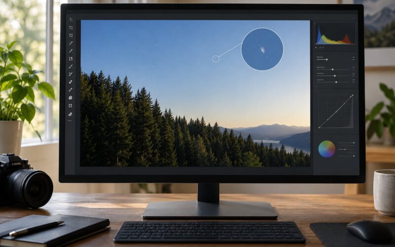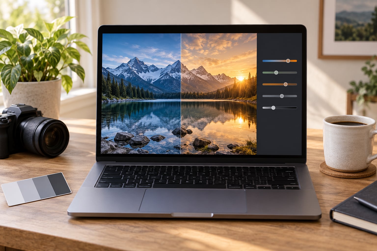
A warm grade comes down to three moves: warm the white balance a little, push yellow into the highlights, and let the shadows drift slightly cool. Do those three things in that order and most photos land somewhere believable in about ten minutes of slider work.
The reason most warm grades go wrong isn’t the wrong settings. It’s the order. If you warm an image before you fix exposure, you end up chasing color problems that were really tonal problems all along. Below is the workflow I use, written for Lightroom Classic, Adobe Camera Raw and Photoshop, but the same seven steps translate cleanly to Affinity Photo, Capture One, or the mobile versions of those apps.
Table of Contents
- What You Need
- Step-by-Step: How to Color Grade for a Warm Look
- Step 1: Set Up a Non-Destructive Workflow
- Step 2: Correct the White Balance First
- Step 3: Balance Exposure, Highlights, and Shadows
- Step 4: Add Warmth Without Oversaturating
- Step 5: Refine Contrast and Color Balance
- Step 6: Check Skin Tones and Avoid Clipping
- Step 7: Make Final Checks and Export
- Common Mistakes
- Frequently Asked Questions
- What is the best way to make a photo look warm?
- Should I adjust temperature or use a warm filter for a warm look?
- How do I make a warm color grade without making skin look orange?
- Can I color grade for a warm look in Lightroom or Photoshop?
- Do I need a preset to create a warm photo edit?
- How much warmth should I add to a photo?
- Conclusion
What You Need
- A non-destructive editor. Lightroom Classic, Adobe Camera Raw, Photoshop, Affinity Photo or Capture One all expose the same core controls: temperature, tint, vibrance, highlights, shadows, whites and blacks.
- The RAW file. JPEG has almost no room to move a white balance without breaking up. RAW gives you a couple of stops of tolerance before colors clip.
- A comparison view. Most of these programs can show a split-screen before and after, or a single-key press for a backslash. Use it constantly, because your eyes adapt to a grade within seconds.
- An optional neutral reference. A white shirt, a grey card or a silver car in the frame tells you instantly whether “warm” has tipped into “orange.”
- Ten minutes and a cold cup of coffee. Warm grades are quick work. Overthinking is what takes the hour.
Step-by-Step: How to Color Grade for a Warm Look
Step 1: Set Up a Non-Destructive Workflow
Duplicate the file before touching a single slider, or work inside the adjustment stack your editor already provides. In Lightroom that’s a virtual copy; in Camera Raw it’s the edit settings panel; in Photoshop it’s a smart object or a camera raw filter layer above the original.
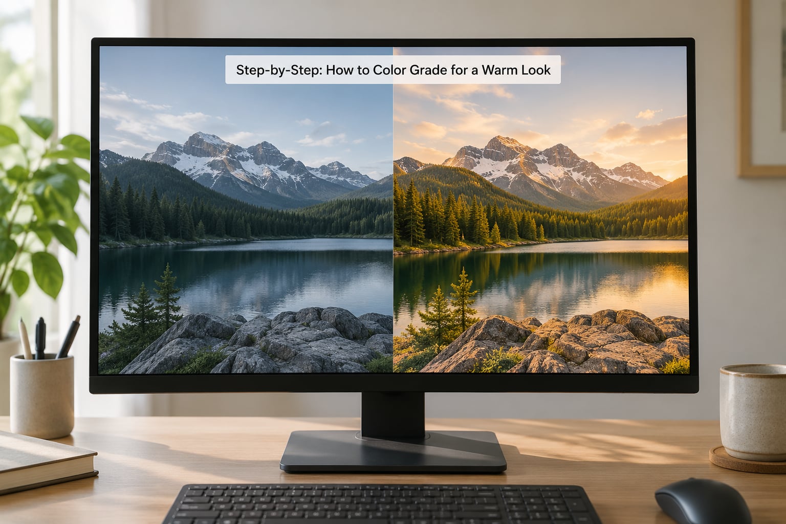
Then split the screen. Grading without a side-by-side is how you end up with a grade that looks extreme while you’re making it and slightly radioactive once you’re done.
Step 2: Correct the White Balance First
Push the temperature slider toward the warmer end, usually by small steps of about 100 to 300 Kelvin from the as-shot value. Add a touch of magenta on the tint slider, often 3 to 8, because too much of a pure yellow push turns skin sallow.
The test is simple: find the brightest neutral surface in the frame. A white wall, a cloud, a sheet of paper. If it has gone cream or tan, you’ve gone a step too far. Back off half a step and check again. If you can’t find a neutral reference, that’s usually because the shot is indoors under mixed lighting, which is a different problem with a different fix.
Step 3: Balance Exposure, Highlights, and Shadows
Set exposure so the midtones sit where you want them, then shape the range. Pull highlights down if bright skies or windows are stacking up, lift shadows if the foreground is crushed, and treat whites and blacks as your brightest and darkest anchors.
Warm grades hide bad tone better than any other grade, which is exactly why you should fix tone first. Muddy shadows stay muddy under a warm cast. A file that was properly exposed usually needs only a fraction of the correction once warmth goes on.
Step 4: Add Warmth Without Oversaturating
This is where most people do too much. To color grade for a warm look properly, keep the global saturation slider alone for the first pass and use vibrance instead. Vibrance lifts the muted colors hardest and leaves the already-strong ones nearly alone, which is exactly the behavior you want on foliage, fabric and sky.
Start at vibrance plus 10 and watch what happens. If greens look radioactive, vibrance is not your problem. You need a targeted HSL adjustment: pull saturation and luminosity down on the green swatch, nudge the orange swatch toward yellow, and pull a little blue out of the shadows.
Sunset and golden-hour shots usually need less color work than you’d think. The light already did most of it, and adding more is how a beautiful frame turns into a filter.
Step 5: Refine Contrast and Color Balance
Add modest contrast with the contrast slider or a gentle S-curve, then look at what the contrast did to color. Higher contrast usually means darker, denser shadows, and dense shadows are where warm grades get muddy and brown.
If you want a more cinematic finish, this is the point for split toning. Warm the highlights with a touch of amber and cool the shadows with a small amount of steel blue. That’s the teal-and-orange structure that so many blockbuster films use, and it works because blue and orange sit opposite each other on the color wheel. Keep the shadow shift subtle. In a JPEG-era social feed, a heavy shadow tint reads as a mistake, not a choice.
Step 6: Check Skin Tones and Avoid Clipping
Zoom to a face at 100 percent and look at it for a few seconds. Skin should still look alive. If it has gone orange, brown or brick red, the warmth is coming from the wrong place.
The fix is nearly always to reduce the global temperature shift and warm only the highlights and midtones instead. A quick HSL adjustment targeting the orange and red swatches, dropping saturation a few points and pulling luminance up slightly, rescues most faces without touching the rest of the frame.
Then check for clipping. Pull up the histogram or the histogram panel in your editor and look at both ends. If either edge is piled against the wall with many pixels stacked there, pull that channel back until the pile loosens. Clipped red is the number one reason a warm grade looks cheap.
Step 7: Make Final Checks and Export
View the image at full size, then step back to fit it on screen. Both views catch different problems. If you have a second screen or a phone nearby, check there too, because a grade that looks warm on a calibrated desktop often reads as neutral on a phone.
Turn every adjustment off with a single key press and look at the original. Then turn it back on. The grade should be an improvement you can name, not a change you hope nobody notices. Export a properly saved copy, keep the working file, and you’re done.
Common Mistakes
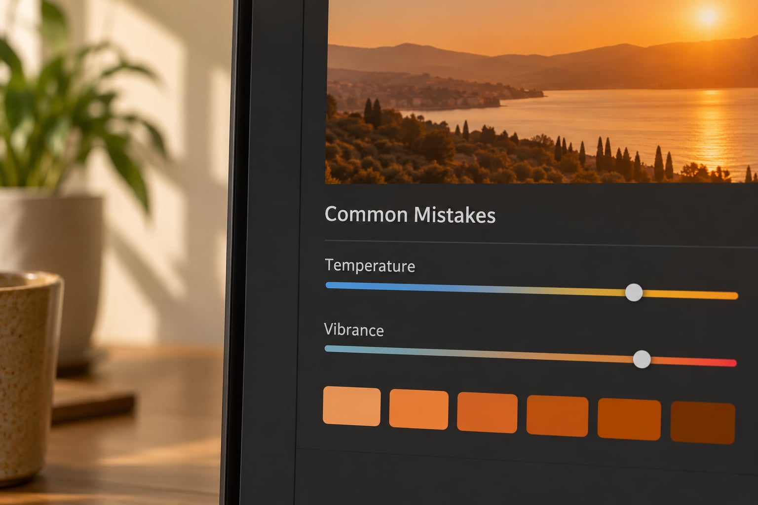
Everything goes orange. The classic failure. Temperature shifts affect the whole image, including anything neutral. Fix: cut the global temperature shift in half and move the warmth into highlights and midtones, where real golden light actually lives.
Saturation everywhere. A blanket boost turns a nice warm grade into a poster. Fix: use vibrance instead of saturation, and treat green and blue swatches in the HSL panel before you touch orange.
Warming shots that are already warm. Sunset frames and golden-hour portraits rarely need a color push. Fix: start every grade by asking whether the light is already the color you’re trying to create. If it is, work on contrast and clarity instead.
Over-using contrast. Dark shadows plus warm tones equals mud. Fix: back off the contrast slider and lighten the black point slightly until shadow detail returns.
Ignoring skin tones. The reason a grade gets rejected fastest. Fix: check a face at 100 percent at the start and again at the end, and correct the orange and red swatches before you export.
Forgetting what happens on export. An image graded in a wide color space and posted without conversion can shift noticeably on different platforms. Export in sRGB for web and social, and keep your working file in the wider space if you have one.
A few more things worth knowing. Presets are a starting point, not a grade. Auto tools, whether that’s a phone’s auto adjust or an AI one-click warm filter, are quick but blunt, and professionals tend to use them as a first pass at most. And if you’re grading a set of photos from one shoot, build one adjustment on the first image and copy it across the batch, then fine-tune each one from there. Consistency is the whole point of a warm look across a series.
Frequently Asked Questions
What is the best way to make a photo look warm?
Warm the white balance first, keep the global shift small, then add warmth through vibrance and highlights rather than saturation. Add a hint of cool in the shadows for color contrast. Check a face and any white surface before you export, because orange skin and cream-colored walls are the two things that give a warm grade away.
Should I adjust temperature or use a warm filter for a warm look?
Adjust the temperature slider yourself. A warm filter is a fixed overlay that tints everything equally, including skin, food and neutral walls, and it gives you no room to pull warmth back where it does not belong. Temperature plus vibrance plus a selective adjustment takes about the same time and stays believable.
How do I make a warm color grade without making skin look orange?
Reduce the global temperature shift and move the warmth into the highlights and midtones instead. If skin is already orange, use the HSL panel: pull saturation and luminance down slightly on the orange and red swatches. Warm grades built this way still read as golden, but faces stay alive.
Can I color grade for a warm look in Lightroom or Photoshop?
Yes, and both use the same core controls: temperature, tint, vibrance, highlights, shadows, whites and blacks. Lightroom Classic works on the whole catalog and syncs recipes across a shoot. Photoshop is better when you want to mask skin or shift one color range only, using a camera raw filter layer or an HSL adjustment layer.
Do I need a preset to create a warm photo edit?
No. A preset saves about a minute on a first pass, but it applies the same numbers to every image, including the shots that do not need them. Manual sliders let you match warmth to the light in each frame. Learn the sliders first, then use presets when they are already close.
How much warmth should I add to a photo?
Enough that a white surface in frame reads slightly cream rather than pure white, and no more. In practice that is usually a temperature shift of 100 to 300 Kelvin from the as-shot value, plus vibrance around plus 10. If you notice the warmth immediately, you have probably passed it. Step back to five steps.
Conclusion
Start with the white balance and keep the global temperature shift small. Add warmth through vibrance and highlights, give the shadows a touch of cool for contrast, and keep checking faces and white surfaces along the way. Small, deliberate adjustments in that order are what separate a warm grade that looks intentional from one that just looks orange. Export in sRGB, compare it on a second screen, and be done.