Monitor calibration is the process of measuring your display and adjusting it so it reproduces colour accurately and predictably, usually by creating a device-specific ICC profile that tells your software exactly what this screen can and cannot show. For photographers it is the difference between judging an image with data and judging it with a guess.
Most laptop and desktop screens ship in a bright, punchy mode tuned to look good in a shop. That mode is not wrong for browsing, but it will lie to you about contrast, saturation and highlight detail. Calibrating takes about twenty minutes and fixes the parts of the display that software sliders cannot reach.
This guide covers what monitor calibration for photographers actually does, how the process works, how to run it step by step, and what it genuinely cannot fix for you.
Table of Contents
- What Is Monitor Calibration for Photographers?
- Why Does Monitor Accuracy Matter in Photo Editing?
- How Does Monitor Calibration Work?
- What Is Monitor Calibration for Photographers Used For?
- Hardware Calibration vs. Software Calibration
- What Display Features Should Photographers Prioritize?
- How to Calibrate a Monitor for Photo Editing
- How Often Should You Recalibrate Your Monitor?
- What Should You Do If Calibration Does Not Fix Your Colors?
- Frequently Asked Questions
- Do photographers need to calibrate a laptop screen?
- Is a built-in monitor calibration enough for editing photos?
- Does monitor calibration guarantee that colors will match in print?
- How bright should a monitor be for photo editing?
- Should HDR mode be used for photo editing?
- Do photographers need an expensive colorimeter to get accurate colors?
- Conclusion
What Is Monitor Calibration for Photographers?
Monitor calibration for photographers is the measurement and correction of a display’s colour output so that a known colour sent to the screen appears on the screen as that colour, within a small measurable tolerance.
That is the whole idea. It sounds simple, but two different panels showing the same file will display it differently even when they came out of the same box, and factory panels vary far more than the marketing suggests. One may have a green cast, another lifted blacks, a third a slightly blue white. Calibration measures what your specific panel is actually doing and writes an ICC profile describing it, so colour-managed software can compensate for what it can.
It is worth separating this from the adjustments most people already make. Lowering brightness and picking a “warm” setting from the on-screen menu is adjustment. Adjustment moves sliders. Calibration measures the result against a reference and tells software what to do about the difference. Adjustments you can repeat by eye; calibration produces a file that lives in your system and applies itself every time you open an image.
Two more distinctions trip people up. Calibration is not the same as colour management. Colour management is the system that translates between an image’s colour space and a device’s gamut; calibration is the act of making one device behave properly inside that system. And calibration is not a repair job. It will not fix a panel with dead subpixels, an uneven backlight or a failing power supply.
Why Does Monitor Accuracy Matter in Photo Editing?
Because nearly every editing decision you make is a decision about how much of something to remove. Brightness, contrast, saturation, sharpening, recovery of shadows, highlight roll-off. If the display is wrong, you will systematically remove or add the wrong amount, every single time you open a file.
The practical failures show up in predictable places. Clipped highlights look recoverably textured on an over-bright screen and turn into flat white in the output. Shadows that look open on screen go muddy and dense in print. Skin tones that read slightly warm on your monitor come out orange. These are not random errors; they are the signature of an uncalibrated display pushed too hard.
Consistency is the quieter problem. If your monitor drifts between sessions, or if you edit part of a project on a laptop and the rest on a desktop, the same grade applied twice will not look the same twice. Photographers doing client work feel this immediately, because someone else will eventually view the file on hardware you do not control.
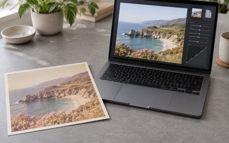
Prints are where the gap becomes undeniable. A screen emits its own light, which makes blacks look deeper than they will on reflective paper. Even a perfectly profiled monitor will not predict a print exactly, which is what soft proofing exists to address. But an uncalibrated screen makes the mismatch much larger, and it makes it impossible to tell whether a disappointing print is the printer’s fault or yours.
The other reason worth knowing: colour management needs something to manage. An ICC profile is only as useful as the measurement behind it. Without calibration, colour-managed software is interpreting a display nobody has described, and the results are worse than doing nothing deliberately.
How Does Monitor Calibration Work?
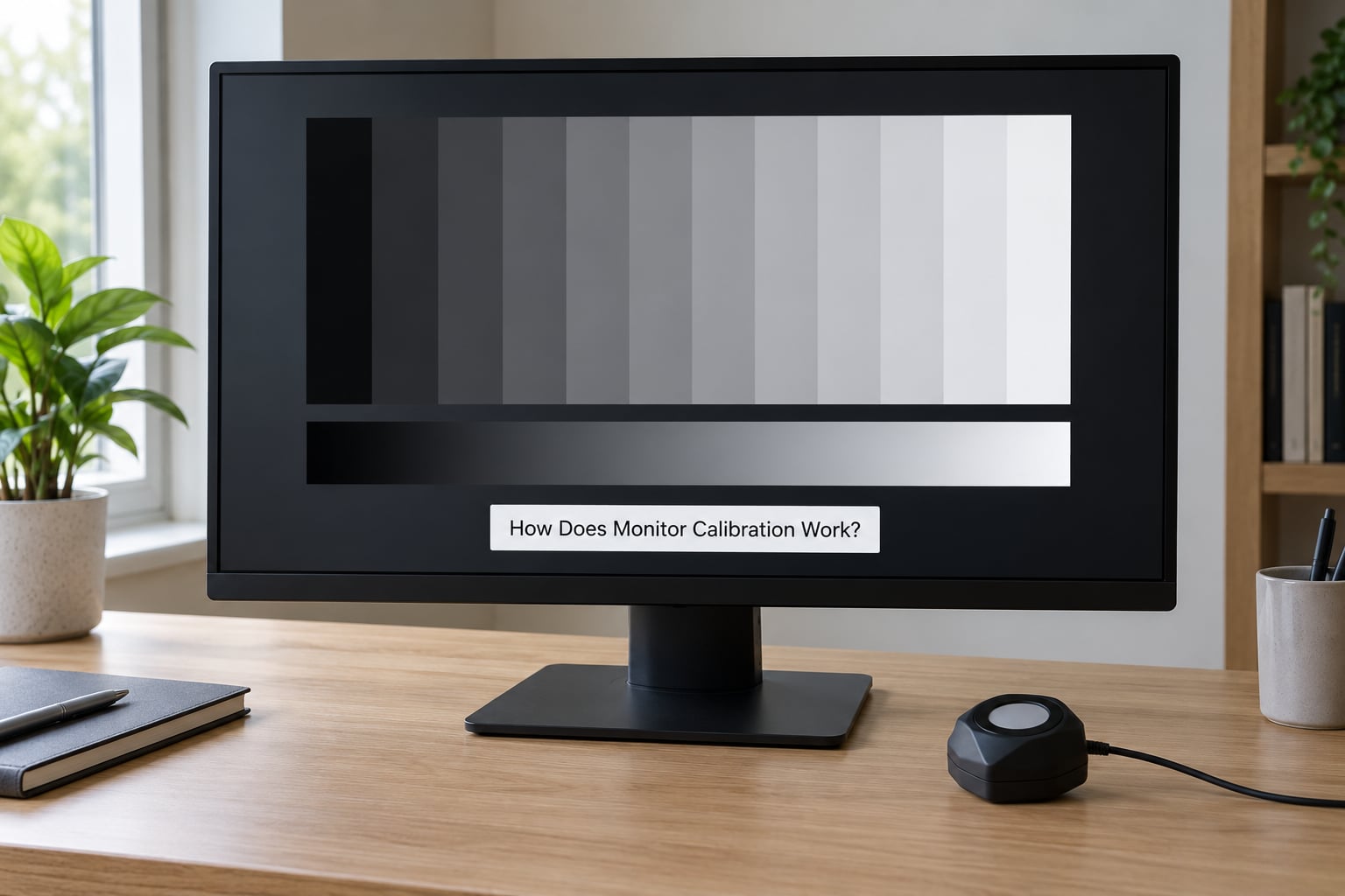
Hardware calibration runs in four stages. The software shows a series of known colour patches on the screen, a measuring device reads what actually came out, the software compares those readings to the ideal values, and then it builds a profile that closes the gap as far as the panel allows.
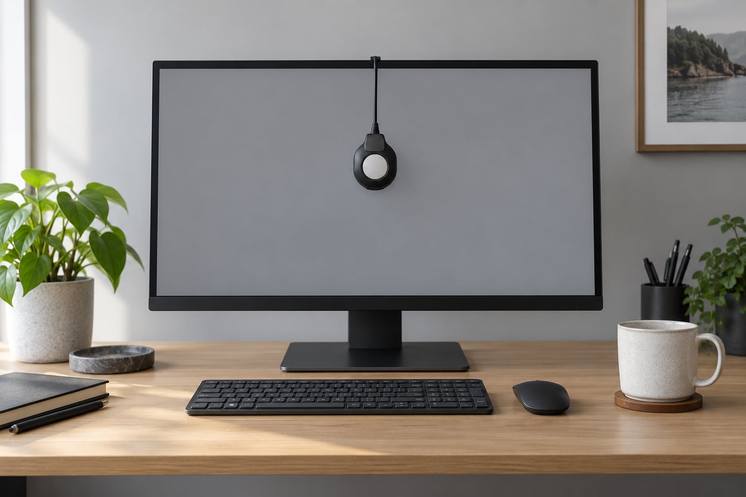
A colorimeter is a small optical sensor that clamps to the screen and reads light as it is emitted. A spectrophotometer does something similar but breaks the light into components, which is why it can also measure printed material and reflected light. For display work, a colorimeter is the usual choice; the extra capability of a spectrophotometer matters if you are also building printer profiles.
Those patches form a ramp from black to white in small steps, followed by patches of pure red, green and blue and a grid of mixed colours. The first pass measures the display’s current gamma curve and black point. The software then calculates what adjustment will bring the output closest to the target, applies it to the graphics card or the panel’s own controls, and measures again. It repeats this until the error is small enough to accept.
At the end, the profile is written as an ICC file and attached to the display in your operating system’s colour settings panel. From then on, colour-managed applications read it automatically. Applications that are not colour-managed ignore it entirely, which is worth remembering when you are troubleshooting.
One practical note: the profile does not make your display cover more colours. If the panel cannot reach a saturated red, the profile records that limit and software avoids asking it to. Calibration improves accuracy inside the gamut you already have; it cannot expand the gamut itself.
What Is Monitor Calibration for Photographers Used For?
Colour correction and grading come first. When you are matching a white point or neutralising a colour cast, you are adjusting values until the screen looks right, and you need the screen to be right first.
Soft proofing uses the profile to simulate how an image will look on a specific paper and press while you still have the RAW file open. The simulation is only as good as the printer profile it relies on, but a calibrated display is a precondition.
Matching a laptop to an external monitor is quietly the most common real-world reason people buy a colorimeter. Editing on a laptop in a cafe and finishing on a desktop at home otherwise means two different grades for the same project. If you calibrate both to the same targets, the two screens agree closely enough to work across.
Consistent output preparation is the quiet benefit. Exporting for a print lab, a client gallery or a specific web space all depend on knowing what your screen is doing. Photographers who only post to a phone-shaped social feed will notice little difference. Everyone who prints or hands files to someone else will notice it immediately.
Hardware Calibration vs. Software Calibration
Software calibration means using what already ships with your system: the visual match routines in macOS or Windows, or an on-screen eyeball adjustment in your editing software. Hardware calibration means measuring with a colorimeter.
| Factor | Built-in visual adjustment | Manual eyeballing | Hardware colorimeter |
|---|---|---|---|
| How accurate | Moderate; good enough for general use | Depends entirely on your eyes and the room | High; typical result within a small Delta E of target |
| Cost | Included with the system | Included with the system | A one-time hardware purchase plus software |
| Time | 15 to 30 minutes | Under 10 minutes | 20 to 30 minutes, then a minute monthly |
| Needs a controlled room | Yes, strongly | Yes, absolutely | Less sensitive, but still best in controlled light |
| Matches a second display | Poorly | Poorly | Well, when both are set to the same targets |
| Verifiable | No | No | Yes, the software reports measured error |
| Suits | Viewing and general work | Casual checks | Colour-critical editing, printing, client work |
The choice is simpler than the marketing makes it. If you do not print, do not deliver colour-critical work and edit on one screen, the built-in system tool is genuinely fine. If you do any of those things, the hardware route is the only one that produces a result you can trust and check.
There is also a free middle path worth knowing. DisplayCAL, built on the ArgyllCMS engine, will drive many older colorimeters that their original software no longer supports. It is not as polished and the documentation assumes some technical comfort, but it can rescue hardware you already own.
What Display Features Should Photographers Prioritize?
Colour gamut coverage comes first. A wide gamut display can show the saturated blues and greens that sRGB cannot, which matters if you shoot in Adobe RGB or work in a cinema-style space. Editing in a wide gamut space on an sRGB screen means the software compresses everything to fit, and you lose the precision you were aiming for.
Factory calibration matters more than panel spec sheets suggest. Many manufacturers now ship displays with a measured ICC profile embedded in the monitor itself, so the panel is neutral and close to correct out of the box. That profile only applies on that display, on that computer, in the software it was made for, but it gives you a good starting point instead of a panel that needs everything undone.
Brightness range and stability come next. You need the display to reach and hold a consistent, moderate brightness without drifting during a session. Panels that ramp their brightness as they warm up make repeated calibration pointless, and cheap panels with a limited dimming range cannot be set low enough for print work.
Uniformity matters at the edges. A panel that is dimmer in the corners can make you crop out shadows you did not need to. On a matte panel this is subtle; on a glossy one it can be obvious in reflections.
Finish is a preference with a real trade-off. A matte surface scatters reflections and works in a normally lit room, which is where most people edit. A glossy surface gives you deeper blacks and higher perceived contrast but behaves like a mirror under any light source. Whichever you choose, work in a room where you can control reflections.
Panels with built-in hardware calibration, where the display adjusts its own internal LUT and saves the result, are worth considering if you edit across several computers. Be aware that some cheaper colorimeters cannot drive hardware calibration on certain brands because of firmware locks, so check compatibility before buying.
How to Calibrate a Monitor for Photo Editing
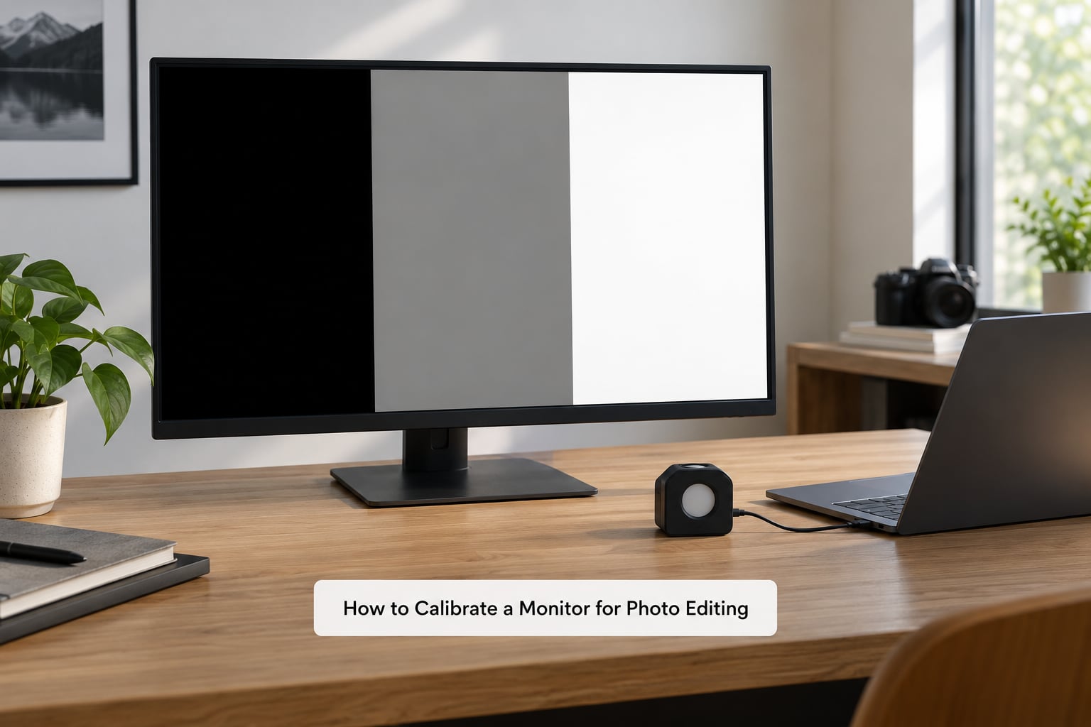
Before you start, decide your targets. For photo editing, a luminance around 100 to 120 cd/m2 in a dim room is the working standard, with a white point near 5000K to 6500K and a gamma of 2.2. ISO 12646 is the standard photographers’ displays are often evaluated against.
| Setting | Typical photo editing target | Notes |
|---|---|---|
| Luminance | 100 to 120 cd/m2 | ISO 12646 reference condition; lower if your room is dark |
| White point | D65, roughly 6500K | 5000K gives a warmer, print-like look many photographers prefer |
| Gamma | 2.2 | The sRGB standard; video work often uses 2.4 |
| Black point | As low as the panel allows | A true 0 is unrealistic on most displays |
| Colour space | sRGB for web, Adobe RGB for wide-gamut work | Match your editing space and your delivery target |
| Ambient light | Neutral, roughly 10 to 30 lux | No daylight, no coloured walls directly behind the screen |
Now the workflow itself.
- Warm up the display. Leave it on at your normal brightness for at least 30 minutes before measuring. Panels cool down and shift colour as they settle, and calibrating a cold panel gives you a profile that will be wrong within the hour.
- Control the room. Close blinds, turn off coloured lights and aim for a neutral wall behind you rather than behind the screen. Reflections on a glossy panel are the single biggest source of error and they are entirely your fault to remove.
- Reset the display to factory settings. Put brightness at the manufacturer’s reference, colour temperature at neutral, and disable any vivid, punchy, cinema or eye-saver mode. Those modes exist to attract buyers in a showroom.
- Set your target brightness. In a dim room, roughly 100 to 120 cd/m2. Most calibration software can measure and set this itself, which is better than guessing with the monitor’s own menu.
- Run the colorimeter. Clamp the device flat against the screen in the centre, let it settle, and follow the measurement sequence. Keep the room still and the screen untouched; a bumped desk is a ruined run.
- Let it build the profile. The software will adjust, re-measure and iterate. It will then offer a save location and a descriptive name. Name it something you will recognise later, tied to the device and the date.
- Set it as the display’s profile. Go to your system’s colour settings panel, select the display, assign the new profile to it and set it as the default for that device. This step is skipped surprisingly often.
- Work in a colour-managed application. Lightroom, Capture One, Photoshop and most modern browsers will read the profile automatically. An application that ignores colour management will ignore your calibration too.
- Verify before you trust it. Open a test image or step wedge. Blacks should be genuinely black, the grey ramp should show smooth transitions without banding, whites should be white without looking clipped, and skin tones should look like skin. If it looks duller and slightly brown after calibration, that is usually correct.
That last point deserves emphasis, because it is the most common source of confusion. A factory monitor is deliberately oversaturated and bright. A correctly calibrated one at a print-appropriate brightness looks flatter than that. Forum threads about calibration describe this shift repeatedly, and many first-time users assume something broke.
If you work in a wide gamut space, calibrate against the same gamut you edit in. A profile built for sRGB will fight a wide gamut workflow and leave saturated colours looking flat, which is not a hardware fault.
How Often Should You Recalibrate Your Monitor?
Monthly is a reasonable default for active editing, and forum practice broadly reflects that, with some people settling on every six to eight weeks. But the honest answer depends on what is actually drifting.
Panels drift slowly. Backlight output falls a little over years and colour stability shifts with heat and ageing. The change over a month is usually small enough that you will not notice it in a comparison, which is why a monthly check costs little and catches drift before it becomes habit-forming.
Recalibrate sooner when the environment changes. A new desk lamp with a warm bulb, moving the monitor to a different wall, or a workspace that is now sunlit in the afternoon will all shift your results. Temperature matters as much as light level.
Recalibrate when you change what you are doing. Moving from web delivery to print work, or starting to edit in Adobe RGB after working in sRGB, means your targets have changed and the old profile no longer matches.
Recalibrate when you see the symptom. If an edit that looked right last month now looks flat or dark, and nothing else changed, that is the drift. Comparing the same image across weeks catches this earlier than any scheduled interval would.
There are two cases where frequency does not matter much. A well-built panel with an embedded factory profile on a stable desk may hold accuracy for a year or more before it needs help. And an older colorimeter that no longer has supported software is not going to become accurate again, so re-running a broken tool changes nothing.
What Should You Do If Calibration Does Not Fix Your Colors?
Work through these in order, because most complaints about calibration resolve into one of them.
Confirm the profile is actually loaded. Open your system’s colour settings panel and check the display is assigned to the new profile, not to a vendor profile or to none. This single mistake causes more confusion than any other, and it looks identical to bad calibration.
Check the application is colour-managed. A viewer that does no colour management shows raw numbers and ignores both profiles. Browsers are usually fine, but browser colour management has its own quirks: some viewers ignore a monitor’s brightness and simulate a brighter white, which makes every image look washed out on a correctly dimmed display. Toggle the viewer setting off and compare.
Reconsider brightness before anything else. Prints looking darker and more saturated than the screen is almost always a too-bright display rather than a faulty profile. Reduce brightness toward the 100 to 120 cd/m2 target and let the image settle before you judge colour again.
Remove the ambient light problem. A calibrated screen in a sunlit room is a contradiction. If the image looks different at night versus midday, no profile will fix that; the environment has to change.
Rule out display modes and picture settings. Night mode, eye comfort, adaptive brightness, HDR toggling and auto brightness will all fight a fixed profile. Disable them and leave the display at a fixed output level.
Test the hardware path. A different cable, a different graphics output or a different machine is a quick way to separate a panel problem from a software problem. If the image looks right on another computer, the issue is in the profile path, not the panel.
Accept the laptop limitation. Laptop panels are glossy, often dimmable only within a narrow range, and frequently shared with other functions. You can improve them. You will not match a good external display with a laptop panel, and expecting to is the most common source of disappointment in photography forums.
And one honest expectation to set: no calibration makes your screen match your phone, another person’s monitor or a printed page under gallery lighting. It makes your screen accurate. Everything beyond that is a separate problem with separate tools.
Frequently Asked Questions
Do photographers need to calibrate a laptop screen?
A laptop screen benefits from calibration, but it is the weakest case. Laptop panels are usually glossy, limited in dimming range and shared with brightness and power-saving features that fight a fixed profile. Editing finished work on a laptop is fine with the built-in system tool. Using it as your main grading display is not. Most photographers calibrate a laptop to match an external monitor so the two agree.
Is a built-in monitor calibration enough for editing photos?
The built-in tool in macOS or Windows uses visual matching and works reasonably well for general viewing and even moderate editing. It is limited by your ability to judge colour by eye and by the lighting in the room. If you print, deliver to clients or grade across two screens, a hardware colorimeter gives you a measured, repeatable result with an error figure you can check.
Does monitor calibration guarantee that colors will match in print?
No. Calibration makes your screen accurate, which removes one source of error, but paper reflects light rather than emitting it and no screen predicts a print perfectly. To narrow the remaining gap, work in a print-appropriate brightness of roughly 100 to 120 cd/m2, choose a white point around 5000K to 6500K, and use soft proofing with your lab’s ICC profile while the file is still open.
How bright should a monitor be for photo editing?
Around 100 to 120 cd/m2, measured against the ISO 12646 reference condition, in a room dimmed to roughly 10 to 30 lux. A brighter screen looks more impressive but crushes your judgement of shadows and makes prints arrive darker and more saturated than expected. Many colour-managed viewers simulate a brighter white than your display actually produces, so turn that simulation off when judging brightness.
Should HDR mode be used for photo editing?
Use it only if your editing software supports it properly, because HDR changes the luminance target your calibration profile describes. In HDR mode the operating system often bypasses the SDR ICC profile, and older colorimeters ceiling out near 1000 cd/m2, so the measurement cannot describe the display’s full range. Editing an SDR library on a recent panel with HDR switched on will usually look flat and is best avoided.
Do photographers need an expensive colorimeter to get accurate colors?
No. The measurement principle is the same across price levels, and a mid-range colorimeter with regular software support will keep a display accurate for years. The premium is mostly about hardware calibration, high-luminance capability for HDR and multi-display matching. If you already own an older unit whose software is unsupported, DisplayCAL built on the ArgyllCMS engine can often drive it for free.
Conclusion
Monitor calibration for photographers is measurement, not preference. It tells your software what your specific screen is doing, so the adjustments you make to an image are based on something real rather than on a panel that was tuned to look bright in a showroom.
If you take three things from this guide, make them these. Control the lighting first, because no profile survives a sunlit room. Set your brightness into the 100 to 120 cd/m2 range, because a display that is too bright causes more wrong prints than a display with a bad colour cast. Then run a hardware colorimeter, assign the resulting profile to the display properly, and check the result on a test image.
After that, keep it. A monthly check costs a few minutes, and as of 2026 the tools are stable enough that the habit is the only hard part. Your prints, your client galleries and your own confidence in an edit all depend on it.