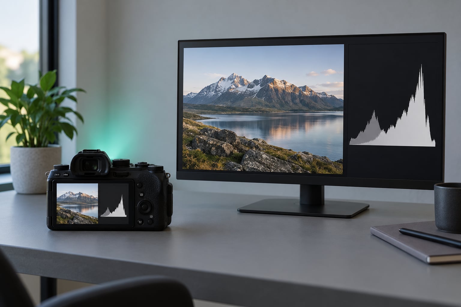
A histogram is a bar graph of the brightness in your photograph. The horizontal axis runs from black on the left to white on the right, and the vertical axis shows how many pixels landed at each brightness level. Learning to read one takes about 30 seconds, and it tells you in numbers what the camera screen cannot: whether you lost detail to clipped shadows or blown highlights.
Here is the part that unblocks most beginners. There is no single correct histogram shape. A snowy street at noon and a low-key portrait in a dim room should look completely different on the graph, and both can be exposed properly. The shape is not a score. What matters is the two ends of the graph, where data piles up against the walls and stops being recoverable.
A short cheat sheet before the detail:
- Check the right-hand end first. Highlight clipping costs you more than shadow clipping.
- Touching the far left wall is fine in small amounts. It only matters when it runs as a tall spike.
- A tall spike hard against either wall is data you cannot get back.
- The y-axis is how many pixels, not how bright. A tall bar on the left means many dark pixels, not a bright area.
- Being close to the right wall without touching it is the goal in most scenes.
- One stop of exposure compensation shifts the whole graph, so small corrections make visible differences.
Table of Contents
- What You Need
- Step-by-Step
- Open the Histogram and Set the Scale
- Read the Shape from Left to Right
- Check for Clipping at Both Ends
- Use the Histogram to Adjust the Photograph
- Compare the Histogram with the Scene You Photographed
- Common Mistakes
- Frequently Asked Questions
- Should my histogram touch the right edge?
- What is the difference between an RGB histogram and a black-and-white one?
- Does a RAW histogram differ from a JPEG histogram?
- What should a properly exposed histogram look like?
- How do I tell if a histogram is skewed left or right?
- Can I recover blown highlights later?
- Conclusion: Check the Edges, Not the Shape
What You Need
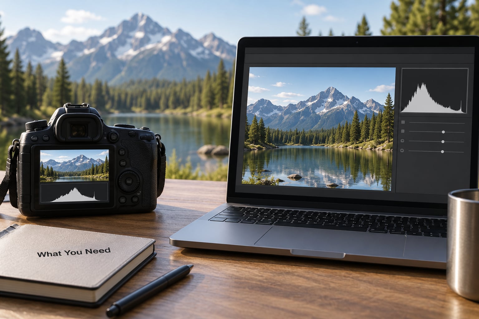
Almost every camera made in the last decade can display a histogram, either on the rear screen in live view or in the viewfinder of a mirrorless body. Editing software shows the same graph after the fact, and it is more accurate than the one on the camera. In Adobe Lightroom Classic and Capture One the histogram sits in the right-hand panel stack; in darktable it lives in the shadows and exposure module of the tone curve view.
What the graph represents is brightness and nothing else. It does not tell you what the subject is, whether the colours are attractive, or whether the composition works. A portrait and a brick wall with identical tone values produce identical histograms. Once that clicks, reading one becomes mechanical.
You need three things:
- A source for the graph. Your camera’s live view histogram, a histogram panel in your editor, or a free web viewer that drops a photo straight into the page.
- The photograph itself. You cannot read a histogram you have not taken. If you are working from an existing file, open it in the editor rather than the camera.
- Optional exposure bracketing. If your camera offers a bracketing mode that shoots several exposures at different exposures in one press, it gives you a set of histograms to compare instead of a single guess.
Step-by-Step
The workflow below takes about a minute per frame once you have done it a few times. Work through it in order, and the numbers stop being abstract.
Open the Histogram and Set the Scale
Most cameras put the histogram toggle somewhere in a shooting or display menu rather than buried in image quality settings, and the exact path changes between models and firmware versions. Canon bodies show a live histogram toggle in the shooting menu, Nikon cameras have a display option for it, and Sony and Fujifilm bodies place it somewhere similar in their shooting menu trees. Check your own manual for the current path.
You will usually meet three variants:
- Combined brightness, which merges the three colour channels into one graph. This is the easiest to read and the one most beginners start with.
- RGB overlay, which draws the red, green and blue channels on top of each other. Overlapping curves mean no colour channel is clipping.
- Individual channels, shown one at a time. Useful when a specific colour is going wrong, such as a sunset where the red channel clips before the others.
The scale matters too. Most camera displays compress the tones, so a graph that looks bunched in the middle may actually cover a healthy range. Some bodies and editors offer a linear scale instead, where shadows sit much closer to the left wall than you would expect. If a graph looks unfamiliar, switch scales before you start worrying about it.
Read the Shape from Left to Right
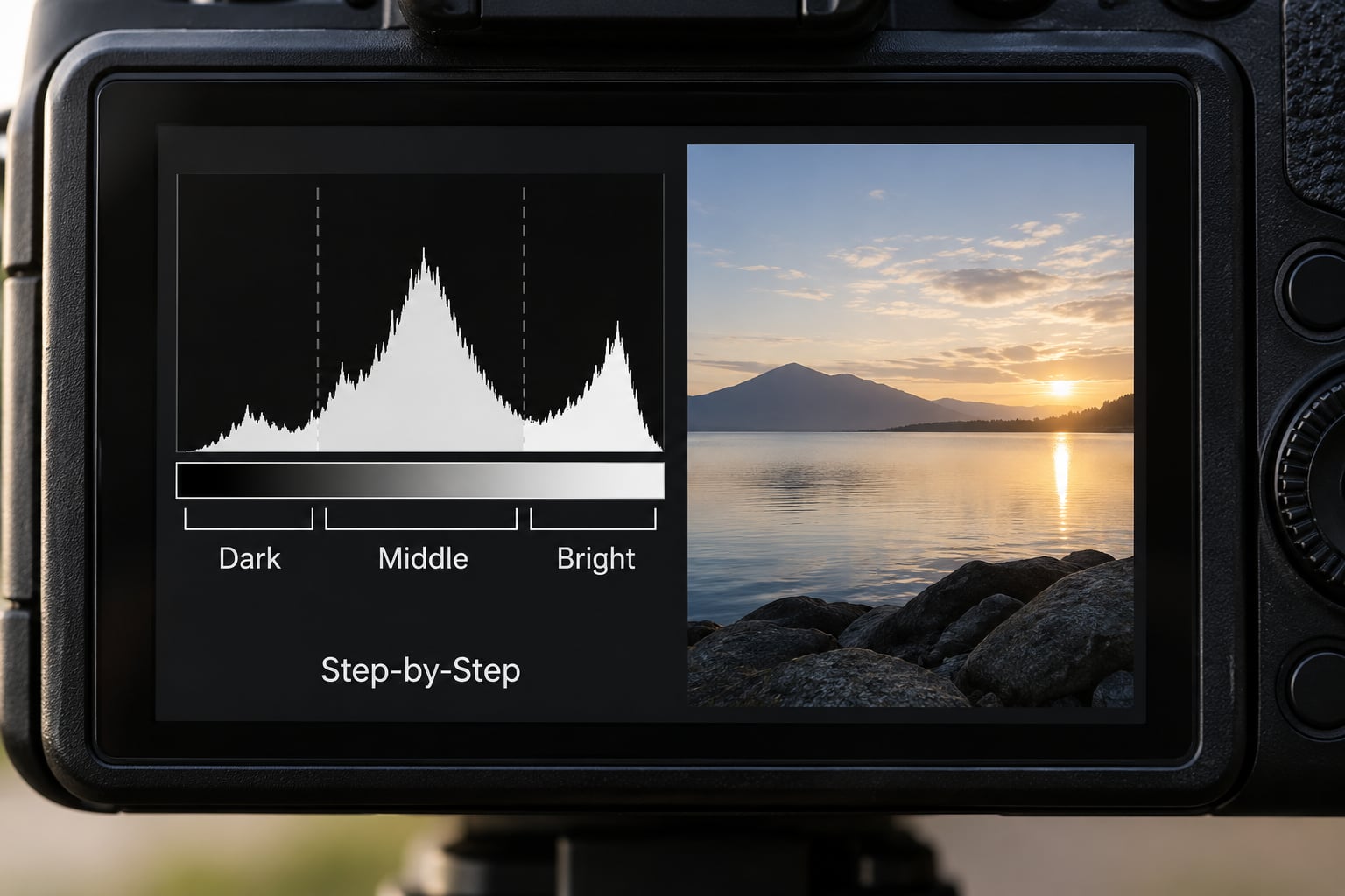
The left-to-right reading order runs from blacks through deep shadows, shadows, midtones, highlights and near-whites to whites. Each bar in a given position counts the pixels sitting at that brightness. This is the mistake almost every beginner makes: they read a tall bar on the left as a bright area of the image, when it actually means many pixels are dark there.
The y-axis is frequency, not brightness. It has no units and no fixed maximum, so graphs from two different cameras are not directly comparable in height. A camera with a smaller sensor will often produce a taller-looking graph for the same scene simply because its pixel values cluster differently.
A peak means most of your pixels share one brightness, which is exactly what happens when a subject fills the frame. A valley usually means two large groups of pixels at different tones, like a dark subject against a bright sky. Neither is wrong. What the peak cannot tell you is whether those midtone pixels are correctly exposed or just sitting in the middle of the scale by default.
The rough division most people use treats the left third as shadow tones, the middle third as midtones, and the right third as highlights. It is a starting point, not a rule, and it becomes less reliable the more contrast a scene has.
Check for Clipping at Both Ends
Clipping is what you are actually looking for. On the right, a bar that reaches the wall and stays there means pixels have recorded pure white with no tonal information left. On the left, the same thing means pure black. Those pixels are gone, and no amount of editing in Lightroom or Photoshop brings them back.
Run-off is the word photographers use for this. A small amount at either end is often fine and often deliberate. What matters is the shape of the run-off: a single pixel column at the extreme edge is negligible, while a wide plateau pressed against the wall means thousands of pixels have merged into one value.
Your camera can flag this for you. Most mirrorless bodies offer highlight warnings that blink the affected pixels, and many also offer zebra stripes over any zone above a chosen threshold. Some cameras go further and show false colour, painting clipped areas in a warning hue. In Lightroom, hold the J key while hovering the histogram and the clipping indicators appear underneath, blue for shadows and red for highlights.
One honest caveat. The histogram drawn on the camera screen when you shoot RAW is an approximation of what the sensor captured, not the raw file itself. Treat it as a very good guide, not a laboratory instrument. If you are near the wall, check the file afterwards before you assume you have clipped.
Use the Histogram to Adjust the Photograph
Now the adjustments. Work from what the graph shows rather than from a preset recipe, because every scene has a different answer.
- Graph sits far left with everything crowded against the dark end. Add exposure compensation until the data moves toward the right. One full stop is roughly a doubling of light, and on most graphs it visibly shifts the whole shape. Aperture, shutter speed and ISO all produce the same effect, so pick whichever one you can adjust without consequences you care about more.
- Graph touches or runs into the right wall. Pull exposure back in small steps. A third of a stop is usually enough and rarely costs you anything in the shadows.
- Graph is flat and bunched in the middle with empty walls on both sides. This is a contrast problem rather than an exposure problem. Lighten or darken the scene itself, use a fill light or a reflector, or fix it later with contrast and clarity.
- Graph has a big gap, a spike in the middle with nothing on either side. The scene itself is very high contrast. Expose for the brighter end and fill the darkness with a flash, or make two exposures and blend them.
- One colour channel clips while the others are fine. Reduce exposure slightly, or select the clipping channel in the editor and judge that channel alone. Saturated sunsets and deep red clothing are the usual culprits.
Two habits pay off here. Shoot RAW when your camera allows it, because the extra tonal headroom makes the difference between blending in an edit and recovering from clipping. And when a scene is genuinely difficult, bracket it: several frames at different exposures give you a set of graphs to choose from instead of one take-it-or-leave-it reading.
There is a deliberate strategy here called exposing to the right. It means pushing the exposure as far right as possible without touching the wall, on the grounds that slightly brighter shadows are easier to lift than permanently white highlights. Experienced photographers argue about this constantly. It works well in even light, and it costs you clipped skies in mixed-contrast scenes like backlit portraits, which is the single most common argument against it.
Compare the Histogram with the Scene You Photographed
The final step is the one most tutorials skip: check the graph against what you actually photographed. The tones in your frame decide where the data should sit, and no amount of adjusting will produce a good photograph from an inaccurate reading of the scene.
Real cases worth knowing:
- Snow. A white ground pushes data to the right. A histogram crowded toward the right wall here is correct exposure, not overexposure. The thing to watch is clothing and shadows, which go black quickly.
- Backlit portrait. The bright background occupies most of the frame, so the graph sits right. The face is a separate exposure, taken with spot metering or a reflector, and judged on its own graph.
- Night sky. Nearly everything is dark, so the graph hugs the left. Aim for a rough bell shape with the sky spread across the middle, and expect stars and the brightest moonlit areas to be the only points near the wall.
- White clothing or a wedding dress. Detail in white fabric disappears fast. Watch the right edge closely and accept a slightly darker picture if the alternative is a featureless dress.
- Dark clothing against a bright background. The background reads white and the subject reads black. Judge the two separately; one graph cannot tell you whether either one worked.
- Silhouette. Heavy left run-off is the intent. The graph should hug the left with a small area of brightness at the right where the sky shows.
- Sunset. Check the individual colour channels. A sunset can look correct while the red channel has clipped, which shows up later as flat, lifeless colour in the sky.
Common Mistakes
These are the errors that keep coming up, each with the fix that follows it.
- Expecting a bell shape. A classic bell curve describes an evenly lit scene, not a photograph. Portrait, sunset and snow shots should not produce one. Fix: judge the ends, not the outline.
- Reading the y-axis as brightness. A tall bar on the left does not mean the image is bright. Fix: remember the y-axis counts pixels, full stop.
- Believing the graph should touch the right wall. This is the most common myth on the internet. Touching the wall means clipped highlights. Fix: get close to it, leave a small gap.
- Ignoring individual colour channels. A combined graph can look clean while one channel has clipped. Fix: switch to the RGB overlay or single-channel view before you commit to a difficult exposure.
- Treating every edge pixel as fatal. One or two columns at a wall are usually fine, and some scenes need them. Fix: look at the width and height of the run-off before you panic.
- Adjusting exposure without looking at the photograph. The graph can be technically correct and still not what you wanted. Fix: take the shot, look at it, then adjust.
- Trusting the camera screen over the file. Backlight and daylight make LCD screens unreliable, and the on-screen histogram is an approximation. Fix: use the graph as your guide, then confirm in the editor.
Two extras that help. Set your camera to show highlight warnings or zebras so clipping is visible in the frame itself. And if you edit on a desktop monitor, match its brightness to the room you work in, since an over-bright screen makes shadows look worse than they are and pushes you to over-expose.
Frequently Asked Questions
Should my histogram touch the right edge?
No. Data reaching the far right wall means pixels have recorded pure white with no tonal detail left, and that data cannot be recovered in editing. Get as close to the wall as you can without touching it, which usually means leaving a small gap. Scenes full of snow, white walls or a bright sky are the exception, since those subjects genuinely belong near the right end.
What is the difference between an RGB histogram and a black-and-white one?
A black-and-white or luminance histogram merges the three colour channels into one brightness graph, which is simpler to read and best for judging overall exposure. The RGB version draws red, green and blue separately, so you can spot a clipped colour even when the combined graph looks clean. That matters with sunsets, deep red clothing and stage lighting.
Does a RAW histogram differ from a JPEG histogram?
Yes, and the difference matters. A JPEG histogram shows final 8-bit file values, so anything at pure black or pure white is already lost. A RAW histogram is based on the sensor data before processing, which usually has more tonal headroom, and the graph drawn on the camera screen when shooting RAW is an approximation of that data rather than the file itself. Check the RAW file in your editor for the accurate reading.
What should a properly exposed histogram look like?
There is no single correct shape, which surprises most beginners. A properly exposed photograph has its tonal data spread across the graph with no large pile-up at either wall, but where the mass sits depends entirely on the scene. Snow sits right, a night sky sits left, a silhouette hugs the left edge on purpose. Judge the ends of the graph and the subject, not the outline.
How do I tell if a histogram is skewed left or right?
Look at which end has the long tail. If most of the data sits left and a thin tail stretches to the right, it is right-skewed, also called positively skewed, and the mean and median both fall to the right of the mode. If the mass sits right with a tail running left, it is left-skewed or negatively skewed, and the mean and median fall left of the mode. The tail always pulls the mean further than the median.
Can I recover blown highlights later?
Not reliably. Once pixels record pure white there is no tonal information left in them, so editing only affects nearby pixels that still hold data. Mild overexposure that comes close to the wall usually recovers fine in a RAW file, which is one more reason to shoot RAW. The equivalent mistake on the dark end is more forgiving, because lifting shadows still leaves some signal to work with.
Conclusion: Check the Edges, Not the Shape
Do one thing next time you shoot: look at the right-hand wall before you press the shutter, and adjust until the data gets close to it without piling up against it. Everything else, the outline, the peak, the bell shape, follows from that one habit. Whatever camera you are holding in 2026, the reading method has not changed and neither has the rule: edges are irreversible, the middle is negotiable.