If your flower photos look flat, the light is almost certainly arriving from the same direction as your lens. The bloom and everything behind it get lit at the same angle, so they record at the same brightness, and you get no shadow, no depth, and no separation between subject and background. It is rarely the camera, the lens, or your editing. The first fix costs nothing: turn about 90 degrees and the same flower gets shape.
A camera records brightness, not depth. We read shape by comparing how bright one side of a petal is to the other, and when the light comes over your shoulder, every petal and the leaves behind them are lit identically. That equality is what flat means.
The good news is that almost all of it is fixable with light you already have. Most of this takes under five minutes once you know which of the usual causes is flattening your picture.
Table of Contents
- What You Need
- Step-by-Step: Why Do My Flower Photos Look Flat?
- Step 1: Diagnose Why Your Flower Photos Look Flat
- Step 2: Photograph During the Best Available Light
- Step 3: Add Side Light for Shape and Texture
- Step 4: Change the Camera Position for More Depth
- Step 5: Focus on the Part You Want to See Clearly
- Step 6: Simplify the Background and Color Relationships
- Step 7: Add Contrast and Color Carefully in Editing
- Common Mistakes
- Frequently Asked Questions
- Are flower photos always flat because of bad lighting?
- Why do my flower photos look dull even when the image is sharp?
- Should I use HDR when photographing flowers?
- Can I make flat flower photos look better in editing?
- What camera settings work best for close-up flower photos?
- Conclusion: Make One Change at a Time
What You Need
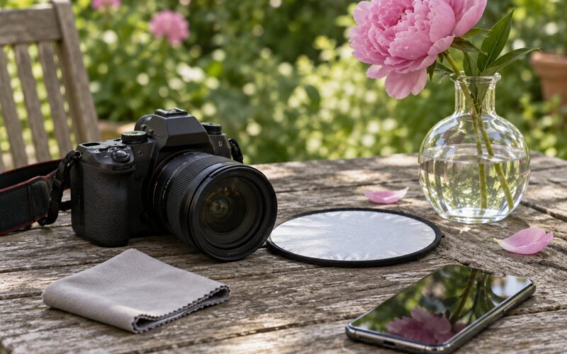
None of this requires new gear. A camera or a phone, plus two cheap helpers, is enough.
- A camera or phone. A phone does everything here if you tap to focus and lock exposure on the flower.
- A flower and something to lay it on. A sheet of black or white card, a book, a piece of fabric, a windowsill.
- Diffused light. A window with no direct sun, an overcast sky, or a small LED panel set back a foot or two. Diffusion is what stops harsh shadows.
- A white card or foam board. This is your reflector. Fill the shadow side with it, or turn it black-side-out to pull light back out of a background.
- A tripod or a steady surface. Not for sharpness alone, but so you can use a narrow aperture and a slower shutter without camera shake.
- A lens cloth. A smudged front element eats contrast in exactly the way readers mistake for flat light.
- An editing app. Lightroom, Capture One, or a phone editor such as Snapseed or the stock editor on your handset.
Step-by-Step: Why Do My Flower Photos Look Flat?
Step 1: Diagnose Why Your Flower Photos Look Flat
Open the file at 100% on a decent screen and look at one thing at a time. Zooming out is what hides the problem.
- Check the histogram. If every tone is bunched in the middle third, you have low contrast. A healthy flower shot has a spike near the left edge for petal shadows and a spike near the right for highlights.
- Check the background brightness against the flower. Similar values are the flatness. Your eye needs a difference to grip.
- Check for a shadow side. Turn the image to grayscale. If the flower reads as a single gray shape, there is no tonal modeling and no depth.
- Check sharpness on the part that matters. If the stamens are mush, your problem is focus, not light.
- Run the ten-second test. Hold a black card behind the flower and take one frame. If it suddenly looks alive, the background was the cause, not the lighting.
Step 2: Photograph During the Best Available Light
Flat lighting in photography simply means light with no direction, and overcast skies are the classic example: soft, pleasant, and completely directionless. That softness is why beginners assume overcast is the safe answer, and it is the reason so many flower photos come home dull.
Each condition flattens differently, so match the problem to the weather.
- Bright overcast: soft, no harsh shadows, and very low contrast. Good for delicate petals, useless on its own for shape. Add a reflector or a card to invent a light direction.
- Open shade: the shaded side of a wall, a tree line, a porch. Softer than direct sun, but still directional if the shade falls from one side. This is the best free light most beginners have.
- Harsh midday sun: blown highlights on white petals, hard-edged shadows across the bloom, and heat haze. Use it for a rim or backlight, or wait.
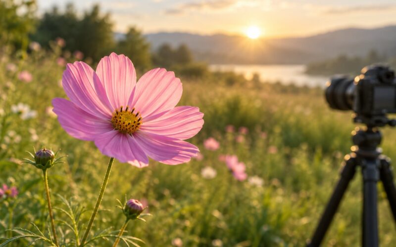
- Golden hour: low, warm, and raking across the garden. Side light arrives almost for free, and thin petals start to glow.
Rule of thumb: if you can see one distinct shadow direction, you have something to work with. If you cannot, you need to make the direction yourself.
Step 3: Add Side Light for Shape and Texture
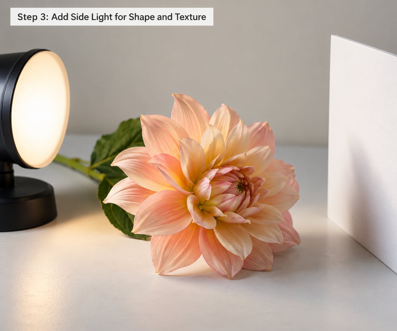
Side light is the single most effective change and it costs nothing. Put your light source 45 to 90 degrees to one side of the flower and slightly above it, then turn the flower or the camera so the lit edge faces across the frame.
The lit side of each petal goes bright and the far side falls into shadow. Veins, hairs, dew, and the curl of a petal edge all become visible because they interrupt the light. That texture was always there; front light simply hid it.
Two details that matter. Keep the light diffused, or the shadow side turns into a black hole. And once the light is to the side, aim exposure at the bright side rather than letting the meter average the two.
On the camera, a reflector on the shadow side brings the ratio back toward even, which is right for pale roses and white daisies. Turn the same card around so the black side faces the flower and it stops bouncing light back, which is how you keep a shadow side dark and dramatic on a dark background.
Step 4: Change the Camera Position for More Depth
Most flat flower photos are shot from directly in front, at the same height as the flower, and that straight-on angle removes the last hint of dimension. Overlapping shapes read as one flat cut-out.
Drop your eye level below the flower and shoot slightly upward. Now the bloom sits against the sky or a distant hedge instead of against more flowers at the same distance, and it separates immediately.
Move a few steps sideways rather than just straight in. A small change in angle puts one petal in front of another, and overlap is what tells the eye there is depth. Then get physically closer instead of cropping afterwards, because cropping a wide frame throws away resolution and leaves the flower cramped with no breathing room around it.
On a phone, stand up, turn the screen, and check the edges of the frame for stray grass and stems before you shoot. A dirty edge reads as clutter no amount of editing fully fixes.
Step 5: Focus on the Part You Want to See Clearly
Sharpness does not create depth, but a soft subject makes a flat image look worse because the viewer has nothing to hold on to. Decide what the photo is about first: the whole bloom, the stamens, a single petal edge, or a dew drop. Then focus there.
Use a single autofocus point rather than a wide auto area, place it on the stamens or the front petal, and leave it there. On a phone, tap the flower to focus, then press and hold the screen to lock focus and exposure so it does not hunt while the wind moves the stem.
For settings, most close-up flower shots start near ISO 100, a shutter of 1/125 second or faster handheld, and a wide aperture around f/2.8 to f/4 to melt the background. On a tripod you can go the other way, to f/8 or f/11, for a full bloom sharp front to back, and then let the ISO climb rather than letting the aperture stop down further.
Stabilization helps, but it does not freeze a moving stem. In a breeze, a slightly slower shutter that lets the petals move often looks better than a perfectly sharp frame that took three tries to get.
Step 6: Simplify the Background and Color Relationships
Subject separation is the difference between a flower and a photograph of a flower. A bloom competing with bright leaves, a tangle of stems, or a patch of pale sky reads as busy, and the eye has nowhere to land.
Four controls fix it, in order of how much they help.
- Distance. Move the background further away, or the flower closer to it, and the blur increases. This is the strongest control and it is free.
- Position. Crouch until the flower is framed against something clean and dark, a shaded hedge or bare shadow, not against a bright wall.
- Aperture. Wide for creamy blur, but watch the edges: at f/1.8 the depth of field can be thinner than a single petal.
- Color. A warm yellow bloom pops against deep blue, a red one against green foliage. Colour contrast works even when brightness is similar, so a red flower on a green hedge has separation without needing a dark background.
Check the corners of the frame, not just behind the flower. One bright leaf in a corner will flatten the whole picture more than a slightly cluttered patch in the middle.
Step 7: Add Contrast and Color Carefully in Editing
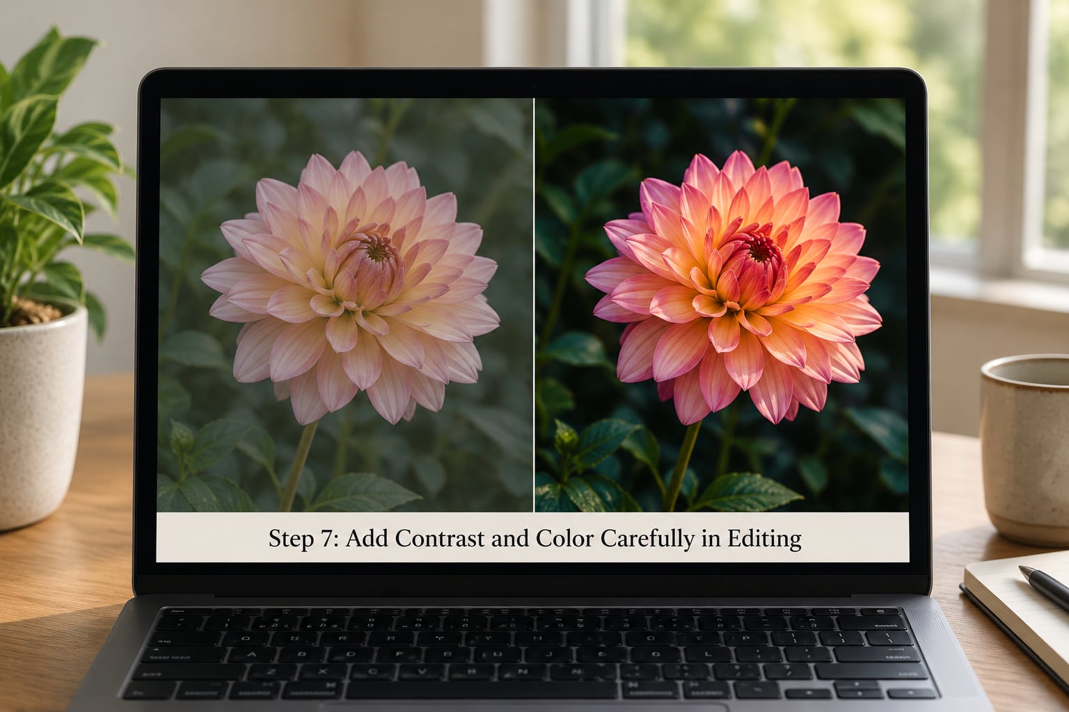
If the photo is already taken, you can recover most of a flat look, though you cannot invent a shadow side that was never recorded. Work in this order, because each step depends on the one before it.
- Exposure first. Pull exposure down a third to two-thirds of a stop if the highlights look chalky, then check the histogram again.
- Set white balance by hand. Auto white balance will leave a warm flower looking muddy. A gray card or a neutral surface in the frame beats guessing.
- Build contrast with curves or levels. Place a point on the left end and one on the right end and pull them inward gently, then add a slight S-curve. Big moves clip color in the petals.
- Add vibrance, not saturation. Vibrance pushes muted colors up and leaves skin of colors alone, which matters when one petal is already a strong red.
- Use local adjustments on the flower only. A small amount of texture or clarity on the petals and none on the leaves keeps sharpening from eating the background.
- Dodge the flower, burn the background. Small brush strokes of light on the bloom and dark on what is behind it create the separation the lens could not find.
- Sharpen last, and lightly. Oversharpening amplifies noise and gives petals a crunchy, artificial edge that no viewer will thank you for.
Common Mistakes
Shooting with the sun over your shoulder. This is the number one cause of the problem this article is about. Turn 45 to 90 degrees, or put the sun behind the flower and work with the glow.
Leaving white balance on auto. The camera is guessing at a color that does not exist, and a dull cast is the usual result. Set it manually or correct it in the edit.
Correcting everything at once. Heavy clarity, high saturation and strong contrast sliders stacked together produce a poster, not a photograph. Change one thing, look, then change the next.
Filling the frame edge to edge. A flower cropped tight to all four sides has no room to breathe and reads as flat. Leave clean space on at least one side.
Sharpening the whole frame. Global sharpening hits the grass, the soil and the noise along with the petals. Mask it to the flower instead.
Waiting for perfect weather instead of adding light. The forum advice on flower macro is split between shoot on bright overcast and bring your own light. Both are half right. Overcast is easy but directionless, so use it and add a reflector to create the angle that the sky is not giving you.
A last check worth doing every few weeks: clean the front element. A smudged lens scatters light and lowers contrast across the whole frame, and it looks exactly like bad lighting.
Frequently Asked Questions
Are flower photos always flat because of bad lighting?
Usually, but not always. Light is the most common cause by a wide margin, especially light arriving from the same direction as your lens. A flat picture style or a neutral color profile, an unprocessed RAW file, an over-smoothed preset, or a dusty front element can all produce the same dull, lifeless look. If your shadows are genuinely dark in the file and the image still looks washed out, the cause is not the light, so check the camera settings before you go outside again.
Why do my flower photos look dull even when the image is sharp?
Sharpness and depth are different things. A perfectly focused photo can still be dull because the flower and the background sit at the same brightness, so the eye has no contrast to read shape from. Fix the tonal range: get the light to one side, put a dark or contrasting background behind the bloom, and add a small S-curve in the edit. The detail will look like it suddenly appeared, because it was always there in the file.
Should I use HDR when photographing flowers?
For most flower work, no. HDR blends several exposures to rescue very bright and very dark scenes at once, and the result often looks like a dull photo that has been made flatter on purpose. It is occasionally useful in bright midday sun, when the contrast exceeds what your camera can hold. The better fix is to soften the light with a scrim or shade cloth, or simply shoot when the sun is lower and the contrast is manageable.
Can I make flat flower photos look better in editing?
Yes, substantially, though you cannot invent detail that was never recorded. Lower the exposure to recover chalky highlights, set white balance by hand, add a gentle S-curve, then nudge vibrance up. Local adjustments are where the real gain is: brighten the flower and darken the background separately, which fakes the separation you missed on the day. If the petals are a single flat grayscale in black and white, you are only adding contrast, not creating depth.
What camera settings work best for close-up flower photos?
Start near ISO 100 with a shutter of at least 1/125 second handheld, and open the aperture to about f/2.8 to f/4 to soften the background. On a tripod, stop down to f/8 or f/11 for sharpness across the whole bloom and raise ISO instead of the f-number. Focus with a single point on the stamens, and shoot RAW so you have room to recover blown highlights. The lens is rarely why a flower photo looks flat.
Conclusion: Make One Change at a Time
If your flower photos look flat, the light direction is almost certainly the culprit, and it is the cheapest thing to fix. Start by looking at one existing photo at full size: check the histogram, look for a shadow side, and hold a dark card behind the flower for a quick answer on the background.
Then change one thing at a time. Move the light to the side and shoot again, and only after that adjust your position, focus and background. Comparing each version is how you learn what your camera and your light were actually doing.