To build a simple photo portfolio website, you do four things: pick a hosted platform, choose a body of 20 or so photographs, load them into a template, and publish it with your own domain name. A beginner can have a working site live in a weekend without writing a line of code. The whole job is mostly deciding what to show and then making it easy to browse.
I built the first version of mine the wrong way around. I picked a theme, spent two days fiddling with fonts and colors, and only then started sorting photographs. The redesign that actually worked started with a spreadsheet of images and a written theme. If you take one thing from this guide, make the selection first. Everything after that is mechanics.
Table of Contents
- What You Need
- Step-by-Step: How to Build a Simple Photo Portfolio Website
- 1. Choose the Photographs and Story You Want to Feature
- 2. Choose a Website Platform and Domain
- 3. Create the Main Portfolio Pages
- 4. Organize and Upload the Photo Galleries
- 5. Make the Design Easy to Browse
- 6. Add Context and Contact Information
- 7. Preview, Publish, and Test the Website
- Common Mistakes
- Frequently Asked Questions
- How do I make a website for my photography portfolio?
- Which website builder is best for photographers?
- How many photos should I put in a portfolio gallery?
- Do I need my own domain name?
- Can ChatGPT build a photography portfolio website?
- Conclusion
What You Need
You need far less than most people expect. Here is the short list of what has to exist before you open a website builder.
- Your selected photographs. Twenty to forty edited images, not the whole card. Set them in one folder so you are not hunting through drives mid-build.
- A one-sentence theme. Something like “quiet mornings in coastal Maine” or “portraits of makers in their workshops.” You will use it on the home page and in every gallery intro.
- A photography portfolio website builder. A hosted option handles hosting, security certificates and software updates for you.
- A custom domain name. Around ten characters that spell out your name or your niche. Buy it from a registrar and point it at your site later.
- An image editor. Whatever you already use for your edits, plus the export settings at the end of this guide.
- A short bio and an email address. Three or four sentences. Include where you shoot and who you shoot for.
You do not need business cards designed or a logo. Photographers often stall here waiting for branding that never arrives. A clean type treatment and a single accent color is enough for a first version.
Step-by-Step: How to Build a Simple Photo Portfolio Website
The process below takes most people an afternoon for the first draft and another evening for polish. Follow it in order and you will not end up with a site that has to be rebuilt from scratch in three months.
1. Choose the Photographs and Story You Want to Feature
Start with a theme, not a count. Portfolio reviewers scan twenty images in under a minute, and the ones that look strongest usually share lighting, color treatment and subject matter. If your best portraits and your best storm photographs do not belong in the same room, split them into separate galleries or separate sites.
Sort candidates into three piles: leads, seconds and out. Leads go on the site, seconds stay for later or for print sales, out means out. Most beginners end up with 200 images because nobody made the decision for them.
Set up folders that match the site structure you want, before you build anything.
- A folder per gallery, named the way you will name the page
- A folder of six to eight images per gallery, not more
- A separate folder for the three to five images you want on the home page
Naming files now saves an hour later. Use 2026-03-14-harbor-lowtide-03.jpg instead of DSC4821.jpg, and you can rebuild the whole site from filenames if you ever switch platforms.
2. Choose a Website Platform and Domain
There are two families of option, and the difference matters more than any feature list.
Hosted builders include Adobe Portfolio, Squarespace, Wix, Pixieset, SmugMug, Zenfolio and Pic-Time. You sign up, pick a template, and everything runs on their servers. Galleries, proofing and print selling are usually built in. Adobe Portfolio is the fastest start if you already pay for Creative Cloud, because it pulls collections straight out of Lightroom. Squarespace and Wix go wider, with room for a blog, booking and a small store. The tradeoff is that layout freedom is limited and recurring fees apply.
Custom or self-hosted options mean WordPress on your own hosting, or a hand-coded site. You get complete control over themes, plugins and page speed, and you own the setup outright. In exchange you handle updates, security and troubleshooting yourself. For a hobbyist building a simple photo portfolio website, this is a second project, not a first one.
Skip the decision entirely if your only goal is a showcase. Reviewers on photography forums repeatedly describe the same pattern: people spend months comparing builders instead of shooting, and the site never launches. Pick the one that lets you publish today, then move later if you outgrow it. Moving is far easier than starting.
On the domain, keep it short and predictable. Yournamephotography.com is fine. Skip hyphens, skip numbers, and skip clever abbreviations. Once you have it, connect it inside your builder’s domain settings, which usually means changing two nameservers and waiting a few hours for the change to spread.
3. Create the Main Portfolio Pages
A simple site needs four pages. Resist the urge to add more at the start, because every extra page is one more thing a visitor can bounce off.
- Home. Three or four strong images, your one-sentence theme, your name, and a clear link into your galleries.
- Portfolio or Galleries. The main index. Each gallery gets a cover image, a title and a one-line description.
- About. Where you are based, what you shoot, who has hired you, and how you got started.
- Contact. An email address and a form. Include a phone number only if you want calls.
Keep the navigation identical on every page. Four links in the same order, same position, same look. A visitor should never have to hunt for the contact page, and that is exactly the sort of small friction that sends people back to the page they came from.
4. Organize and Upload the Photo Galleries
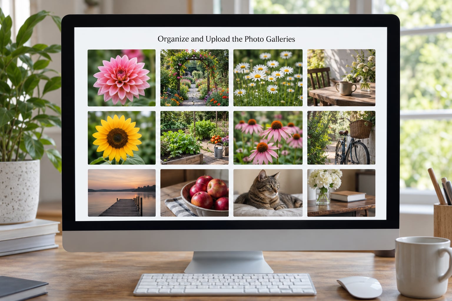
Create one gallery per shoot, season or subject. The test is whether the set tells a small story on its own, in roughly ten seconds of scrolling.
Now handle the files. These are the export settings I use, and they hold up on any modern builder:
- Export at 1600 to 2000 pixels on the long edge. Big enough to look sharp on a desktop, small enough that the page loads quickly on a phone.
- Export in sRGB. Your monitor may be wider-gamut than most visitors’ screens, so this keeps colors predictable.
- Save as JPEG at quality 75 to 80. A 2000-pixel image usually lands between 300 KB and 700 KB. If it is above 1 MB, export it again and compare.
- Batch rename. Descriptive filenames help search engines and help you in two years.
Write a real caption for each image. Two lines covering what it is and why it matters: the location, the client’s project, the season. Avoid the filename-in-sentence habit of writing harbor-lowtide.jpg as the caption. Alt text describes the picture for screen readers and for Google, so it works the same way: describe what a person would see if they looked at it.
5. Make the Design Easy to Browse
Good portfolio design is mostly restraint, and it is easier to achieve than most beginners expect. Pick one grid layout and use it everywhere, choose two typefaces at most, and let the photographs be the only thing with real contrast.
Leave real space between images. Cramped grids make every picture compete with its neighbours. Give each gallery a consistent number of columns, and keep the hover effect simple: a soft fade or nothing at all. Full-screen sliders that steal attention tend to make people leave.
Then check the phone. Most of your visitors will see the site on a phone first, and a template that looks fine on a monitor often turns into an unreadable stack of tiny images on a narrow screen. Tap through every page on your own phone before you publish. If the images are smaller than your thumb, the layout needs work.
6. Add Context and Contact Information
Now the words. A short introduction on the home page tells people what they are looking at and who you are. Write it plainly: where you shoot, what you specialise in, and what you would like to happen next.
Add a line about your process on the about page. Clients like knowing whether you work with couples or families, whether you shoot on location or in a studio, and how long a session takes. Photographers who answer those questions on their own site get fewer email back-and-forths.
On the contact page, offer two ways to reach you. An address and a short form, or a form plus a booking link if your platform supports scheduling. Say when you reply. “I answer every message within two working days” removes the anxiety of sending an email into silence. If you use client galleries for proofing, add a note about how long private galleries stay online and whether downloads are enabled.
Add a privacy note if you collect addresses through a contact form or a mailing list. One short paragraph is enough: what you collect, why, and who you share it with. It is a small signal that a serious photographer runs a real business.
7. Preview, Publish, and Test the Website
Do a real test pass before you announce anything. Open every page on a desktop and on a phone, and click every link. Broken internal links are the most common flaw on small portfolio sites and the least visible to the person who built them.
Then check the technical basics. Look at page load speed on an online test tool and see if any single page scores poorly, which almost always means oversized images. Confirm that each page has a distinct title and description, that your images have alt text, and that a contact form actually arrives in your inbox. Test the form twice, because forms sometimes look perfect and deliver nothing.
Submit your URL to Google Search Console so you can see what people search for and which pages get visited. It takes five minutes and gives you data that guessing will never produce.
Finally, connect the domain, turn on the security certificate that builders issue automatically, and publish. Then schedule the next two hours of work: a month from now, add one new gallery and fix whatever annoys you about the design. A portfolio improves through small updates, not long rebuilds.
Common Mistakes
These are the errors I see repeatedly in beginner portfolios, each with a straightforward fix.
Uploading full-resolution files. A 50-megapixel RAW export straight from the camera can be 30 MB on its own, and six of those will stall the page. Fix: export at 1600 to 2000 pixels on the long edge, JPEG, quality 75 to 80.
Mixing several visual styles. Four different fonts, a slider on one page and a grid on another. Fix: choose one template family and change only colors and spacing inside it.
Ignoring the phone layout. The site looks fine on the desktop and unusable on a phone. Fix: view every page on your own phone before publishing, not just the home page.
Confusing albums with galleries. Uploading every shoot in date order creates a catalogue, not a portfolio. Fix: group by theme or season and put six to eight images in each gallery.
Forgetting to test the contact form. Fix: submit it yourself twice, from two devices, and confirm the message arrives with your attachments intact.
Leaving the default template wording. Placeholder text about lorem ipsum or a demo client’s name does real damage. Fix: search the whole site for the template’s sample names before you go live.
Waiting for the perfect collection. The most common delay is not skill or software, it is indecision about which photographs count. Fix: set a date, pick 30 images, and launch. You can always replace a gallery later.
Frequently Asked Questions
How do I make a website for my photography portfolio?
Sign up with a hosted photography portfolio builder such as Adobe Portfolio, Squarespace or Pixieset, pick a template, create your gallery pages, upload your edited images at around 2000 pixels on the long edge, then connect a custom domain and publish. Most people finish a first version in an afternoon, and no coding is involved at any point.
Which website builder is best for photographers?
It depends on what you need the site to do. Adobe Portfolio is the fastest start for Lightroom users because collections sync automatically. SmugMug and Zenfolio suit photographers who deliver large client galleries. Squarespace and Wix handle a portfolio plus a blog and booking in one place. Pick the one matching your workflow rather than the one with the longest feature list.
How many photos should I put in a portfolio gallery?
Six to eight images per gallery is the working range, with three to five on your home page. Enough to show range and consistency, few enough that each picture still gets looked at. If you have 400 images, you likely have three or four distinct bodies of work rather than one gallery, and splitting them usually makes the site stronger.
Do I need my own domain name?
Not to start. Most builders give you an address on their own domain, which is enough for a first version. A custom domain such as yournamephotography.com costs a modest annual fee, makes your address easier to remember, and keeps you ready to move platforms later without breaking links you have printed on business cards.
Can ChatGPT build a photography portfolio website?
An AI assistant can help you draft an about page, write captions, plan your gallery names and troubleshoot error messages, and it can produce code for a custom site. It cannot upload your photographs, choose and edit them, or connect a domain and hosting for you. The build itself still happens inside a website builder or a hosting account you own.
Conclusion
Start by making the decision everyone avoids: pick one theme and thirty photographs from a single shoot or season. Choose a hosted photography portfolio builder, use the template as it comes, and publish four pages rather than fifteen. Test it on your phone, check the contact form works, and put the domain in front of people.
A small finished site beats an ambitious one you are still planning in three months. You will learn more from publishing in one weekend than from another month of comparing platforms.